KOKUYO DESIGN AWARD 2026
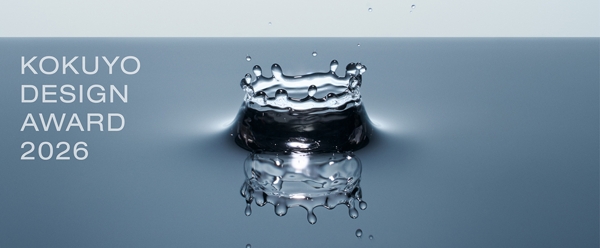
2026 Theme: “HAMON —Design that Resonates”
We have received 1,344 works from in and out of Japan (785 from Japan and 559 from overseas).
The 10 designs that passed the first round judging will undergo final judging on March 14, 2026.
One Grand Prix winner and three Merit Award winners have been selected.
Grand Prix
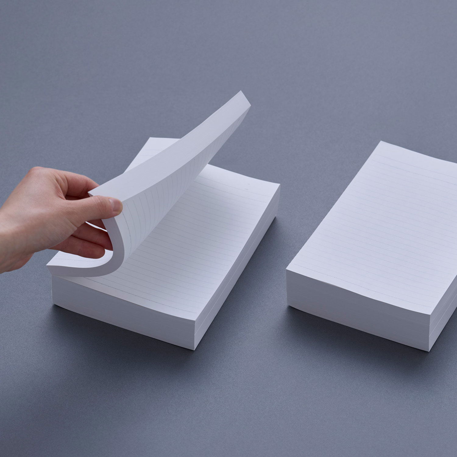
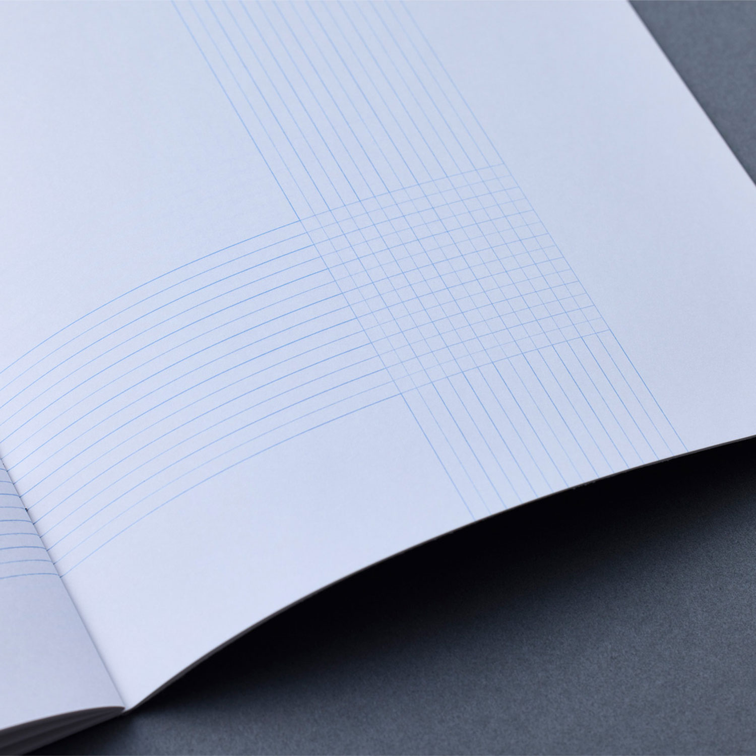
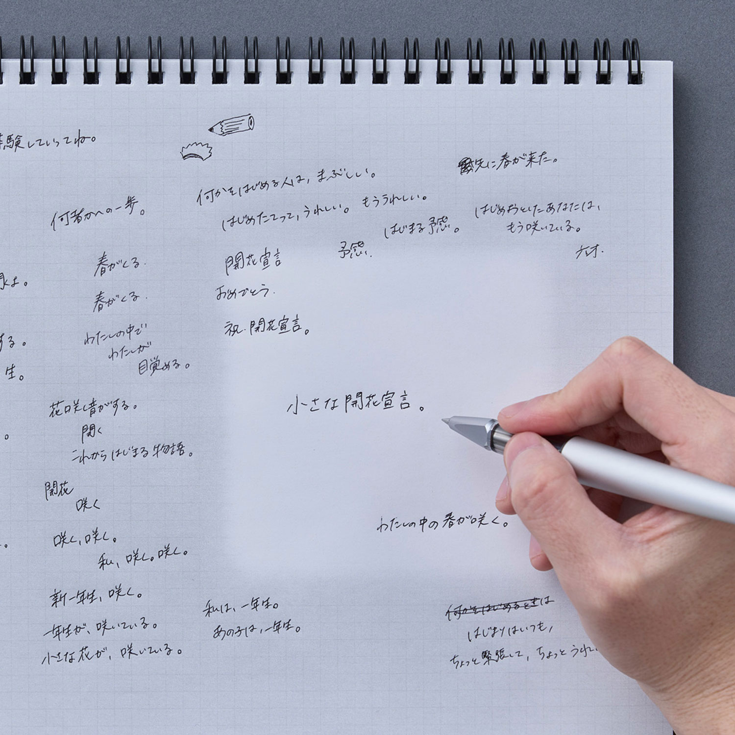
- title
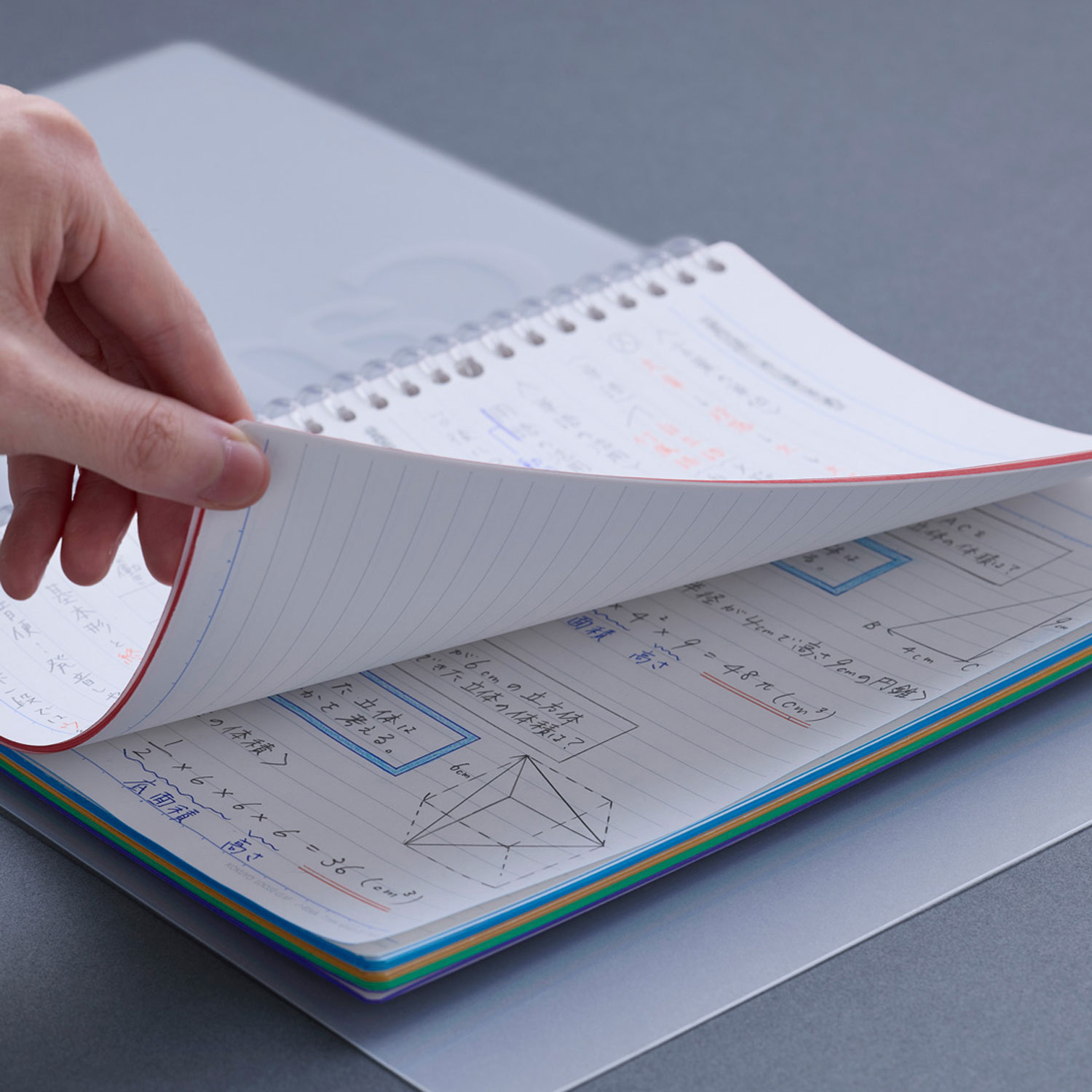
- Before Note
- creator
- Hiroki Kannari
Description
A bundle of inner pages that have been glued and backed. By having users choose the quantity and cover design, and returning to the form just before it becomes a notebook, I envisioned a product that embraces both mass production and personalization. Especially in this age of accelerating diversification and abundance of goods, I hope this proposal will be meaningful not only for users, but also for makers and sellers.
Even among the finalists, I thought this entry showed a particularly broad concept, and was very worthy of the Grand Prix. The concept behind the proposal is that a semi-finished notebook is, in essence, a “bundle of paper,” and the idea is to leave what it’s used for up to the user. Maybe this equation can be made to be common not just to notebooks, but to other products as well. That’s why I felt it was “big,” but on the other hand, there was also a risk that the idea wouldn’t get conveyed without an explanation, and as a designer, to be honest, I was also worried about that.
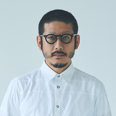
Shogo Kishino
A proposal that’s as pure and minimal as a “pebble.” But all the same, it made a strong impact when I picked it up, and had a power that resonated with me directly. What’s more, leaving room for the users to think about how to use it in their own ways is also a wonderful point, and it’s a well-thought-out design with a solid core, also including the balance between mass-producibility and personalization. The creator’s storytelling ability and personality really came across in the presentation, and I think that also influenced the impression the work left.
Nao Tamura
With everyone looking to release finished products into the world nowadays, it was wonderful how the creator of this entry found value in the pre-production process, and transformed it into an act of creation that would form a connection with society. The object itself has a massive impact, and conjures up an image that feels related to the theme—an image of various possibilities getting personalized and spreading out from a pure, raw gemstone. It also prompted me to re-examine “writing” as a primal act like drawing on stone.
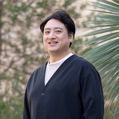
Kunihiko Morinaga
I felt that it’d be easy for lots of people to picture situations where they’d use the fact that you can make a portable notebook by taking just as much of it as you need. It’s a proposal that leaves people room to use their own imagination in thinking up ways to use it—and not just creators, but people from a wide variety of professions and generations. Given that this year’s theme of “HAMON” means spreading out like ripples, it stands to reason that this entry was unanimously chosen to be the Grand Prix winner.
Teruhiro Yanagihara
This proposal had grabbed me right from the first round of judging, and I really related to it on a personal level. Even when I was carrying around a whole bundle of paper, when I used it, there’d also be times when I’d want to engage with it as a single sheet. Also, the “right amount” of something will vary from person to person, so it’s a difficult problem, and not just for notebooks. The delicate sensibility to question that aspect, the freedom and possibilities that having multiple sheets of paper brings…factors like these, and the resulting proposal that takes notebooks back to being a “material,” and the design itself, all contained a story that resonated with a sense of personal involvement from various perspectives.
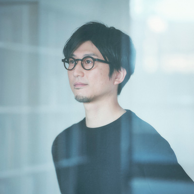
Satoshi Yoshiizumi
The presentation in the final judging was excellent. It may have started as a very personal and small realization, but I thought it was a proposal that could resonate with latent “wants” that lots of different people have, myself included. We are now in an age where people will increasingly think about things for themselves, and also design how to use things for themselves. The concept of rethinking how notebooks are used and their value, and entrusting that to the users, also aligned perfectly with this year’s theme of “HAMON.”
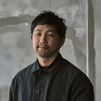
Hidekuni Kuroda
Merit Award
title
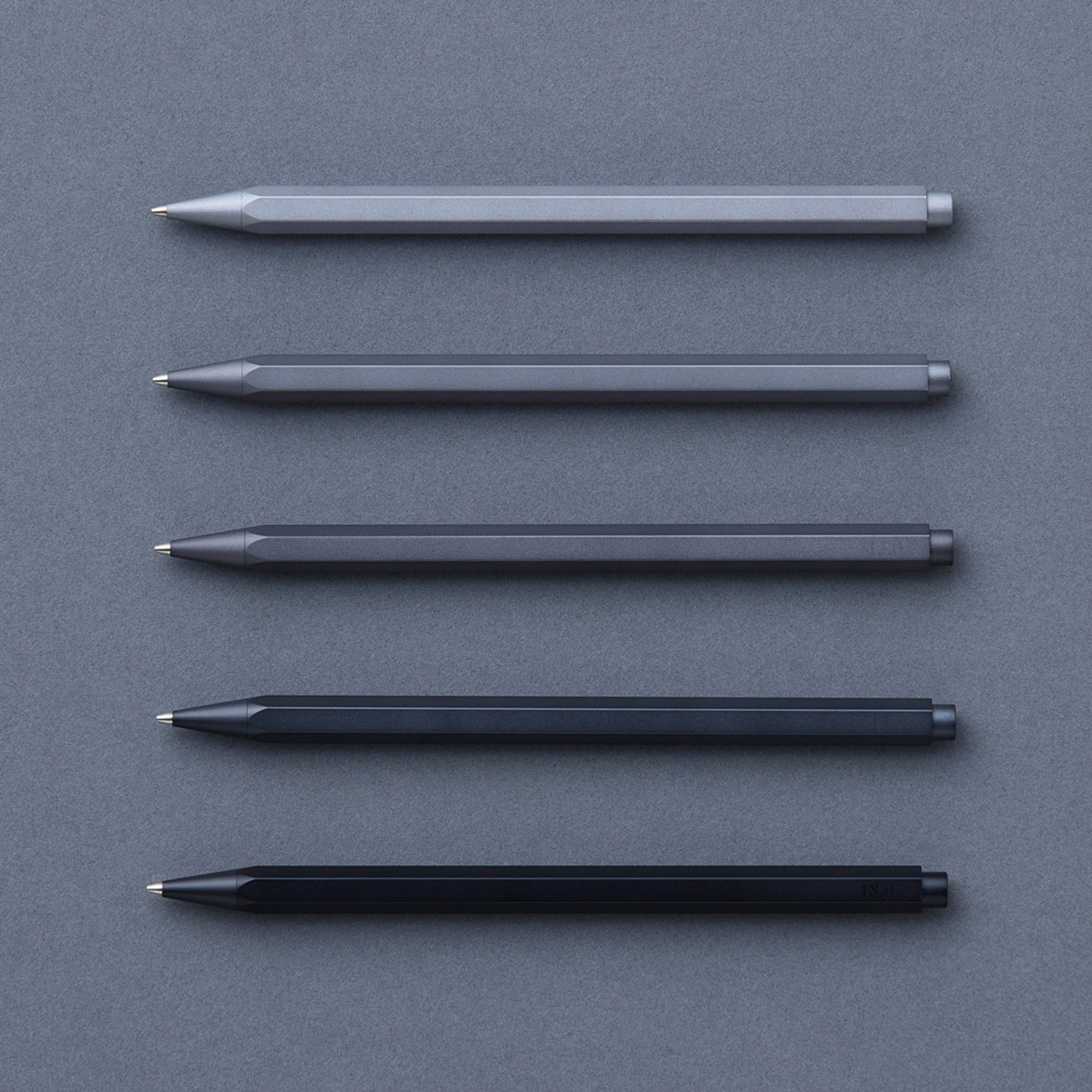
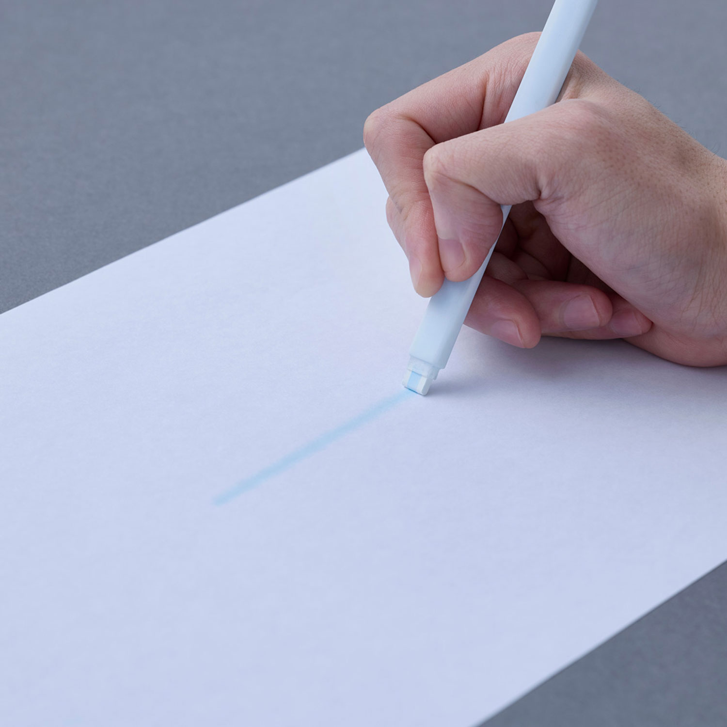
gram
creator
Takashi Higashide
Description
When I picked up a model of my long-used pen that had the same shape but different materials, I felt a slight sense of unfamiliarity. It turned out to be only a few grams in weight. The “gram” pen series delicately adjusts weight alone without changing shapes or materials. The comfort of writing is not uniform, and the difference in comfort or unfamiliarity caused by a few grams is a sensation many people feel unconsciously. By focusing solely on weight, you will experience a silent emergence of sensations that you were not even aware of.
Even among all the finalists, the prototype for this entry stood out as overwhelmingly complete. In addition to being finished to a high level, this wonderful entry gave form to uneasy feelings and unconscious sensations that everyone might actually be experiencing.
Shogo Kishino
Metal is a material I work with regularly, and I’ve learned from experience how much our impression of objects can vary even with just slight differences in weight, so this entry caught my attention right from the first round of judging. From the logo and concept to the story, I consistently felt that the communication was the work of a professional. It was a simple and powerful idea, and if there’d been one further step of deep exploration to make you focus on the subtle differences in weight, it might’ve won the Grand Prix.
Nao Tamura
Adopting a perspective that set it apart from all the other pen proposals I’d seen to date, this entry took sensations that many people have likely been experiencing unconsciously, and translated them into design. I thought it was outstanding for that.
Kunihiko Morinaga
This entry garnered praise from the judges for how highly complete its prototype was. Its concept was also clear, it expressed a personal “wouldn’t it be nice to have?” perspective, and it was easy to picture various people relating to it and using it, so it fit this year’s theme nicely, too. On the other hand, from the point of view of future product development and expansion, it would probably have been better to clarify the weight differences that would suit the target audience. I also hope the creator continues to pursue the balance between the center of gravity and the writing feel.
Teruhiro Yanagihara
Just like how we engage with food will depend on whether we use heavy, substantial cutlery or a plastic spoon from a convenience store, I think the weight of a writing implement also has a significant impact on the act of writing. As a product, a pen is composed of various elements such as its shape, the materials it’s made from, and how easy it is to hold, but focusing on the subjective element of the weight when it’s held is an important insight that appeals to the user’s feelings.
Satoshi Yoshiizumi
As products, pens are categorized by things like line thickness and darkness and ink properties, and they come in many varieties. However, this entry showed the drive to create a new category based on weight. On seeing the prototype in the final judging, I was also impressed by how beautifully finished it was. The presentation clearly introduced the creator and the background to the idea, and it’s an entry that’s invested with a desire to spread a new writing experience to people all around the world.
Hidekuni Kuroda
title
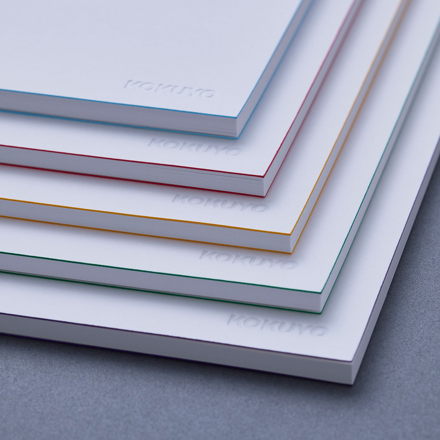
Notebooks Identified by Edges
creator
Yuji Tsukamoto
Description
This pure white notebook series features colored edges on the cover, meeting the need to “distinguish yet coordinate.” The subtle and understated color scheme of the edges makes each notebook easily distinguishable, while its simple look brings a beautiful sense of unity to desks and bookshelves. Also, since only the edges are colored and not the entire cover, less ink is used which contributes to reducing environmental impact. This stripped-down notebook quietly organizes your field of vision and encourages you to focus on your studies and creations.
As products, notebooks consist of two elements: “paper” and “the act of writing.” Also, in terms of functional evolution, they’ve already been explored to their limits. This entry was more a design competition proposal with an easy-to-understand concept than it was a product, and that conceptual aspect was also appreciated by the judges. Since pristinely white notebooks will of course get dirty, making the entry fit for practical use will probably require careful consideration to refine it as a product.
Shogo Kishino
This entry was a simple proposal of having colored edges on white notebooks, but getting to see the genuine personality of a creator who notices little things made me feel happy somehow. Commercialization will pose some challenges, but I commend the entry for having the courage to unwaveringly pursue details. I thought I’d like to have some of these in my own studio, too, so I think the idea has the potential to spread in ways we’ve never seen before.
Nao Tamura
While many designs consist of adding ideas to something that already exists, this one focuses on a key point by stripping things down to the bare minimum—namely, simply adding a minimal amount of color to a notebook. The design concept itself is very small, but I felt it has the potential to connect with this year’s theme as well, in the sense of potentially altering the landscape of a large space. While the paper texture and the attention to detail are beautiful aspects, the dirt and wear that daily use will entail are likely to be future challenges.
Kunihiko Morinaga
I appreciated the idea of viewing stationery as an element that surrounds our living spaces and focusing on how it can harmonize with them. I really liked the idea of having notebooks with blank space for people to use their imagination and get creative in. On the other hand, when it comes to picturing people using these notebooks, the white spaces inevitably get dirty. The paper’s matte texture is also an appealing point, but it might’ve been better to eliminate as many potentially negative elements as possible.
Teruhiro Yanagihara
While books are often regarded as part of an interior design, I suspect viewing notebooks as elements of a space might be a perspective no one had noticed before. The design was imbued with that new idea—with an objectivity that could make you think, “Oh, yes, that’s right.” Consequently, the entry really resonated with the judges.
Satoshi Yoshiizumi
The presentation in the final judging was impressive. Proposing that stationery should also blend seamlessly into interior design just like furniture and home appliances do is a fresh perspective that really captures the spirit of the times. On top of that, it proved that you can strip things down as much as this even with products where the details are crucial, as they are with notebooks.
Hidekuni Kuroda
title
Gradience Diary
creator
Mizuki Igarashi Rara Takizawa
Description
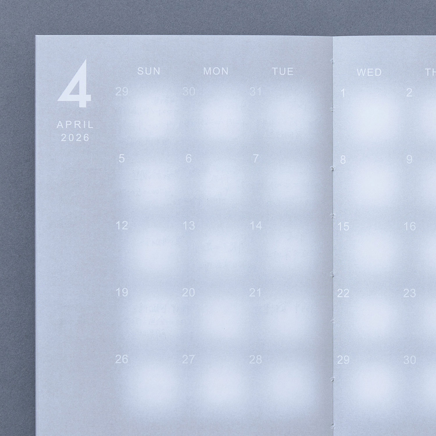
While the amount of scheduled tasks varies from day to day and some tasks might span multiple days, conventional planners consist of uniformly sized squares and days are clearly separated by lines. We questioned the way such planners are designed, so we created the “Gradience Diary.” This planner has no lines, and each day is separated only by a gradient of white and gray. The writer can decide the size of each square based on the amount of tasks, and can write down schedules spanning multiple days while retaining a sense of continuity.
As a graphic designer, when I want to imbue paper with functionality, I naturally use ruled lines. However, the creators felt reservations about those kinds of lines, and provided gradation-like, vague boundaries instead. In reality, time flows continuously, and also with varying density. This entry has a fresh perspective—one that says, “People experience all kinds of things every day, right?” That said, it doesn’t stray very far from the usual calendar format, so maybe a slightly different visual design would’ve been possible, too.
Shogo Kishino
Personally, I sometimes find myself being chased by daily deadlines, too, but often draw lots of grids and lines in my planner to clearly separate the days and months. In contrast to that, the creators’ proposal consists of vibrant, progressive “transitions.” The approach seemed to evoke a sense of breathing and sighing. That was something I’d never seen in a calendar before, and I found it very interesting.
Nao Tamura
A ripple is a phenomenon that spreads from the inside out, creating a gentle boundary as it goes, until at last, the distinction between the inside and outside disappears. This entry has taken that kind of impression and turned it into a product. Questioning the commonplace notion of ruled lines, the proposal looked at the concept of time, and how it’s somehow gotten divided up based on decisions by nobody knows who. Then, it erased the boundaries through an incredibly simple method that evokes the way humans originally perceived time—namely, light and shadow.
Kunihiko Morinaga
I think this entry was recognized as having potential because it involved ideas and solutions that were developed in line with this year’s theme. On the other hand, turning it into something that can truly be used in everyday life will require not just theoretical simulations, but also a process of refinement that includes getting hands-on experience of actually using it.
Teruhiro Yanagihara
This year, I got the impression that there were lots of notebook proposals, and in particular, ideas about how to draw ruled lines in ways that are different from how it’s usually done. That’s a good insight, but deciding what kind of form to pursue as an alternative is surprisingly difficult. This entry focused on the space between the boundaries of a day and the things done during it, and the concept and the planner’s form were directly linked. Maybe this made it easy to understand.
Satoshi Yoshiizumi
A youthful proposal from some students, this entry conveyed the very human message that even once we’re adults, we still don’t want to be bound by ruled lines. That really struck a chord with me. I think it’s well designed, but it’d be even better if they went further by also delving into who it might be used by, and what kinds of situations. I think it’s a work that still has a lot of potential for growth.
Hidekuni Kuroda
Finalist
title
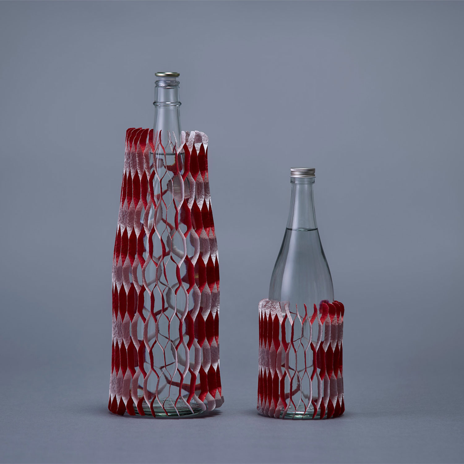
red and white packing paper
creator
Tasuku Denno
Description
Red and white packing paper is a packaging material used to protect celebratory gifts.
The red and white paper strips are connected successively to form the whole.
When you unfold the paper, a honeycomb-like structure is formed.
You can use it not only as packing material but also as decoration for celebrations and as interior decor.
I would be happy if the feeling of caring about someone spreads to the world.
title
Edge Index
creator
Renki Torigoe
Description
Looking at my used-up loose-leaf paper from high school, I felt there must be a way to organize it more beautifully in my own style and make my daily studies more enjoyable. The Edge Index was born from that memory. Dyeing the edges of loose-leaf paper makes the color emerge each time it is used or stacked, making the page itself function as an index. Reconsidering the edge coloring not as decoration but as a structure for classifying information, transforms the accumulation of records into organization. A proposal for loose-leaf paper that makes you visually enjoy the traces of learning.
title
AWAI
creator
Ryoichi Nakamura
Description
“AWAI” is a pen that leaves faintly smudged lines after writing.
Usually, lines drawn strongly and distinctly send a powerful message to our future selves or others who see them.
The faintly smudged lines are new ways of being lines.
What the new lines pose to the future is not a strong message like “This is important, or this is wrong,” but rather a suggestion and question that leaves room to think, “Maybe you should take another look and reconsider.”
title
OVERLAP
creator
Yohei Oki
Description
Lines with different orientations, overlapping lines, and white space. Different types of content bring changes to how you use your notebook.
Writing something completely different in each area, combining what’s written, breaking things down starting from the overlapping parts, or just writing whatever you want along the lines. Such ways of using it stimulate your thinking and produce unexpected outputs.
By changing the way you draw the common element of ruled lines, you will get to expand the possibilities of your notebook.
title
KASUMIORI
creator
Yoshihiro Matsumura
Description
The white mist slowly and silently blurs the view, then gradually reveals a new landscape before your eyes.
When reading a book, we imagine various scenes and stories, and draw them in our minds.
They are sometimes vivid, then gradually fade while repeating their fluctuations, and are etched in your heart.
KASUMIORI bookmark links to the emotional movements, gently connects sentences, and silently connects books, people, and the scenes that come to mind.
title
a glimmer of inspiration
creator
Nao Momoishi
Description
I work as a copywriter, and sometimes when I keep thinking, ideas pop up like a reward.
It’s like the moment when light suddenly filters through the cloudy sky.
This product is for people who write down their thoughts in a notebook. It shines a soft spotlight on even the most casual strings of letters, serving as a guide for their thoughts.
Genral comments by the judges
* Judge occupations and titles current as of the time the individual served as judge.
Shogo Kishino
Representative of 6D-K / Art Director and Graphic Designer
In taking on the role of creating the key visual, I interpreted this year’s theme, “HAMON” (Japanese for “ripple”), as meaning each individual taking something they have within themselves and throwing it out into the world. Many of the entries were simply a case of the creators taking thoughts and sentiments they’d personally had or nurtured, and turning them into a product. All of the winning entries were filled with wonderful sentiments and were of high quality, too, so judging them was a very educational experience for me.
Nao Tamura
Designer
Some ripples disappear straight away, while others spread out quietly. I was delighted to get to encounter so many proposals that were rooted in the creators’ own personal experiences, that would resonate with lots of people once they realized what they were about, and whose circle would expand naturally.
I was reminded that design work isn’t about aiming to create a big ripple right from the start, but about carefully picking up on countless small ideas and things that seem off day in and day out, and pursuing them thoroughly.
Kunihiko Morinaga
ANREALAGE / Designer
We were asking for proposals whereby small insights would change people’s everyday lives in the future, like throwing a stone into the “water’s surface” of conventional wisdom and assumptions we’ve had up to now. Entries whose creators had derived highly personal and unique concepts from manufacturing in order to meet that challenge really stood out. This was my first time taking part in the judging, but I got to see proposals that overturned conventional product wisdom, and ideas that were like raw gemstones that could only have been mined from this theme. That made me feel like I was looking a little way into the future.
Teruhiro Yanagihara
Teruhiro Yanagihara Studio / Designer
In developing their entries, many of the finalists had focused more on how their ideas would spread rather than how easy they would be to understand, basing their approach on their own personal experiences. On the other hand, overall, the abstract interpretation of the theme of “HAMON” differed from person to person and country to country, and this may have made it difficult to connect it to the notion of “ideas spreading out around the world” that the judges had in mind. I hope this award continues to be one where people take part through global themes.
Satoshi Yoshiizumi
Principal of TAKT PROJECT Inc. / Designer
Phrases like “sense of being personally involved” came up many times in the meeting to decide on the theme, but they weren’t misconceptions, but sentiments based on deep insights that can only come from direct experience. That direct experience of really being personally involved can transcend subjectivity, lead to objectivity, and become ripples. The finalists recounted various formative experiences they’d had, expressed discomfort with the current standards, and proposed alternatives to them. All of the entries were compelling, but I suspect that differences in their approaches in terms of the objectivity of their ideas and the rationality of their designs may lie behind the differences in the awards.
Hidekuni Kuroda
Representative Corporate Officer and President, KOKUYO Co., Ltd.
To mark the milestone of our 120th anniversary, as we discussed and decided on the theme with the judges, we consciously reminded ourselves of our goal of making it “a design award that benefits society.” In reviewing the over 1,300 entries, I was struck by the different lineup of creators and proposals compared to previous years. This year’s event served as a real reminder of how this award is contributing to spreading the power of design and enhancing its potential. In this uncertain and rapidly changing world, I want to go on promoting design together with all of you.
Trophy
Shogo Kishino, one of the judges, worked on the key visuals and art direction of the trophy and award certificate. KOKUYO’s representative designers Mei Sato and Shinpei Yoshida, also had a part.
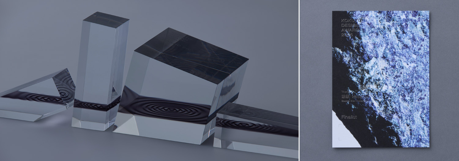 Left: Trophies Right: Certificates
Final Judging / Winning Design Announcement / Talk Show
Final Judging
Ten finalists met this year’s theme “HAMON —Design that Resonates” head on, and gave impassioned presentations.
The judges listened to them earnestly, and judged the entries with five points in mind: The idea’s clarity, The idea highlights social issues, The design’s potential to become a product.
Winning Design Announcement
On March 14, the final judging for KOKUYO DESIGN AWARD 2026 was held. One Grand Prix winner and three Merit Award winners have been selected. Out of the 1,344 works (785 from Japan and 559 from overseas), Hiroki Kannari’s “Before Note” was selected as the Grand Prix.
NEW GENERATION AWARD
The NEW GENERATION AWARD was established to encourage the young generation who will lead the next age to challenge themselves. Works submitted by students to the KOKUYO DESIGN AWARD 2026 are judged based not on whether they can be commercialized, but on whether they have appealing ideas and viewpoints.