


KOKUYO DESIGN AWARD 2026 Report
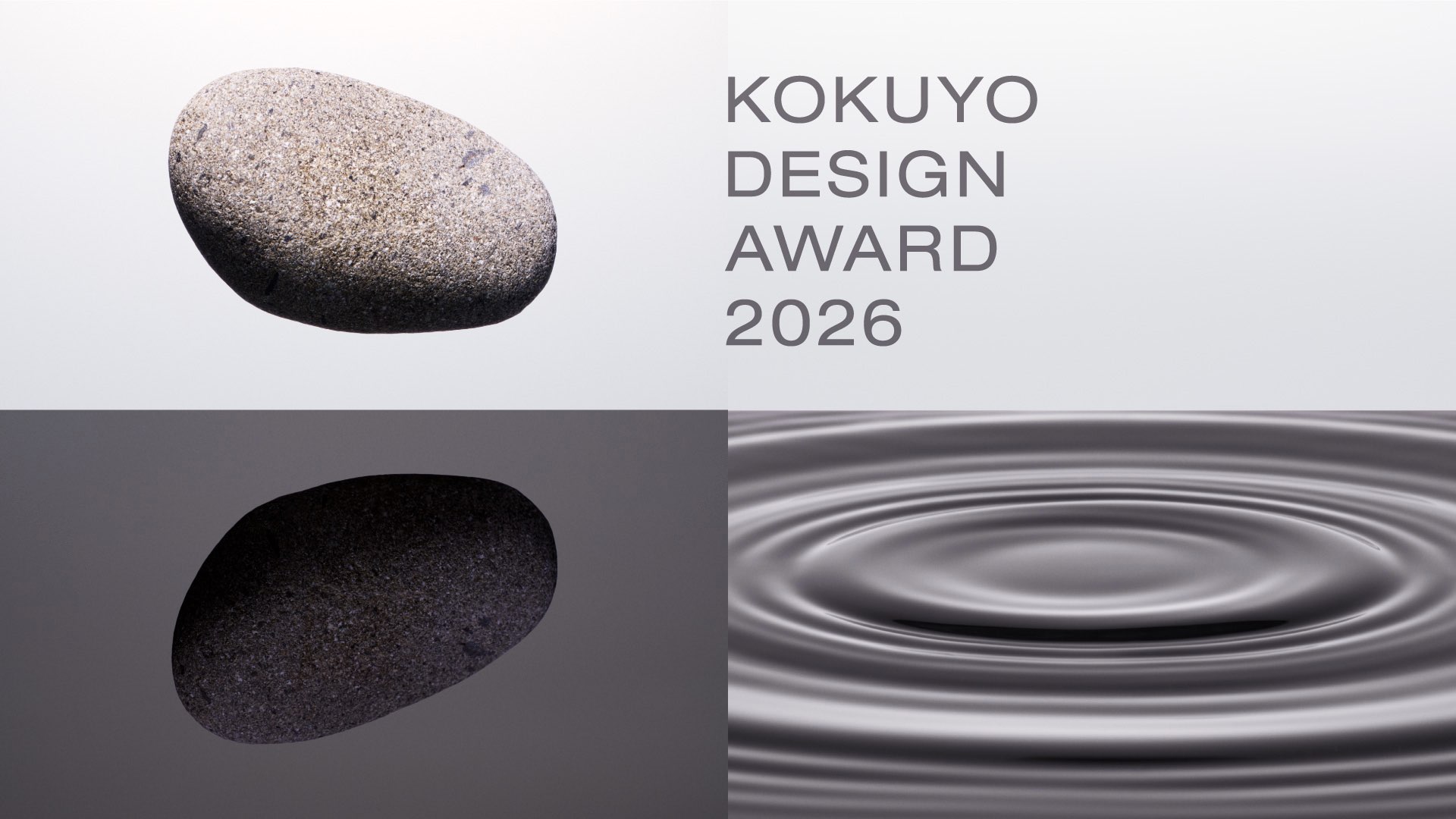
KOKUYO DESIGN AWARD 2026
Final Judging Report
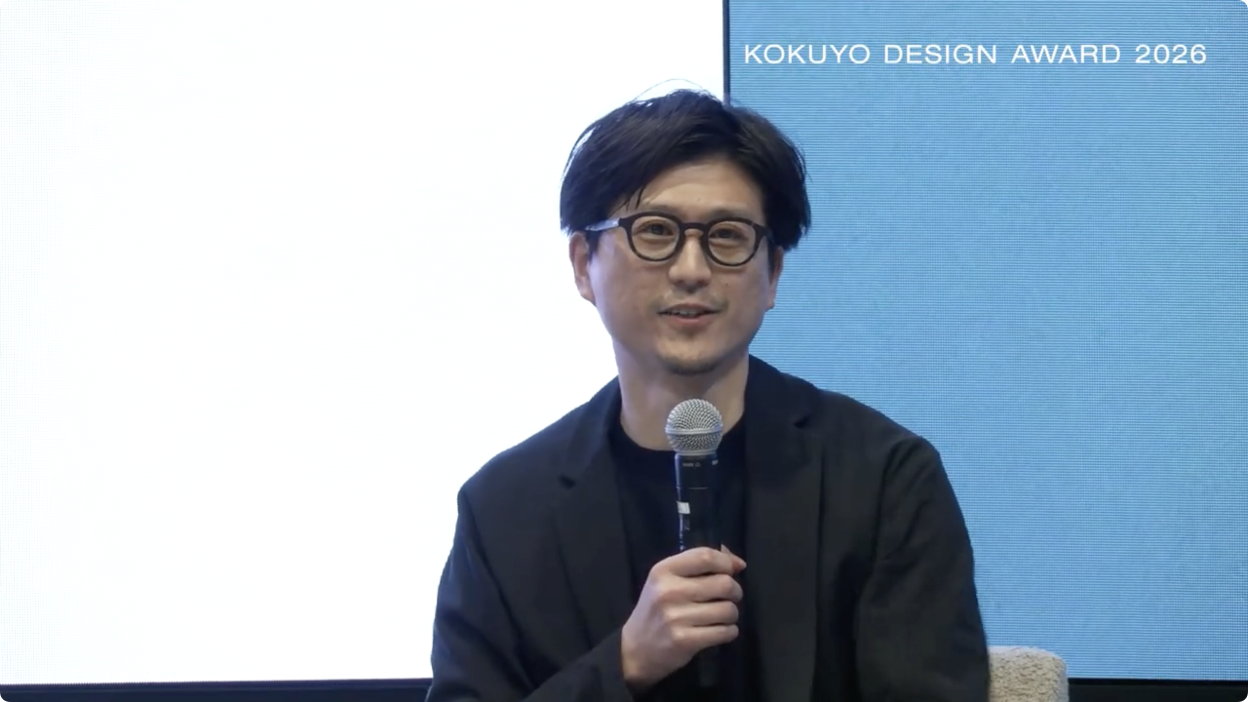
On March 14, the final judging for KOKUYO DESIGN AWARD 2026 was held. One Grand Prix winner and three Merit Award winners were selected. Out of 1,344 entries (785 from Japan and 559 from overseas), “Before Note” by Hiroki Kannari won the Grand Prix.
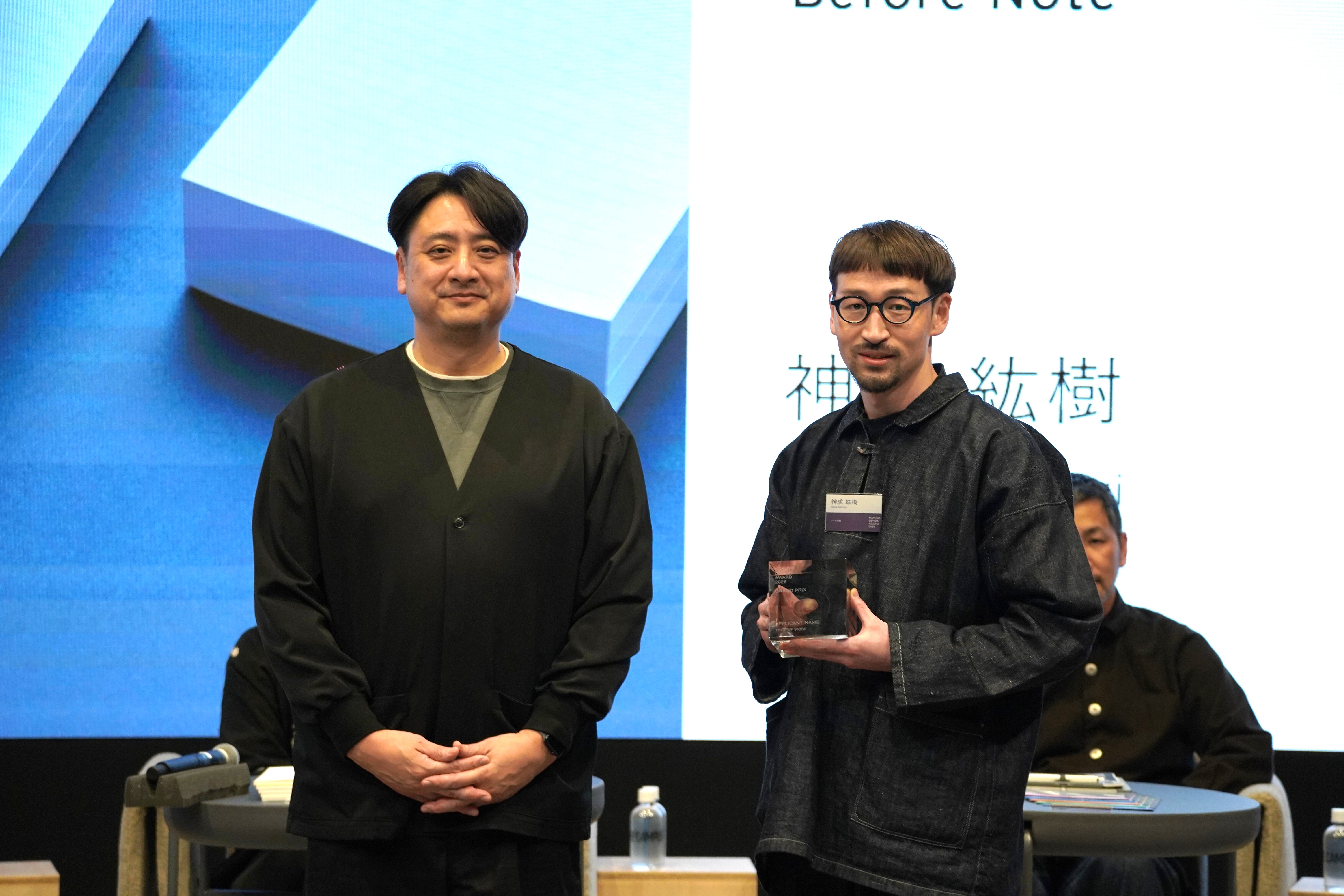
Grand Prix winner Hiroki Kannari (right) and Hidekuni Kuroda (Representative Corporate Officer and President of KOKUYO), who presented the awards
KOKUYO DESIGN AWARD 2026 was the 23rd time the competition had been held, and the theme was “HAMON —Design that Resonates.” Adopting a Japanese-language theme for the first time in roughly 10 years (the last time having been 2015), the competition called for designs based on ideas that were born from each entrant’s personal real-life experiences, and whose impact would spread through society like ripples from “a stone” thrown into its waters.
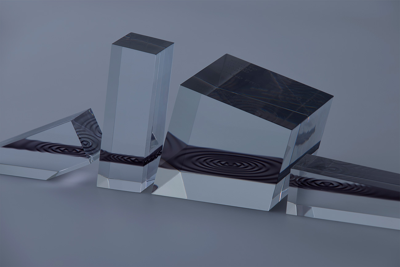
This year’s main visual and trophies, created under the direction of one of the award’s judges, graphic designer Shogo Kishino. The trophies all have different shapes, and each one contains something that can only be seen from the perspective of the person holding it: a “ripple” born from throwing a stone.
Grand Prix: “Before Note”
The final judging was held in the hall “CORE” inside the Tokyo Shinagawa office “THE CAMPUS.” The 10 groups of finalists gave their presentations in the venue, then the judges proceeded to assess the entries, asking questions and handling the prototypes as they went along. After that, the judges deliberated together in a separate room, then voted to decide the winners. As a result, the entry “Before Note” (Hiroki Kannari) won the Grand Prix by a unanimous vote.
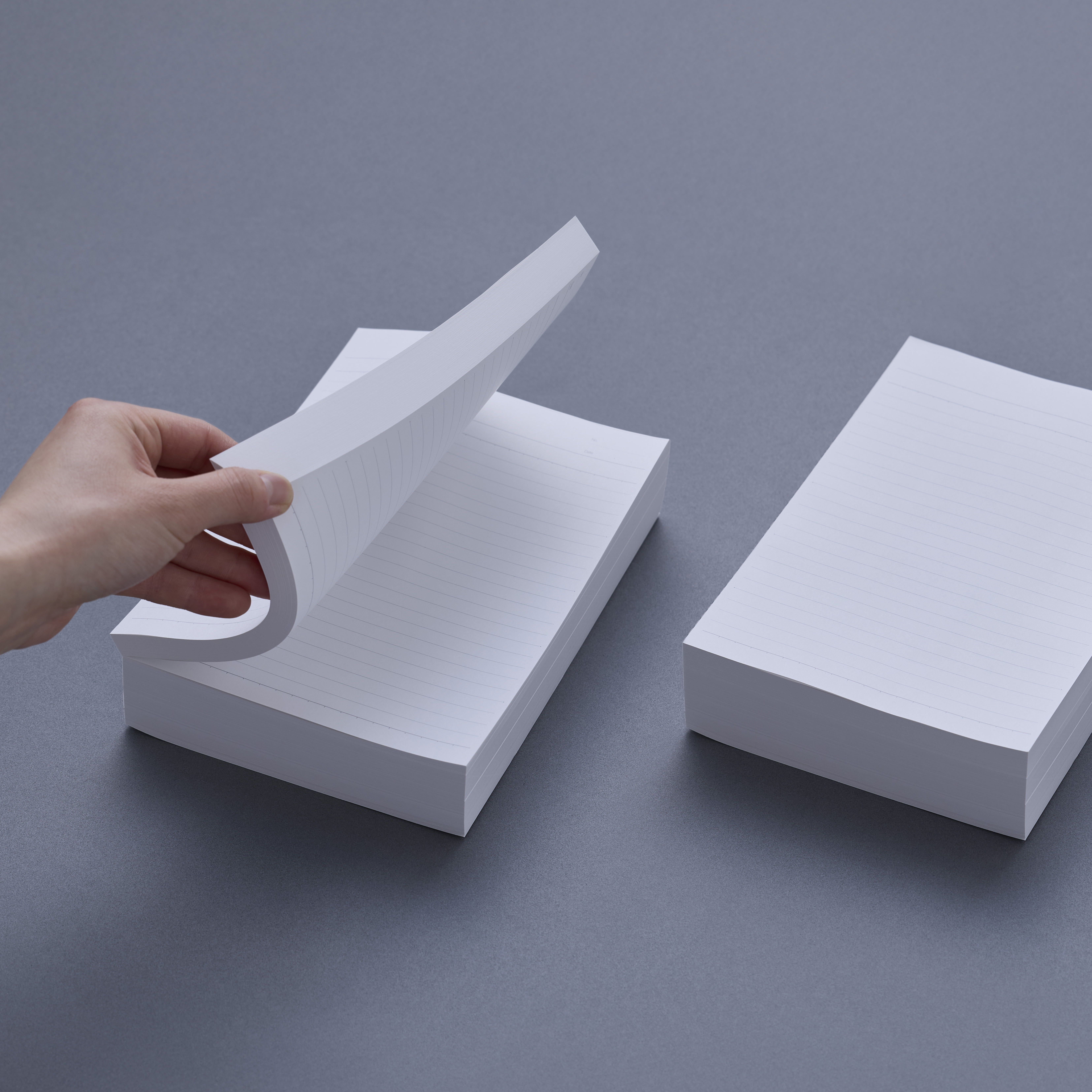
Grand Prix: “Before Note”
“Before Note” is a proposal to distribute bundles of paper glued together at the spine as “semi-finished” notebooks. In response to concerns like “I can never seem to use up a whole book” and “I don’t really like the combination of the cover and the inner pages,” it offers users the freedom of being able to bind up and carry around the amount that’s just right for them. The prototype featured perforations at the glued spine to make it easier to split up, and product reliability was backed up by means of packaging and color variations that followed the design of Campus notebooks.
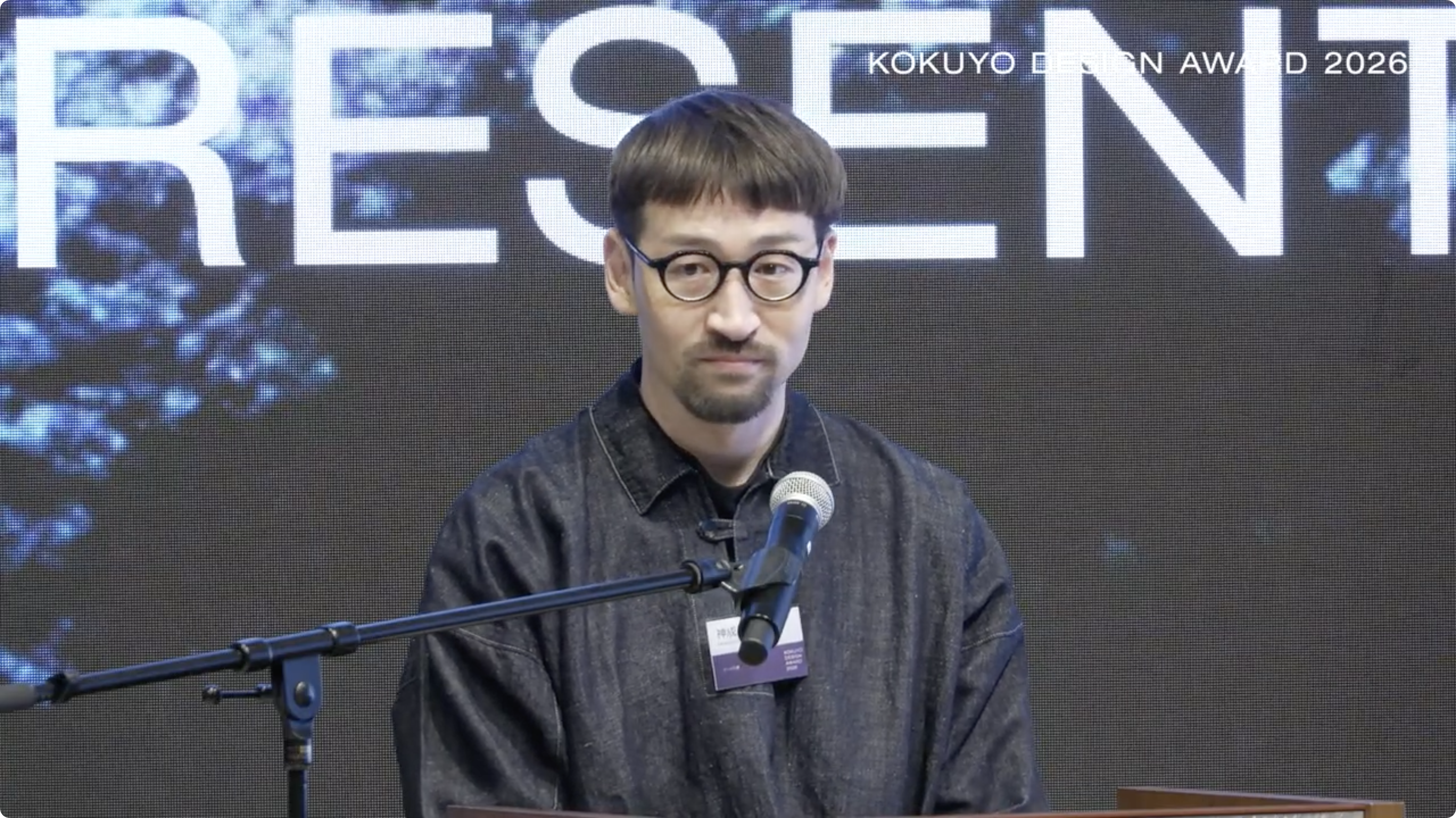
Creator Hiroki Kannari
In the judging, the concept of releasing a semi-finished product with blank space and leaving the rest up to the users was deemed to have a sense of scale that was worthy of the Grand Prix, and also to be strongly linked to the theme of “HAMON.” Other points that were praised included how it had also focused on the need to “store” notebooks after using them. Taking part in the judging for the first time, fashion designer Kunihiko Morinaga also commented, “The substantial feel of the thick paper brought to mind the ages when people wrote on stone, prompting me to re-examine the act of writing.” After receiving the award, Mr. Kannari expressed his delight by saying, “I still haven’t gotten my head around it all, but I’m truly happy. Campus is a brand that places emphasis on the durability of its notebooks and I was worried about that, but I’m really glad that the judges liked my approach.”
The Three Merit Awards
The Merit Awards went to the following three entries.
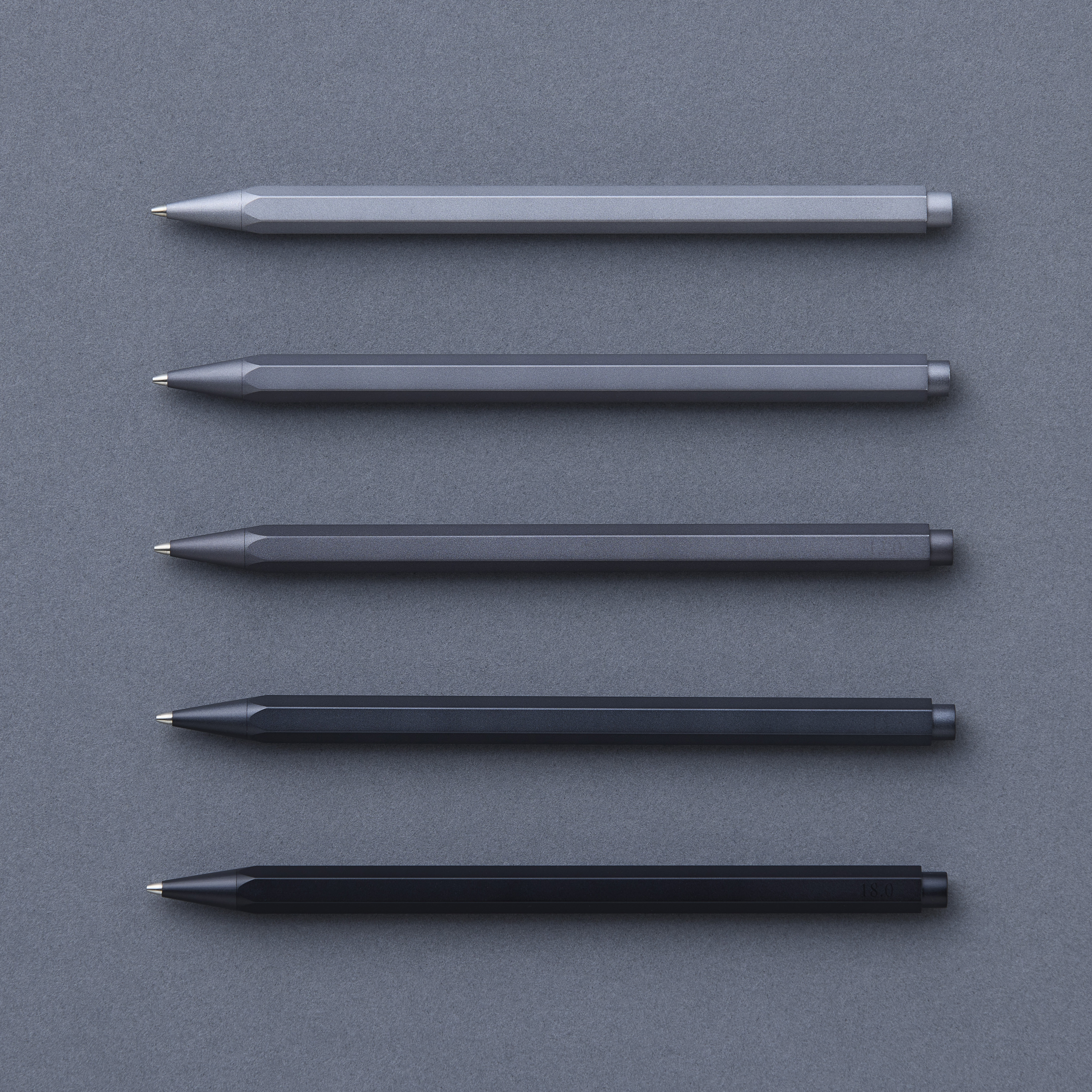
Merit Award: “gram”
The entry “gram” (Takashi Higashide) was so highly regarded in the final judging that it vied with “Before Note” for the Grand Prix. Based on personal experience of “feeling uncomfortable with the weight of a pen,” the creator devised a series of metal (aluminum) mechanical pencils with which a difference of a few grams changes the writing experience. After conducting experiments of his own devising based on the “Weber-Fechner law” (which states that changes in human sensations are proportional to the intensity of the stimulus received), he set the weights using intervals of 20% above and below the median of 13 grams.
Creator Takashi Higashide
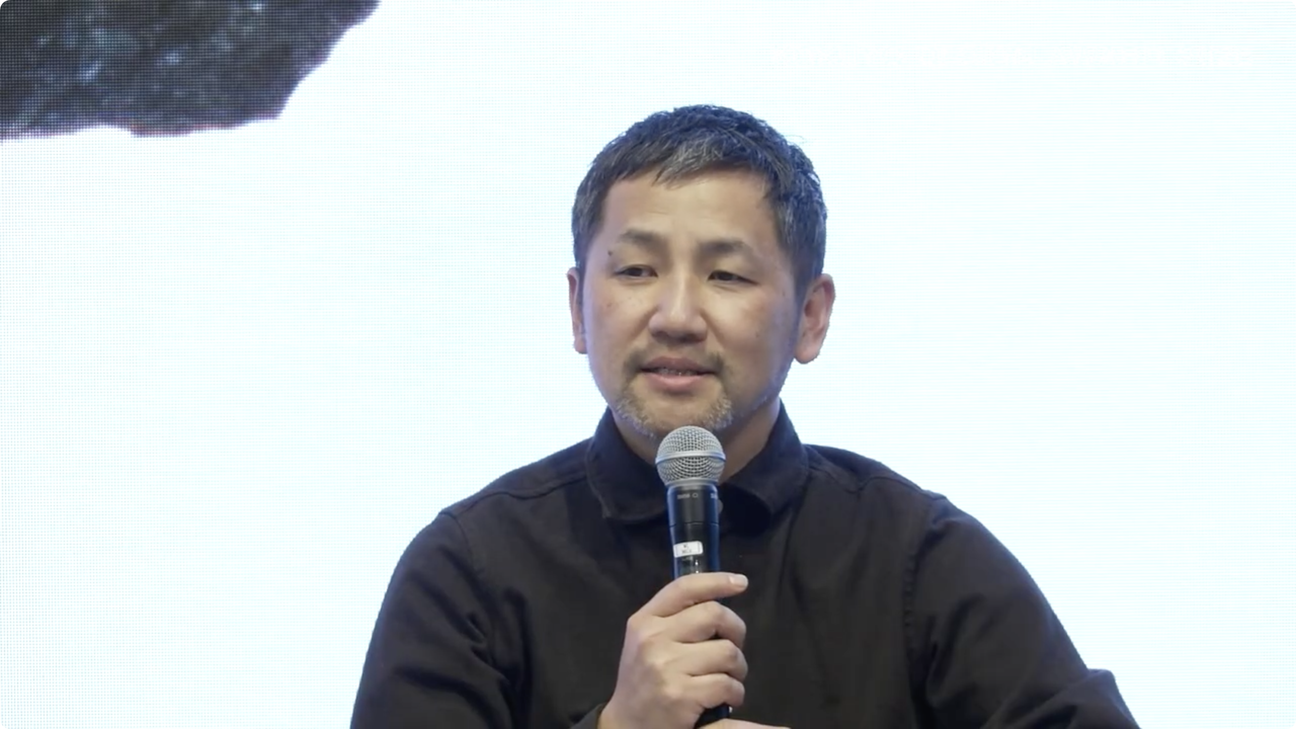
The judges were impressed by the high quality of the prototype, and also appreciated the concept of engaging with human sensations’ ability to perceive differences of just a few grams. On the other hand, the very novelty of focusing on weight prompted expectations to do more with the idea, as expressed by comments such as (from Satoshi Yoshiizumi), “I’d like you to further explore how the experiential element of weight affects the users’ feelings and the act of writing, and to delve deeper into the psychological aspects of that.”
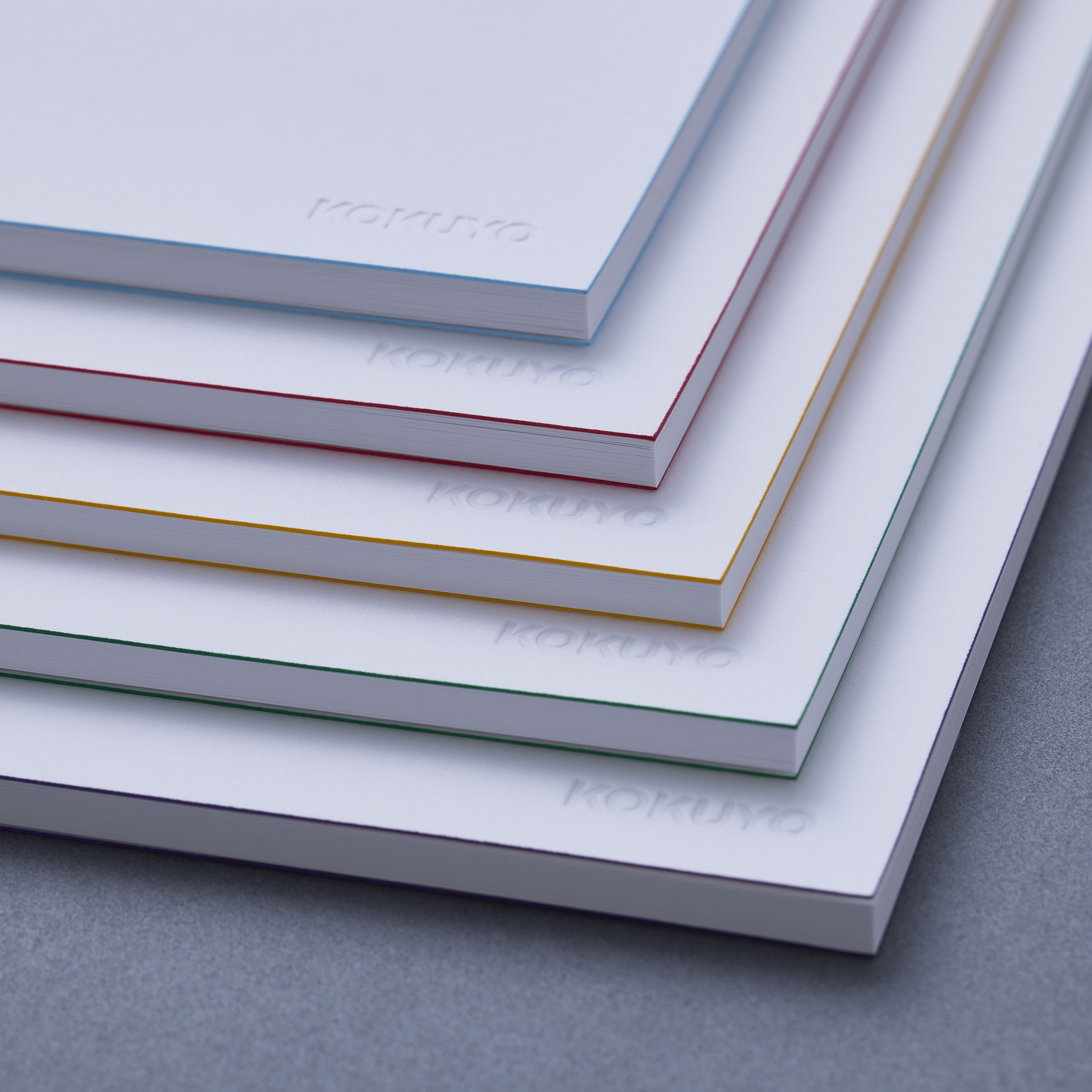
Merit Award: “Notebooks Identified by Edges”
“Notebooks Identified by Edges” (Yuji Tsukamoto) is a series of notebooks with dyed edges on their covers. They just look like simple white notebooks at first glance, but can be told apart by means of a minimal amount of color. They also adopt embossing for their logos, reducing the colored area by a total of 99.3%. This makes them a new option for combating environmental impact as well.
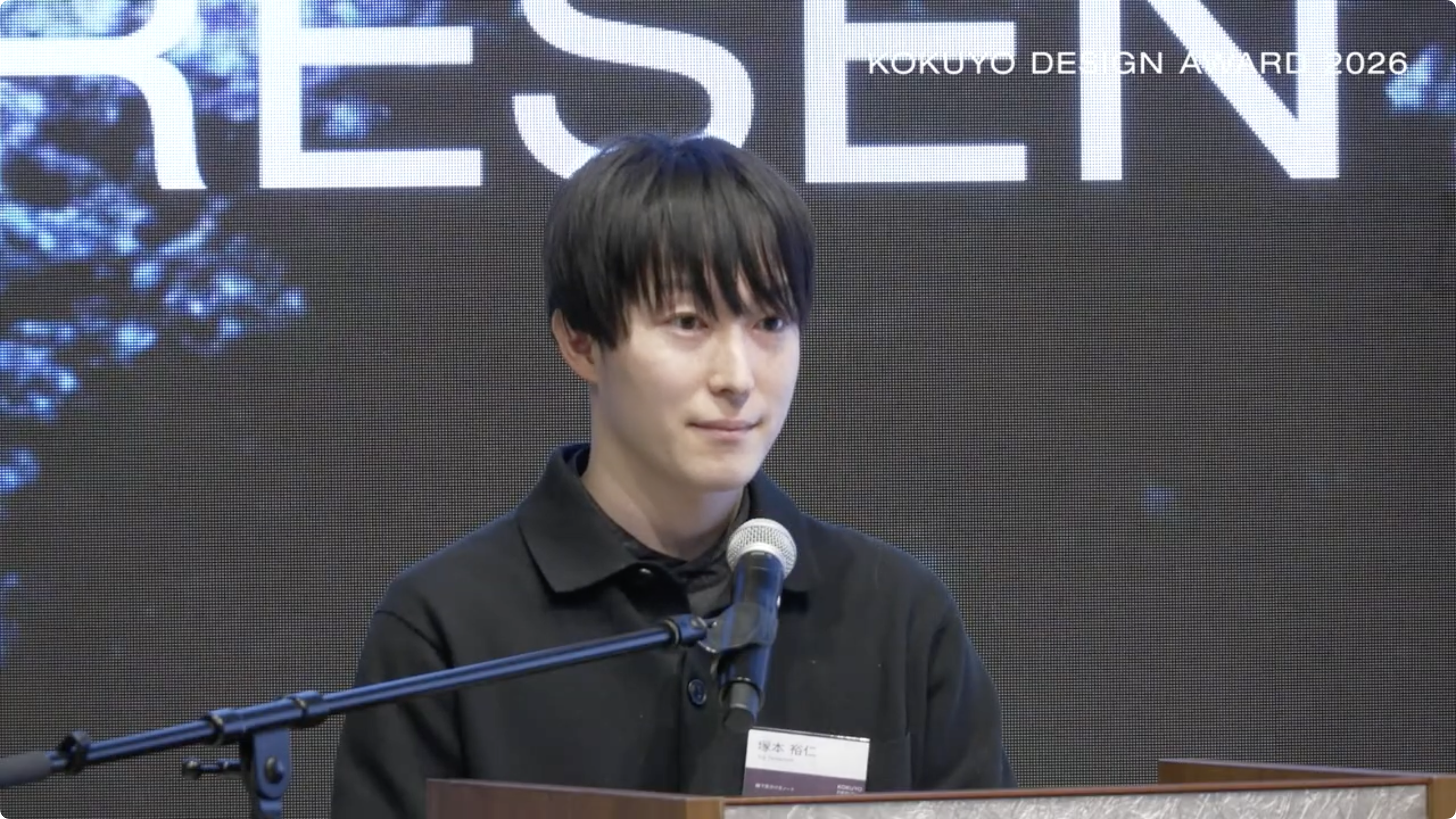
Creator Yuji Tsukamoto
In the judging, the entry was praised for focusing on the relationship between spaces and products as is the case with home appliances, and for its connection to the theme of “HAMON.” While the matte finish of the covers has a delicate beauty, this also drew some criticism, such as (from Nao Tamura), “Things like susceptibility to dirt and durability will be negative factors in everyday use, so I’d like to see further refinements made in terms of material selection and surface finish.”
Merit Award: “Gradience Diary”
And there was also “Gradience Diary” (Mizuki Igarashi and Rara Takizawa). Feeling uneasy about the ruled lines (squares) that uniformly divide up the pages of a planner, the creators of this entry have blurred the boundaries between dates and times, letting the users freely decide how “spread-out” their plans will be. The student unit’s very human, pure concept was about venturing not to set a specific target audience based on age or gender, and about wanting to respect how each individual spends their time rather than pushing a message of “a packed schedule equals a fulfilling one.” This approach really appealed to the judges.
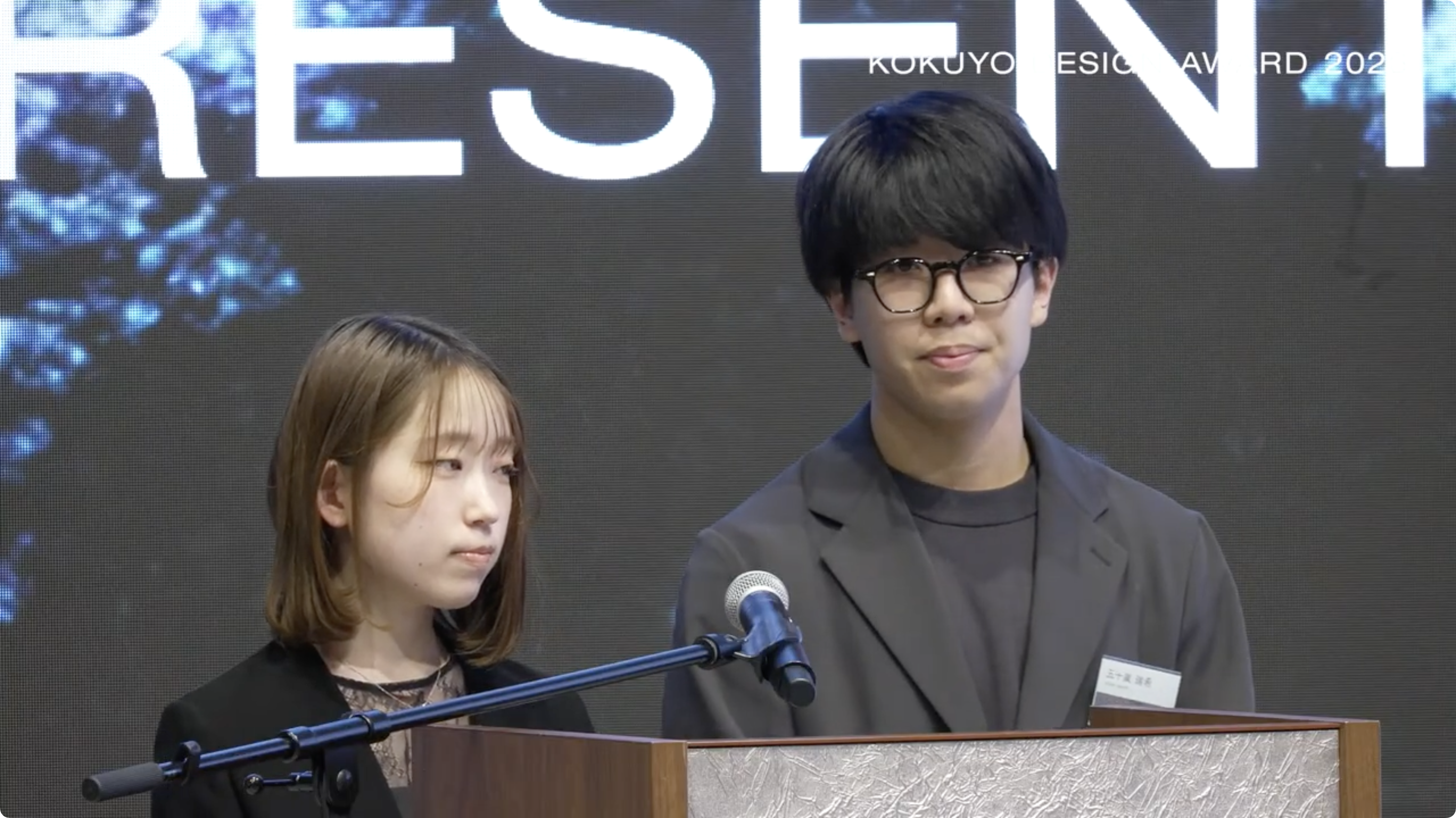
Creators Mizuki Igarashi (right) and Rara Takizawa (left)
Trends Among the Finalists
In addition, although it unfortunately didn’t win an award, “red and white packing paper” by Tasuku Denno (who won the Grand Prix two years ago) garnered attention for its clever concept of combining wrapping paper and cushioning materials with traditional gift-giving customs. Also, “Edge Index” (Renki Torigoe), which consisted of loose-leaf paper with dyed edges, was well received for its high quality as a product proposal.
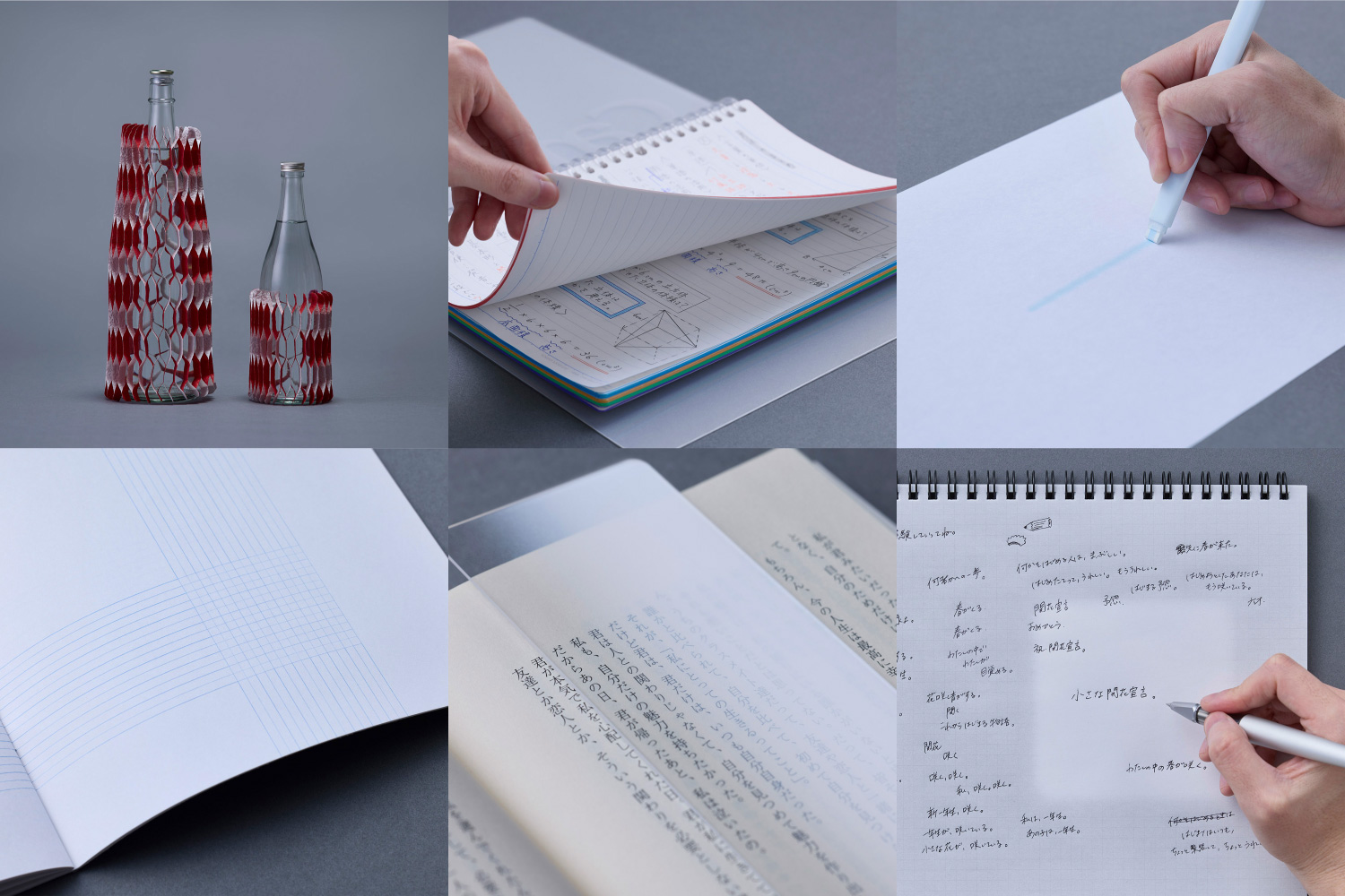
“red and white packing paper” (Tasuku Denno)
“Edge Index” (Renki Torigoe)
Out of the 10 groups of finalists, six entries were for notebooks and planners, and half of those were new proposals about ruled lines. Throughout the process, the key points of evaluation were the realism and objectivity of the stories—specifically, how had the creators leveraged their own personal experiences to re-examine what the act of “writing” is for humans; what kinds of ripples might be generated by the designs they had created as a response to that; and in what ways might those ripples change society?
Meanwhile, it can also be argued that the fact that all the finalists were Japanese was a result of mulling over the delicate emotional and spiritual aspects of the Japanese word “hamon” (“ripple”) more deeply. The judges expressed their expectations about the competition’s next stage of evolution as a global award, focusing on how to take the questioning that stems from this uniquely Japanese aesthetic sense, and spread it beyond language barriers and out to the wider world.
Judges’ Talk Show and Summary of This Year’s Competition
After the results had been announced and the awards ceremony was over, a judges’ talk show was held to look back on this year’s theme and the finalist entries.
“Insights based on your own personal experiences are important for design, and also one of the best things about it. There was lots of anticipation that they would become objective and create ripples, and lots of pleasant surprises, too.” (Satoshi Yoshiizumi)
“More than for having impact or being easy to understand, entries were highly regarded if we could imagine actual situations involving them, and picture them gradually spreading throughout society.” (Teruhiro Yanagihara)
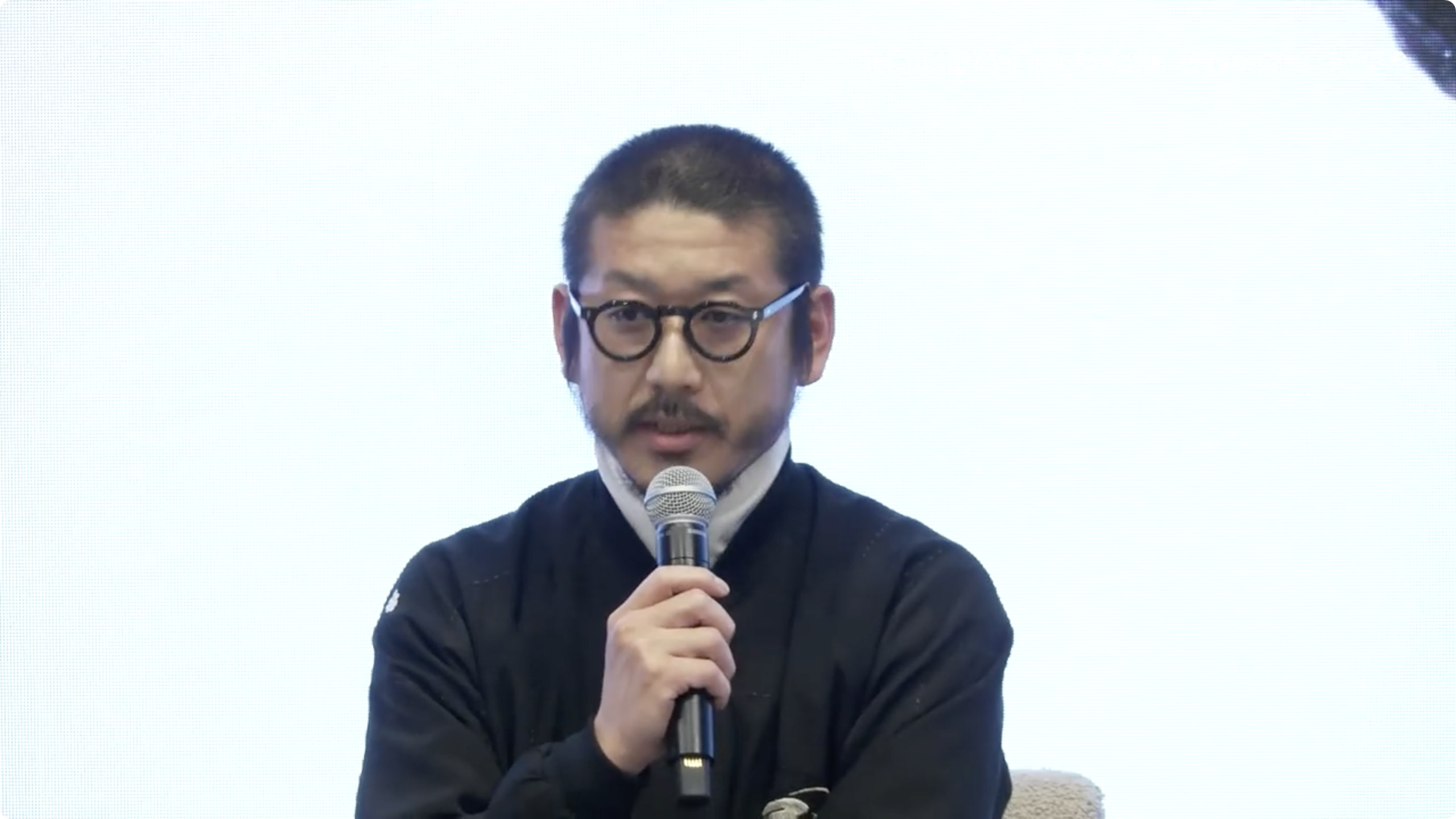
“There were lots of proposals that would overturn people’s ideas about product functionality and conventional wisdom. I think the creators had believed in thoughts and feelings they harbored within themselves, and given them form for us.” (Kunihiko Morinaga)
“Being in charge of the visuals, I thought about the theme deeply myself, too. Throughout the judging, I got to see what kinds of thoughts and feelings you all have as you go about your lives.” (Shogo Kishino)
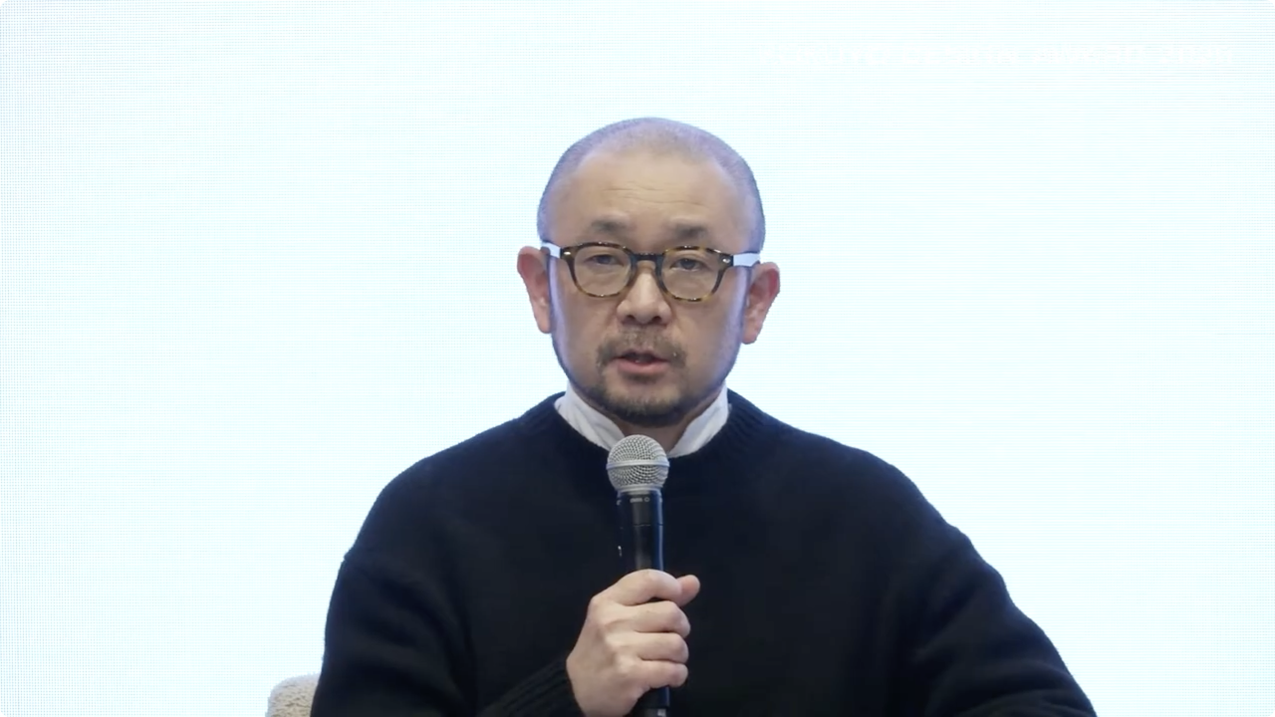
“Design is about producing small concepts and ideas every day. If a design resonates with lots of people and its circle expands naturally, then it’s probably a good one.” (Nao Tamura)
The finalists who attended the talk offered comments on winning an award and asked the judges questions, so the event also featured friendly dialoguing in the relaxed atmosphere that emerged after the judging was over.
Lastly, having overseen the process over the past year as organizer, KOKUYO’s president, Hidekuni Kuroda, wrapped up the KOKUYO DESIGN AWARD 2026 with the following words: “All of the entrants’ ‘stones’ were wholehearted entries, and all of them were wonderful. It was a thrilling award through which we got to imagine them spreading throughout the world. We hope all of you keep on refining your own ideas, and for our part, we want to keep on thinking up themes that will inspire designers from both Japan and abroad to take part, and make sure the KOKUYO DESIGN AWARDs to come are exciting events as well.”
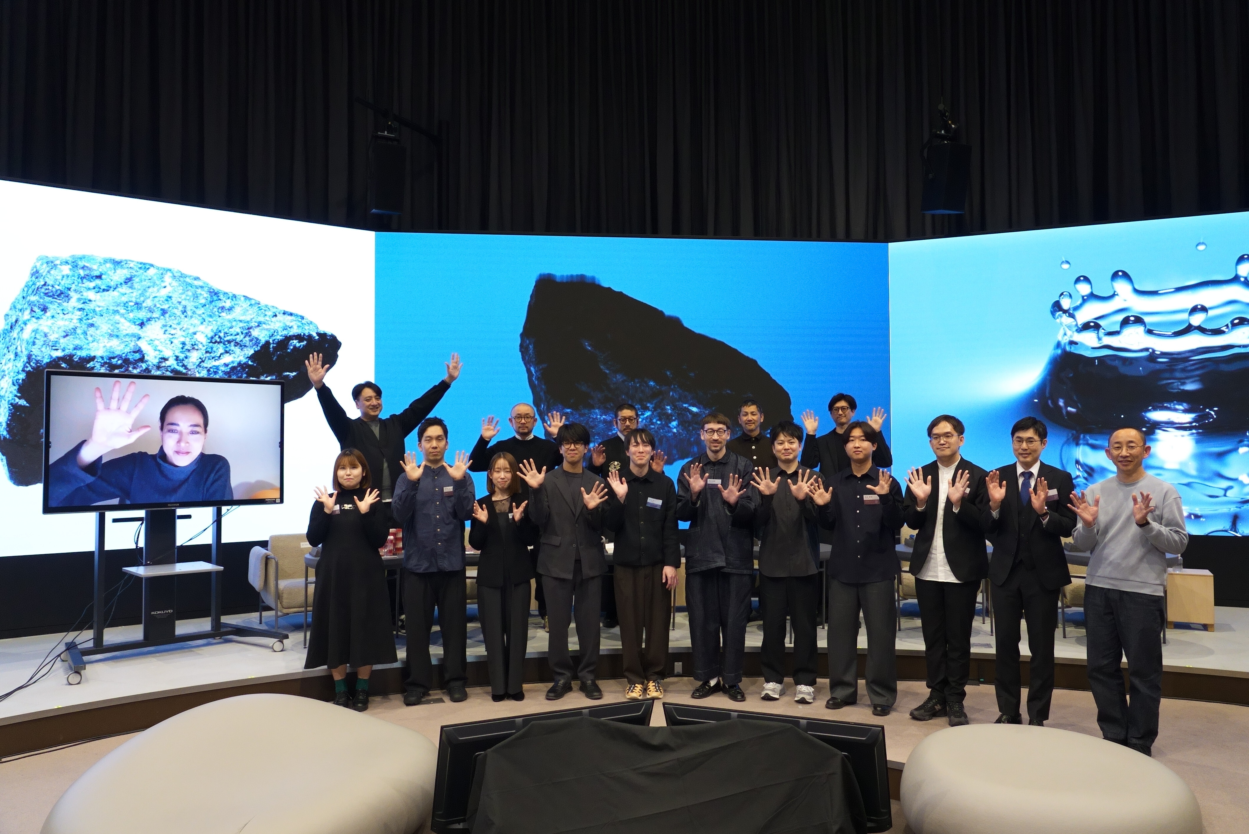
The KOKUYO DESIGN AWARD 2026’s winners and judges


