KOKUYO DESIGN AWARD 2024
2024 Theme: “primitive”
We have received 1,480 works from in and out of Japan (876 from Japan and 604 from overseas).
The 10 designs that passed the first round judging will undergo final judging on March 16, 2024.
One Grand Prix winner and threeMerit Award winners have been selected.
Grand Prix
- title
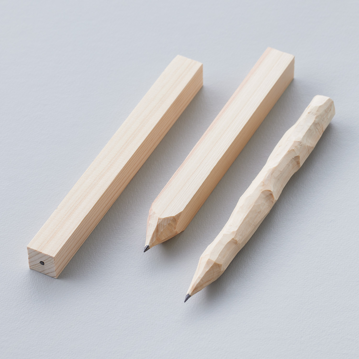
- You Shape
- creator
- Tasuku Denno
Description
“You Shape” is a material product that you can make into whatever shape you want. I had big hands ever since I was a child, and I could not hold pencils well because they were so narrow. Because of that, I held pencils in a way that people said was peculiar. I have never had a pencil that was easy to use. I thought about this product because there are people other than me who are inconvenienced by standardized products.

Comments by the judges
From the first screening, I thought it was an interesting idea and paid attention to it.While the judges emphasized that this work suited the theme, there were discussions among the judges that this work “fit the theme too well”, and I myself wondered what to do.
Merit Award
title
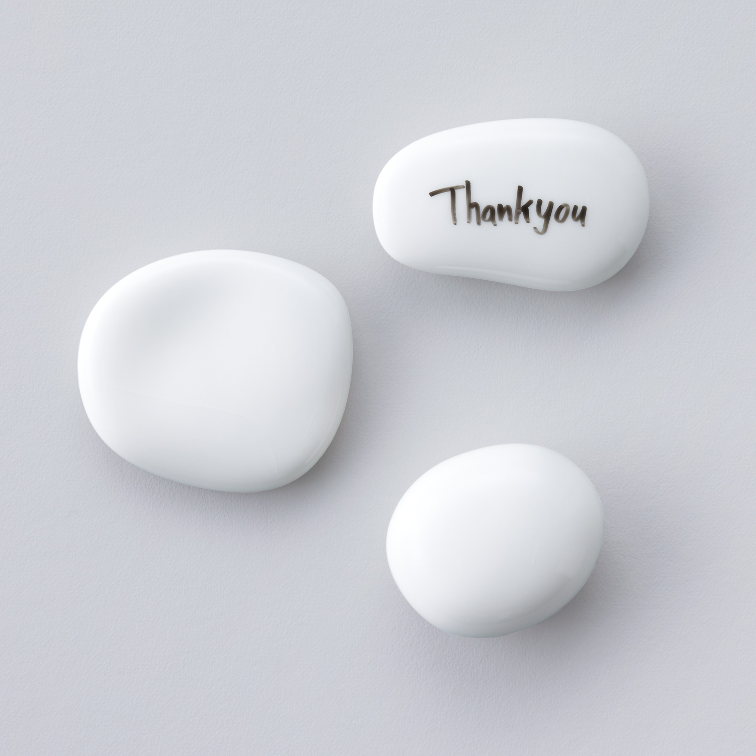
Memento
creator
Soichiro Tanaka
Description
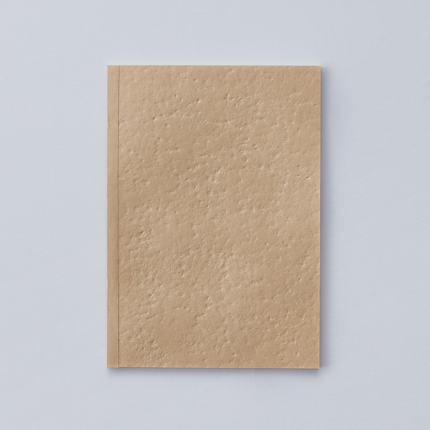
In modern times, we write notes on paper and throw them away immediately, but in ancient times, letters were engraved on stones and animal bones, and naturally weathered. “Memento” is a small whiteboard that is round like a pebble and can be used on a table. You can write a short memo, erase it, and write another one. You can also write an important message that you want to look at for a long time without erasing it. Its stone-like appearance adds to the landscape on your desk. This product lies in between the rush of current day and the flow of primitive times.
Comments by the judges
It is a product that will make you feel the story even when you leave it in your room or desk without using it.
title
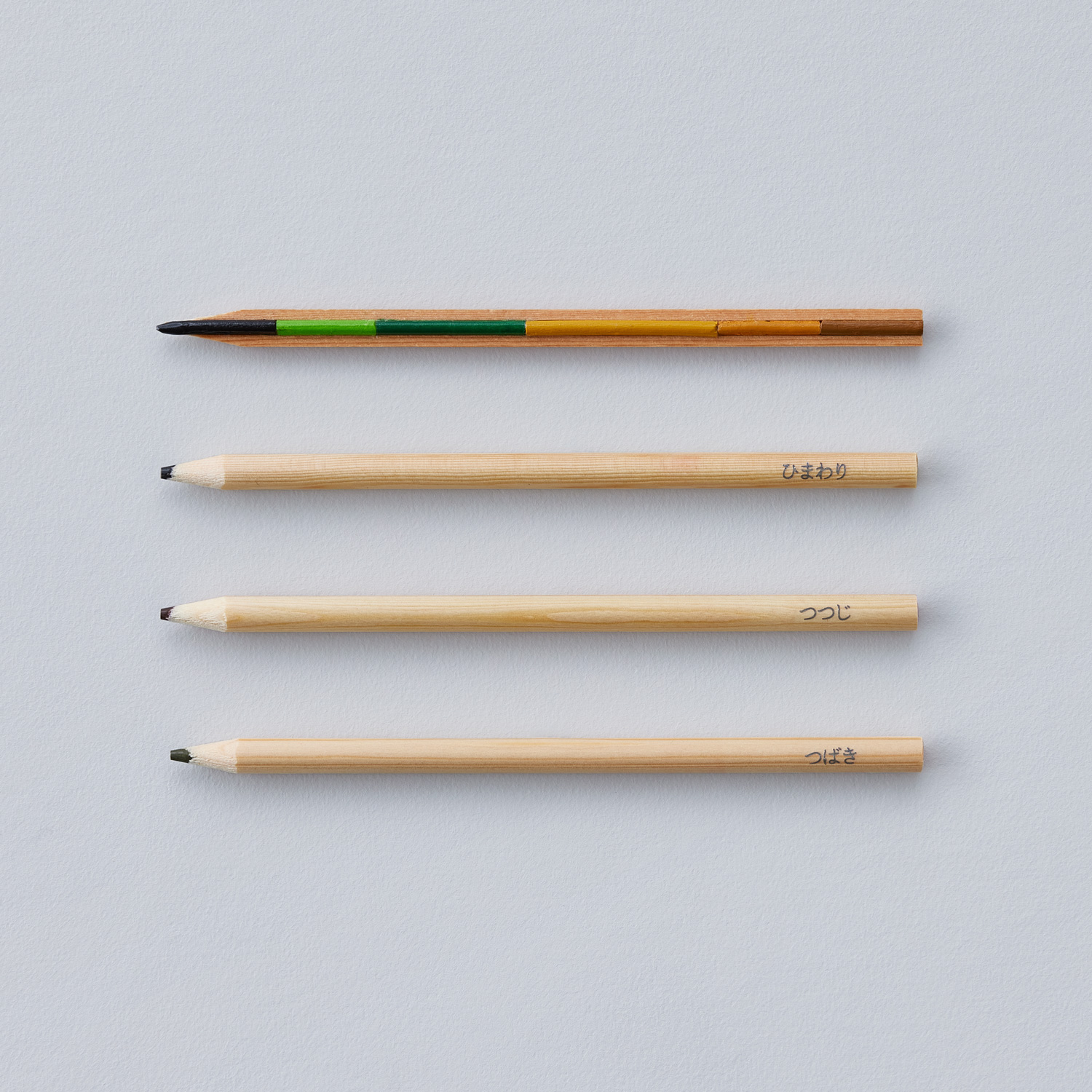
Color-Changing Pencil
creator
Ibuki Ohara
Description
I think everyone stopped at the scent of flowers and greenery at least once. We have grown with plants our whole lives, and they unexpectedly add color to our everyday sceneries. The “Color-Changing Pencill” expresses the life of a plant as buds emerge from seeds, leaves grow, flowers bloom, and the plant withers as the colored pencil changes colors. The colors change just like the seasons the more you use it, and you can see unexpected changes.
Comments by the judges
It is fancy work, but I felt that it would be even better if the artist would think more about the packaging and communication part as a product of high value.
title
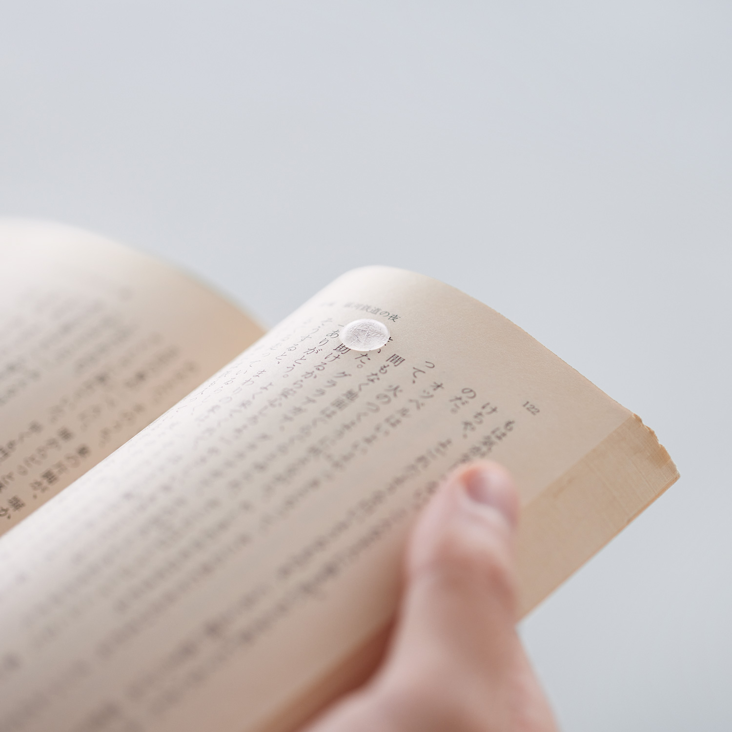
Drippy
creator
FUKATAKA (Takaaki Sato, Mao Fukasawa)
Description
As the name suggests, “Drippy” is a sticky note that looks as if waterdrops have fallen on it. Like tear traces, it is a record of the moments when your heart was moved. Because “Drippy” is slightly thick, the pages open naturally when you turn them. You don’t have to worry about protruding edges like with long, rectangular sticky notes. You can leave marks anywhere on the page.
Comments by the judges
It is the work that I found closest to commercialization. On the other hand, since it is an idea of emotion rather than a function, the way it is felt or used depends on whether it represents just a drop of water or a metaphor of tears.
Finalist

title
Do It Your stationery
creator
Yasuyuki Yamada
Description
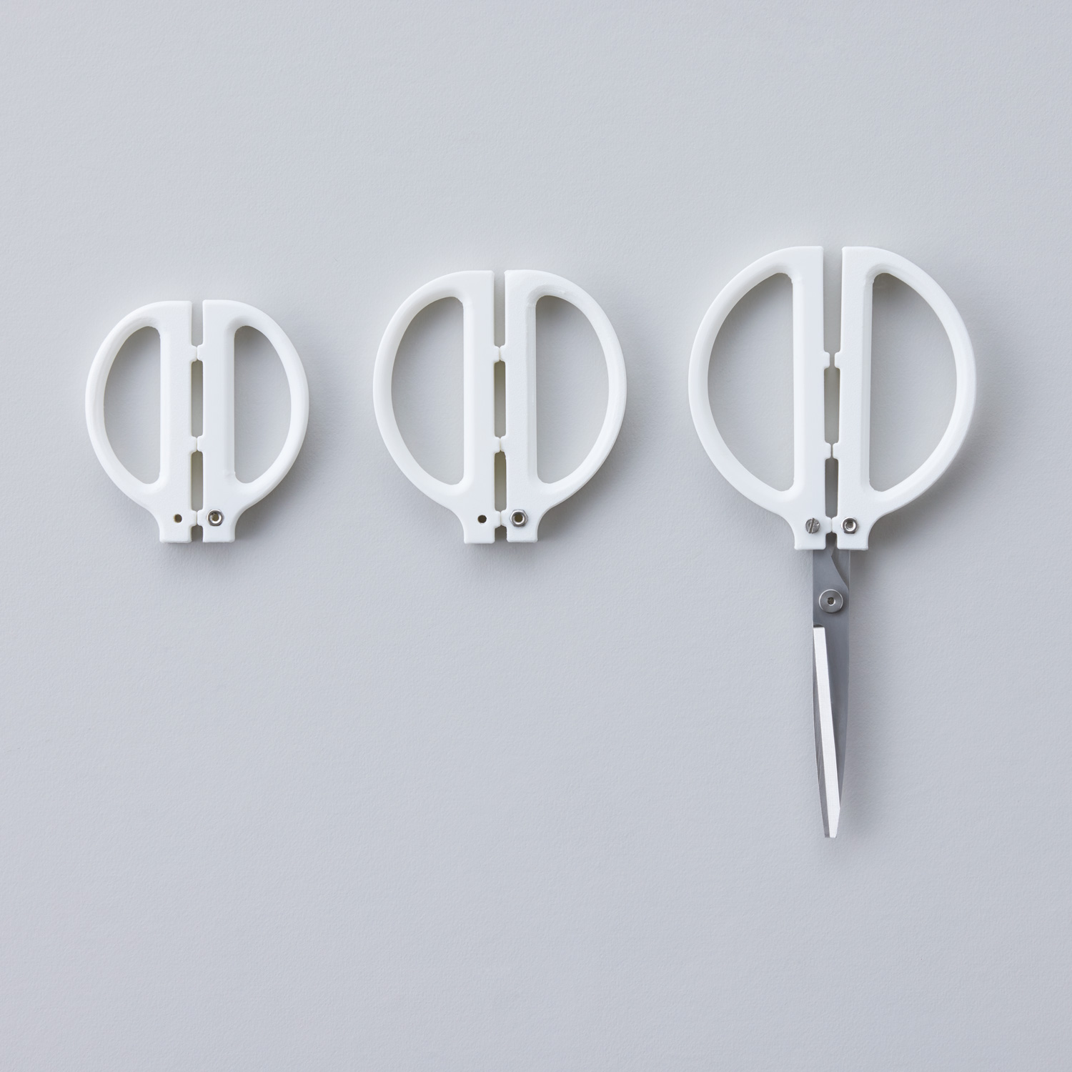
“Do It Your stationery” is a core part of stationery and is made using 3D printing to create specialized stationery. The cores of stationery functions, such as pen tips for easy writing and sharp scissor blades, are sold as DIY parts. It also releases data on parts with various uses and sizes, such as grips attached to stationery materials. You can improve the data, design stationery parts from scratch, or share the part data with someone. It is an open source stationery tool that you can use to create stationery for yourself, for someone else, or for a specific purpose.
title
FLUTE
creator
Natsumi Sakamoto
Description
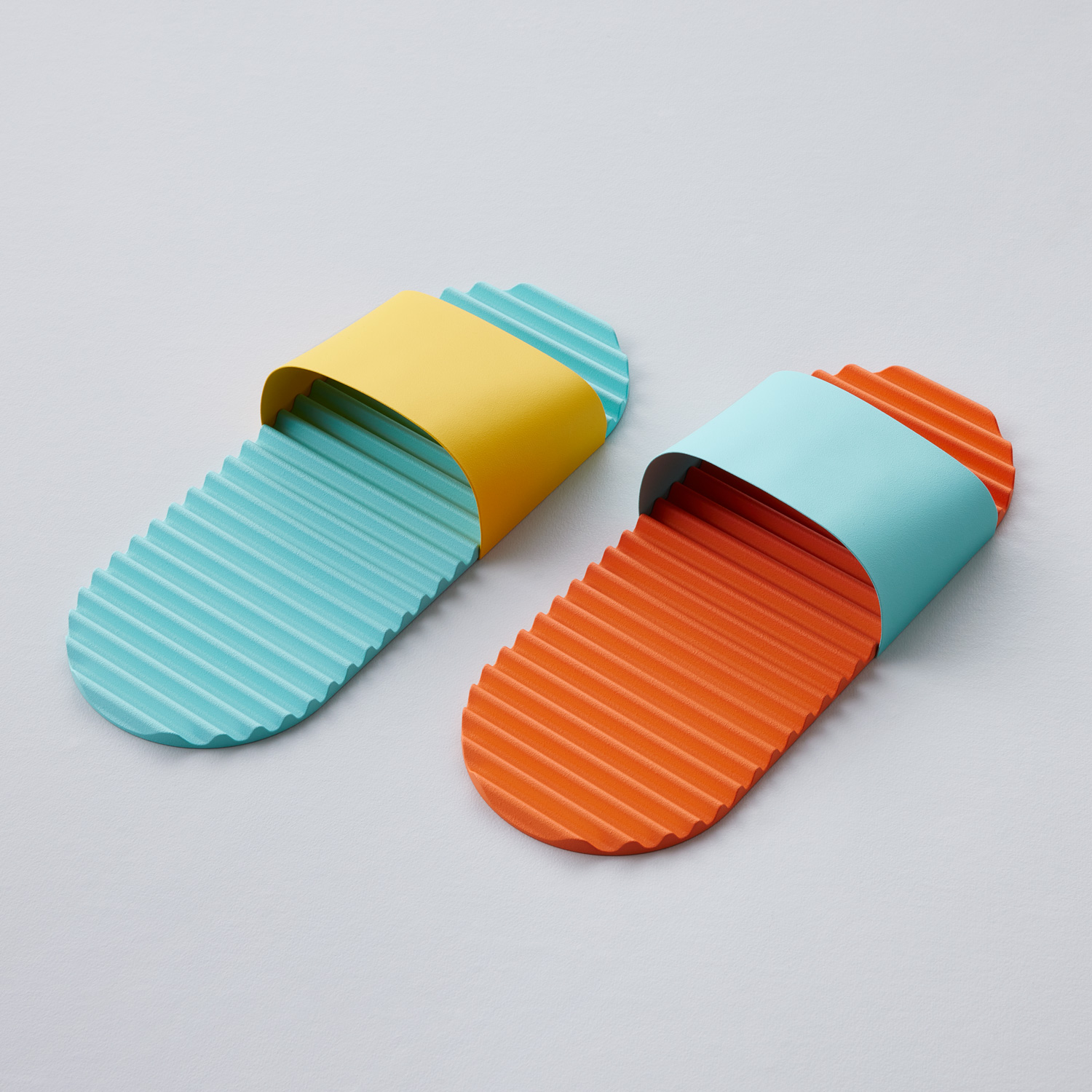
“FLUTE” are paper indoor shoes that add color to your feet. I saw disposable indoor shoes offered at Inns and reexamined them because I wanted them to give the positive feelings of traveling. The beautiful, wavy paper sole instantly makes you want to wear it barefoot and brings a pleasant stimulus to your soles. It will make you feel good and relieved the moment when you take off your shoes.
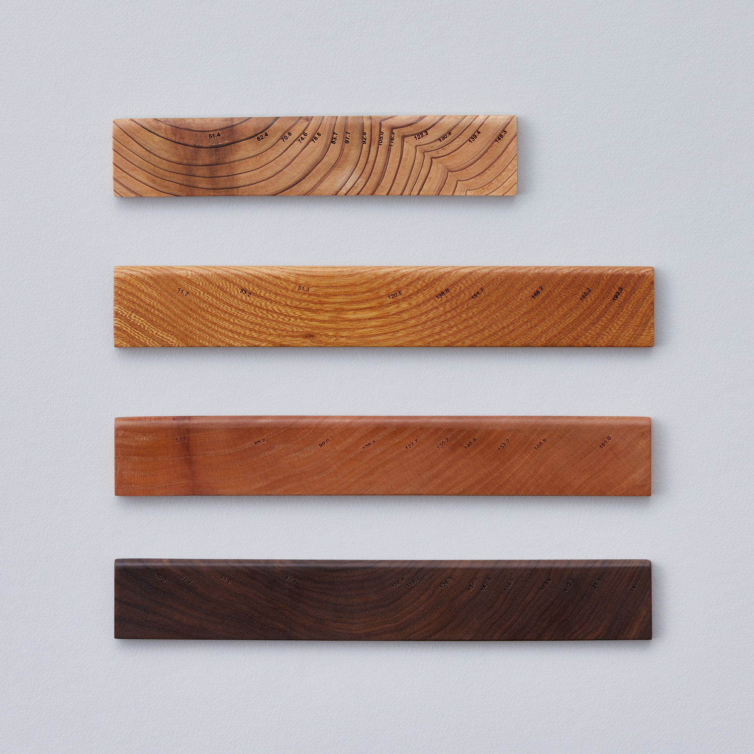
title
Ruler of annual rings
creator
A STUDIO(Lyu Muzhi、Jiang Fang、Chen Yang)
Description
“Ruler of annual rings” uses tree rings to represent its life as a number and measures the length so it is more than just an abstract integer. It redefines the concept of length based on the natural traces of tree growth. The tree rings show a natural distribution, deepening the connection between man and nature and giving a primitive sensation. It covers the stereotypical one-millimeter and one-centimeter intervals and emphasizes the unique dimensions of life. It records the effects of rainwater, temperature, and nutrients, and connects the growth of trees to the dimensions of life. It breaks down the stereotypes of integers, approaches the needs for measurements, lets the user experience natural and primitive sensations, and deepens the connection between humans and nature.
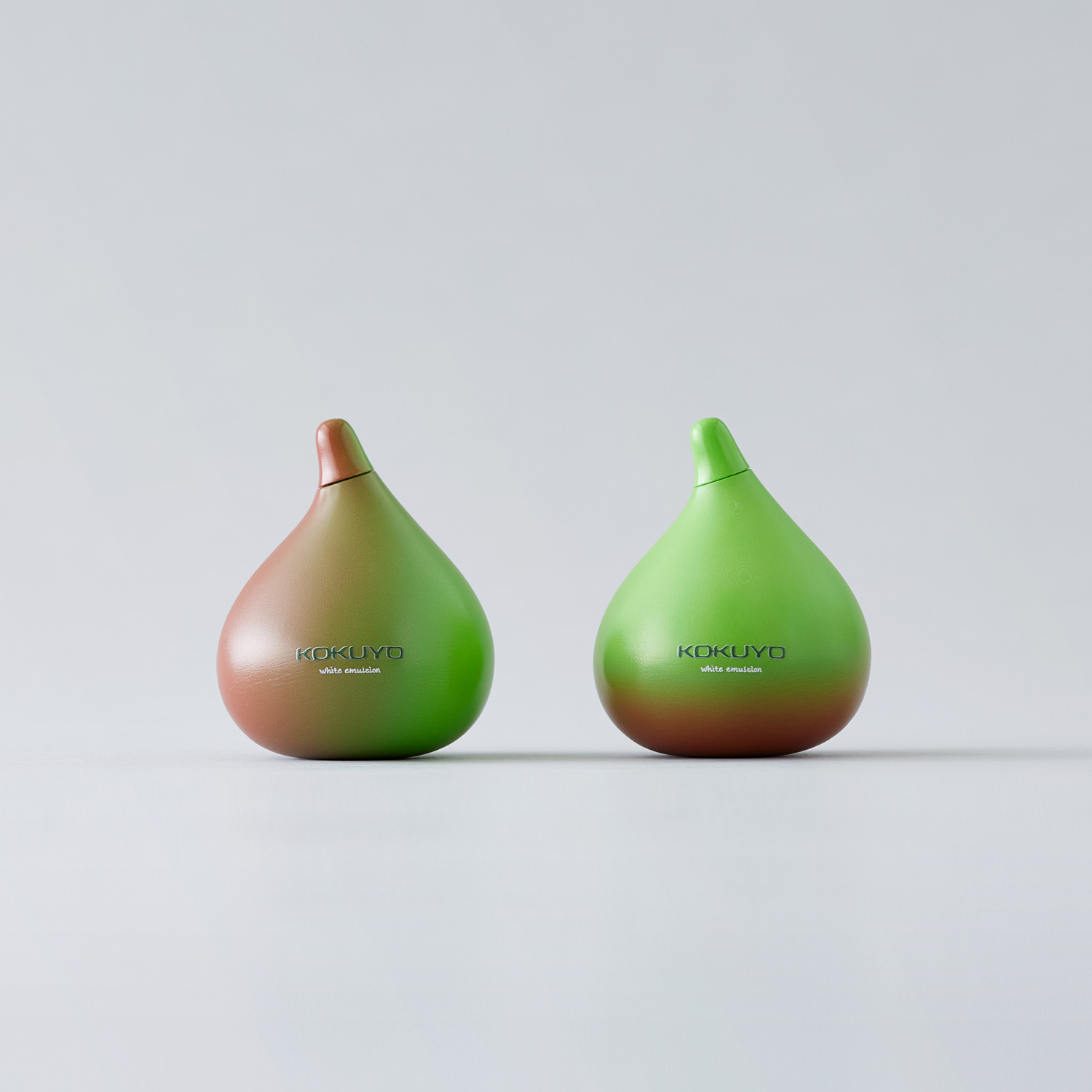
title
Fig Emulsion
creator
W-oH(Yingqi Liu、Yuxuan Chen)
Description
In today’s fast-paced society, using stationery items like liquid glue can contribute to the pressure individuals face. The stickiness of glue often creates subconscious concerns about potential damage to surrounding objects, leading to increased restlessness. Fig Emulsion breaks away from conventional stationery with its unique approach. By tapping into the emotional connection between humans and nature, it evokes perception and brings back cherished childhood memories. Its fruit-like appearance awakens the essence of stickiness and life, infusing it with limitless amusement. When squeezed, fresh milky-white glue flows out, establishing an emotional bond through visual, tactile, and psychological interactions, leaving people pleasantly surprised with a heartfelt smile.
title
Your Cave Wall
creator
Takuya Matsumoto
Description
The act of expression is a human activity that has existed since the past, just as our ancestors painted pictures and signs on cave walls to leave their prayers and wishes. And even as the times changed, the desire to give shape to our imagination has been passed down to us today. I thought of the shape of the notebook as a modern canvas to support creative activities just as our ancestors used cave walls as canvases to project their inspiration.
title
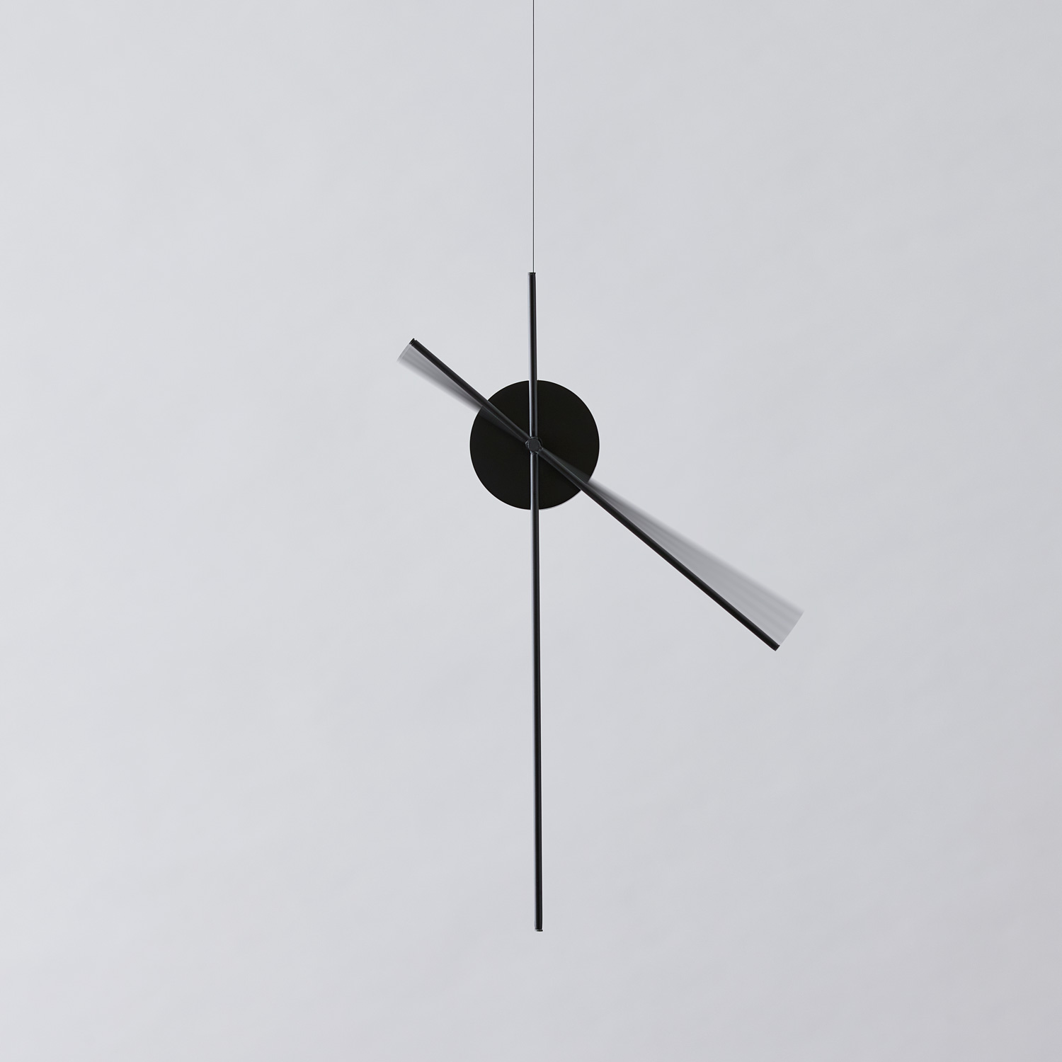
At the moment
creator
RANTA (Shoma Furui, Ken Kobayashi)
Description
The moment when the waves of the sea collide and jump, the moment when a bonfire bursts, and the moment a waterdrop falls. When we find a moment like that in the midst of our everyday sceneries, we feel surprised and happy. By noticing such small changes, you can experience more excitement than usual even in your normal everyday life. “At the moment” is a mobile with a clock hand movement motif that makes you notice moments. It creates opportunities to realize the richness of the moment rather than future plans or past events.
Genral comments by the judges
* Judge occupations and titles current as of the time the individual served as judge.
Shogo Kishino
Representative of 6D-K / Art Director and Graphic Designer
This was my first time taking part in the judging. The theme “primitive” is a nice word, but it is not simple at all, and I watched closely how the theme and each piece of work interacted. I think there were a rich variety of works with various interpretations. I also undertook the production of the Key Visual, but pretending to be an applicant, I struggled with this theme for a year, to avoid misinterpretation of my own work. That's why I understand the hardships of the 10 finalists, and I want you to feel that being selected as a finalist is something cool.

Tsuyoshi Tane
Founder of Atelier Tsuyoshi Tane Architects / Architect
The theme of “primitive” casted the question to the judges of what design can do to live in the future. On top of that, we evaluated the works by the clarity of the idea, the clarification of social issues, and the possibility of commercialization. In our deliberations, we were able to discuss how we should live as beings of life, rather than talking about the future that lies ahead; a mature and convenient but overflown society. There were scenes where opinions were split, but I think that ended up with a creative conclusion.

Nao Tamura
Designer
Based on the theme of “primitive”, each work was judged with interest, looking at the background of creating things while firmly assembling the artist’s personal thoughts and stories. In an era where various information and forms can be obtained in an instant, what is important is the pure feeling of the artist, which is to remove the elements and what they are making them for. In the final judging, the works with a balance of sensibility and functionality were evaluated, I feel.

Teruhiro Yanagihara
TERUHIRO YANAGIHARA STUDIO. CO LTD. / Designer
This is the fifth time for me to participate as a judge, and I think that one of the major features of the KOKUYO DESIGN AWARD is that it keeps asking what is universal, even though it changes the theme every year.
Although it is a product competition, it serves as a good opportunity to learn how the main axis of design has changed with the times, and we had a free and fulfilling discussion of the judging. What was different from previous years was that the importance of the presentation in the final review was higher than before. There were many works where I could feel the density of the presentations more even though I did not notice in the first screening.
Satoshi Yoshiizumi
Principal of TAKT PROJECT Inc. / Designer
The theme “primitive” was also aimed at thinking about the current situation that is not primitive. For example, it can be said that the products on the market today are created by the circumstances and the existence of common sense that approve them. Commercialization is a major proposition of the KOKUYO DESIGN AWARD, but if it is a proposal that updates common sense, it should represent the meaning of primitive, even if it is difficult to immediately commercialize it. That was my approach as one of the judges. As the environment surrounding products is changing, I think it was an opportunity to reconsider the evaluation itself of product design.
Hidekuni Kuroda
KOKUYO Co., Ltd. President and CEO
It was a very difficult theme to deal with. Although there was a risk that the way to receive and read them would fall apart, we could see a wide variety of works consequently. As an initiative from this year, we have established the “New Generation Award” to recognize students, and as a result, we have received more submissions from students and the younger generation as a whole, and I feel that there were many works with young sensibilities. We hope that more people will continue to participate and to use this event to think about design together.
Trophy
Shogo Kishino, one of the judges, worked on the key visuals and art direction of the trophy and award certificate. KOKUYO’s representative designers Takuma Fukushima, Itaru Shinagawa, and Toshikazu Hirai also had a part.
The theme “primitive” was interpreted as a “redefinition of essence,” and the “eye” was incorporated as an element to express a “perspective that sees through to the essence.”
The eye used for the visuals were made by Toshikazu Hirai.
The trophy has a magnifying glass motif that represents “perspective that sees through to the essence” in an iconic way.
The award certificate uses the “eye” from the key visual, and the Grand Prix award has an eye with a special stainless steel inlay.
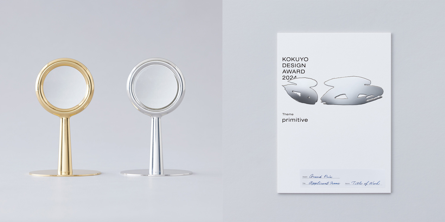 Left: Trophies Right: Certificates
Final Judging / Winning Design Announcement / Talk Show
Final Judging
Ten finalists met this year’s theme “primitive” head on, and gave impassioned presentations.
The judges listened to them earnestly, and judged the entries with five points in mind: The idea’s clarity, The idea highlights social issues, The design’s potential to become a product.
Winning Design Announcement
On March 16, the final judging for KOKUYO DESIGN AWARD 2024 was held. One Grand Prix winner and three Merit Award winners have been selected. Out of the 1,480 works (876 from Japan and 604 from overseas), Tasuku Denno’s “You Shape” was selected as the Grand Prix.