KOKUYO DESIGN AWARD 2018 Key Visual Design Project
KOKUYO DESIGN AWARD 2018
Key Visual Design Project
With acceptance of entries for the KOKUYO DESIGN AWARD 2018 starting on June 22, the spotlight is now also on its novel key visual. The key visual this year was designed by a team consisting of Mr. Masashi Kawamura of PARTY NY (who also serves as a judge) as the creative director, Mr. Kohei Negishi from S2 Factory (who often participates in projects by PARTY) as the art director, and two members of KOKUYO staff. We interviewed the members about how the sharp, strong design that matches this year's theme, "BEYOND BOUDARIES," was born, and what they expect from the award this year.
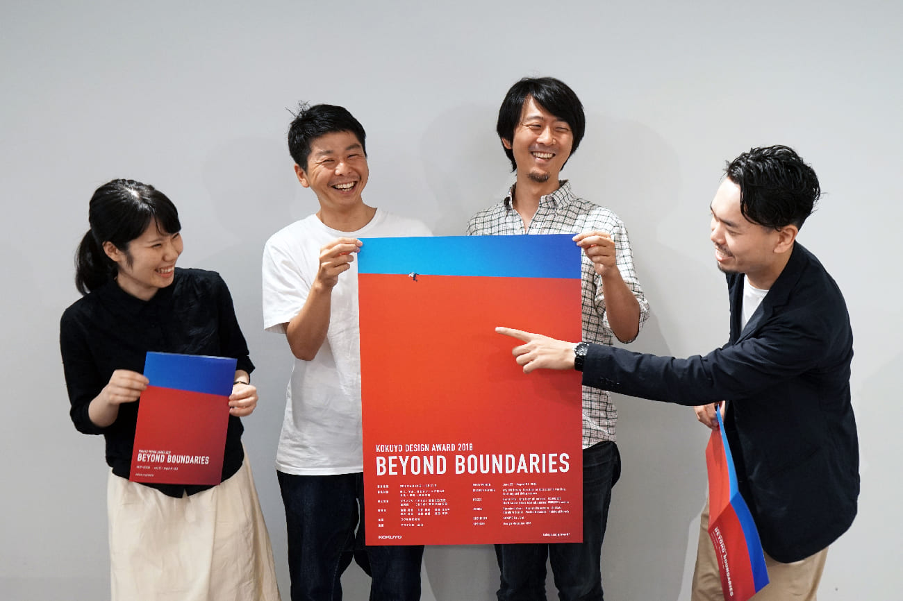
From left: Kaori Taya (KOKUYO Stationary Business Division), Kohei Negishi (S2 Factory), Masashi Kawamura (representative of PARTY NY), Tomoya Kuroo (KOKUYO Furniture Business Division). The team members worked together on a level playing field that went beyond their company affiliations and standpoints.
What are "boundaries" in the first place?
―― Please tell us about the theme "BEYOND BOUDARIES."
Kawamura: First, we had a meeting at which the panel of judges for the award gathered and decided the theme for this year. They unanimously decided on "BEYOND BOUNDARIES." People around the world connect, and a whole variety of problems regarding "gaps" that occur as a result — "boundaries" — are thrown into relief. Differences of race, gender, religion, or more everyday boundaries such as handedness or language. People's lives will be better if we all become aware of these different boundaries, and overcome them. The theme contains this message.
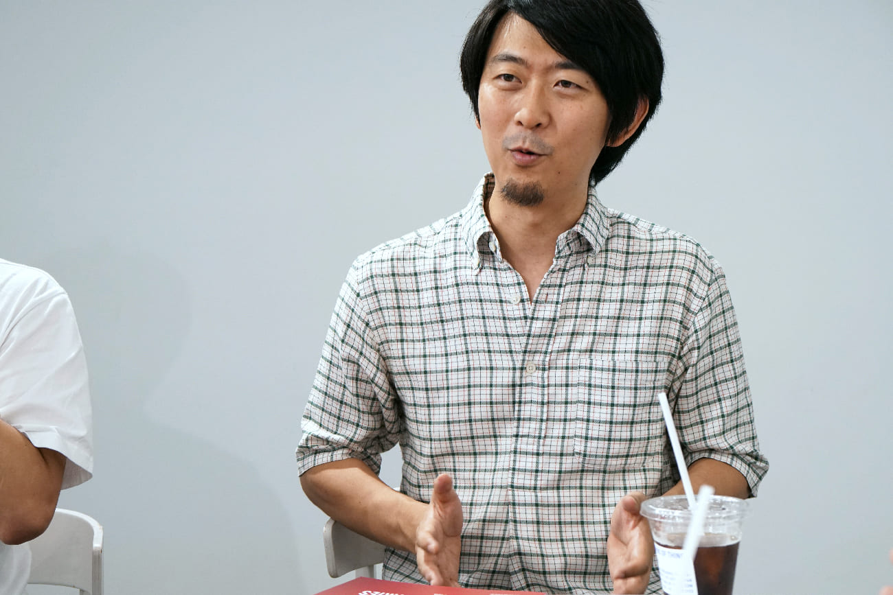
Mr. Masashi Kawamura (representative of PARTY NY)
―― Against such a background, what role is required of this year's key visual?
Kawamura: As I was going to be in charge of the project this time, I thought that what was required might be a global visual communication that anyone from any country can understand at a glance, something that has drive and catches our attention.
―― Among your wide range of work, how did you perceive this project?
Kawamura: I undertook this project with the same kind of commitment as when I work on branding, because we were asked to come up with a promotion and a visual communication based on the award's theme this time. In addition, this project also required that we create a useful visual image, since it will be used not only in logos, posters and flyers, but also for trophies and achievement certificates later on. So, I started to work with my trusted art director Mr. Negishi, and two members of KOKUYO staff.
Negishi: I was interested in the way this team was put together. With things like the fact that it was the first time I was going to work with these two KOKUYO staff members, and also the physical distance between Osaka and Tokyo, I thought it really was "BEYOND BOUNDARIES." I was interested by the fact that we would tackle this theme by first thinking about it ourselves.
―― When the project began, what did you start from?
Kawamura: There are many different ways to interpret "BEYOND BOUNDARIES," so first everyone collected together words and images that made them feel "boundaries," drew pictures and so on, and then we brainstormed vigorously while making a rough selection from among them.
Negishi: The question was "What are boundaries?" in the first place. Then, we thought about how we go beyond boundaries, what we use in order to go beyond them, and what happens after we go beyond them. Everyone brought a broad direction of their own. For example, because boundaries are actually things that we can't see with our eyes, how about "Pantomime" as a motif to express that?
Kohei Negishi (S2 Factory)
Kuroo: We also had some deep discussions about how to understand the phrase; did it mean to go over boundaries, or to destroy them? We thought that "BEYOND BOUNDARIES" could mean not only to go from Point A to Point B, but the possibility that A and B could mix together, and from that collaboration, something new could be born.
Taya: While stepping into the shoes of the entrants, we thought about "How should we get the theme across?" as people on the organizers' side, as well.
Kawamura: The thing we discussed most was whether or not to depict the concept of boundaries as boundary lines. In other words, whether to propose something in which boundary lines themselves are the subject. For example, we could try creating a graphic representation of No Entry tape, which symbolizes boundaries. Mr. Kuroo actually made some tape and demonstrated the idea for us. But we saw that if we went with this idea, actually, it would be difficult to express the feeling of "We want you to overcome it."
―― Did the direction slowly become established as you continued to discuss things together?
Kawamura: Yes, that's right. Every time, we were heading toward the goal while sometimes widening and sometimes narrowing down our ideas. I think we never went up a blind alley. We held four intensive meetings in all, narrowed down the direction around the time of the third one, and finally decided on a visual of a person trying to climb over a huge wall.
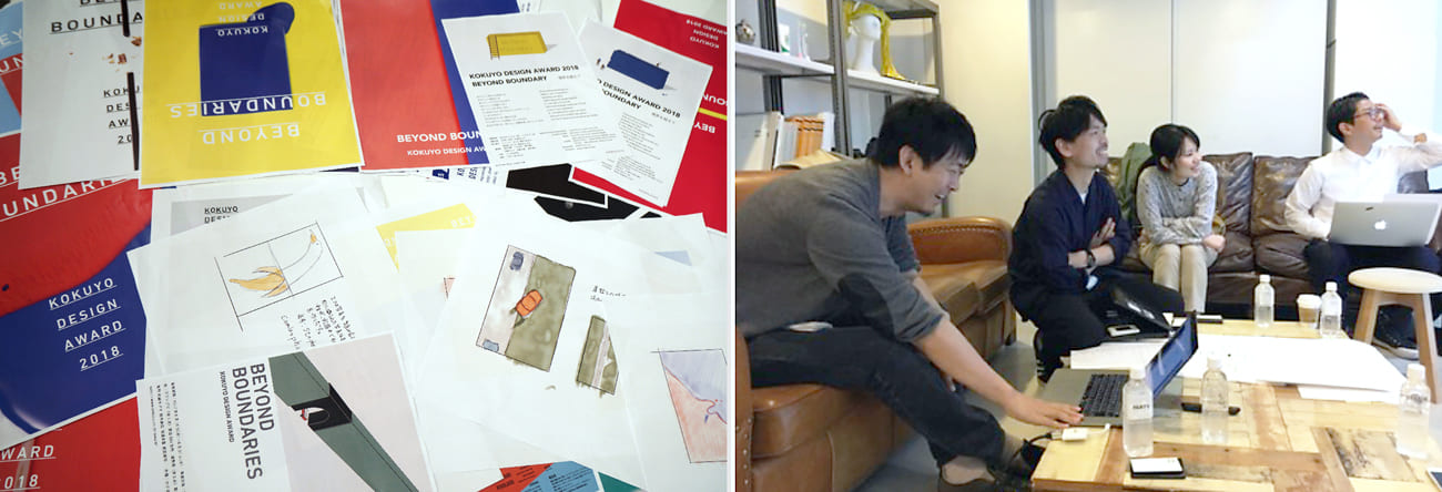
The vast number of sketches and rough drafts tell the story of how intense the discussions were
The idea of "We want you to do your best to overcome boundaries"
―― This person produces a very good effect.
Kawamura: If we just depicted boundaries abstractly, it would be difficult to tell if they were boundaries or colored surfaces. We thought that if people had to look closely to see a small person taking on a huge wall, it would create a design with an interesting gap in scale. This size that makes us "look closely" is the key. If the person were too big, it wouldn't be interesting.
Kuroo: Initially, we had ideas like one where some blue and red ink "have gotten mixed" or one where a microcar "has gone through" a boundary, but then we thought, "We don't want something that will be easy to go over. We want people to go beyond it by making a tremendous effort and doing their best." For the person's posture, too, there were drafts in which it was light or the person was standing on the wall, but in the end, we decided we wanted to produce a feeling of struggling to climb up.
Tomoya Kuroo (KOKUYO Furniture Business Division)
Negishi: We actually created a wall in the studio and got a model to climb up it, and then the photographer, Akiko Isobe, took pictures of it. After seeing some of Ms. Isobe's previous work, we thought she would masterfully capture the vivid colored surfaces and the movement of the person for us.
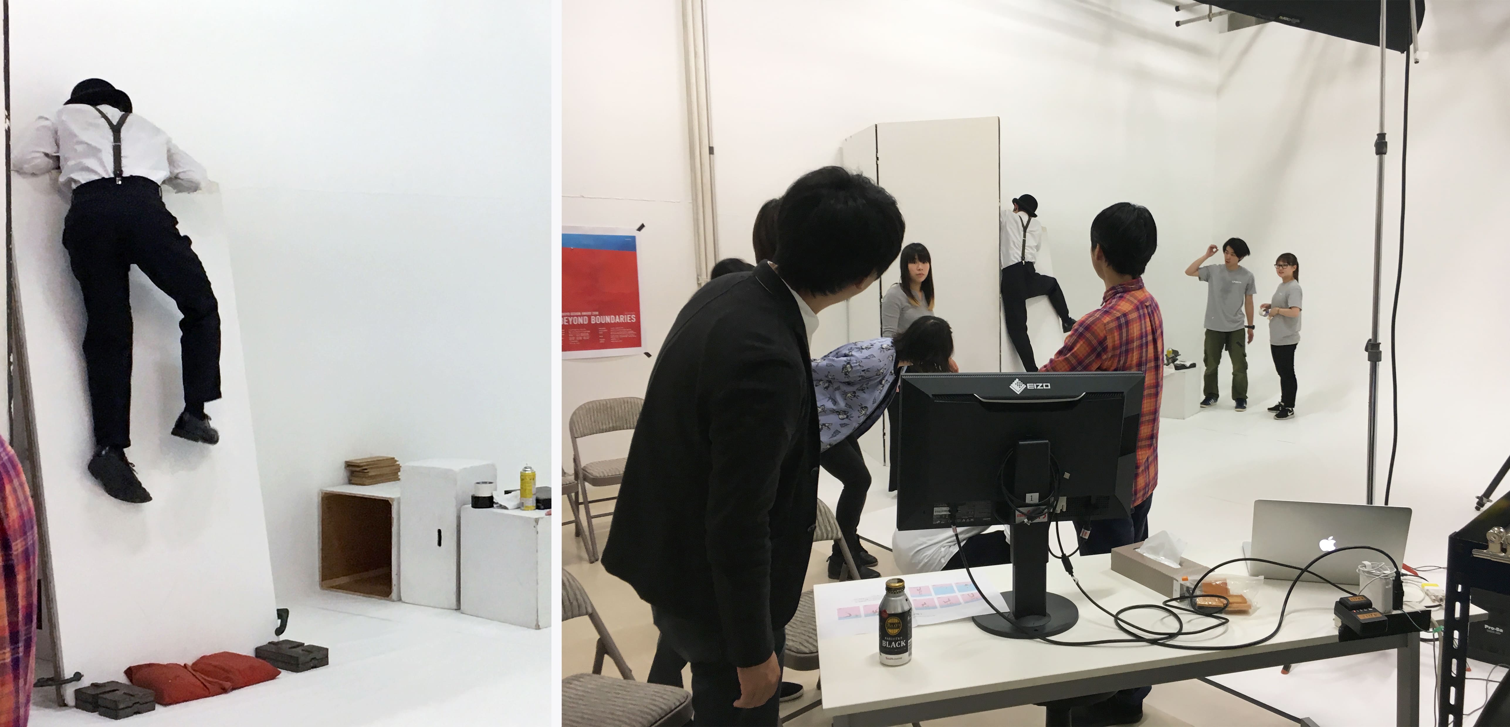
They created a wall in the studio, and got a model to really struggle to climb up it
―― The blue and red colored surfaces are sharp and leave a strong impression.
Negishi: We decided on them while we considered lots of different color variations, with everyone putting in ideas. Blue, which somehow seems to represent the sky, and the opposite color, red. The image of strong confrontation, like the north and south poles of a magnet, clicked with everyone. For the balance of blue and red, too, we initially tried designs with curves, or three layers. We naturally arrived at this configuration as we tried out a lot of different designs.
Taya: And we didn't make the colored surfaces by painting them. Instead, we made them with paper and then took photographs of them.
Kaori Taya (KOKUYO Stationary Business Division)
Negishi: We wanted a texture that would be completely different from what we would get with something made using a computer. The gradation of shading on the colored surfaces was achieved by discussing the composition with Ms. Isobe, through which she designed what kind of space it was in, what the relationship between the sky and wall was, and where the sun (the lighting) was. We aimed for a mysterious balance that would allow the design to be seen as an abstract colored surface and as a real wall.
―― The typography is also bold and strong, isn't it?
Negishi: That's because we talked about wanting a visual that would pack a little bit of a punch. First we tried a slab serif font, but then we gradually chiseled it down from there. We wanted something that was simple yet different. In the end we adopted a vertically stretched "DIN" font, because the words "BEYOND BOUNDARIES" were long, and we wanted to use lettering that would give a feeling of the height of the wall.
―― Please tell us about the response.
Kawamura: Everyone stops and says, "What's this!?" whenever the poster is nearby. I think it's something that catches the eye. Besides that, I'm just praying that it increases the number of entries.
Negishi: We felt, “That's good, isn't it?" when the design was finished, so I think it's a graphic that will make people think, wherever it is.
Kuroo: Putting it in extreme terms, I think it has so much impact that people will say, "Is this really KOKUYO?” Our junior colleagues also tell us they really like it.
Taya: We're getting responses that show that the theme of "Find a wall, and go beyond it" is getting across to people who have seen it, so we are very satisfied.
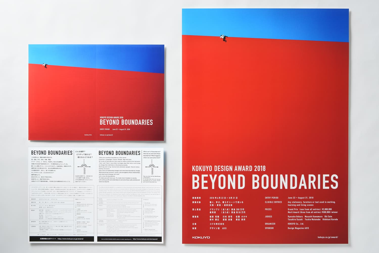
(Left) A3 double-spread pamphlet. (Right) A2-sized poster. The balance of the colored surfaces and the position of the person were carefully adjusted depending on the printed materials and banners in which the design is used
We want people to find their own kinds of boundaries, and then go beyond them in brilliant ways
―― Mr. Kawamura, this is your second year as a judge. Please tell us what you are expecting from this year's award.
Kawamura: While I was working to create the key visual this time, I really felt that the theme "BEYOND BOUNDARIES" fitted the times. What will the entrants think boundaries are? When I think about being able to see different perspectives and output to express that, I get very excited.
Also, I will be really happy if there are even more entries from overseas. Because it's "BEYOND BOUNDARIES," the award will really liven up if richly varied works come together from all over the world, transcending national boundaries.
―― Finally, please could you give some advice to people who are going to enter?
Kawamura: First, the most important judgment criterion is "Stick to the theme!" No matter how good the content of an entry is, if it has nothing to do with the theme, we can't judge it. I think "BEYOND BOUNDARIES" is a broad theme that can encompass a lot of different elements, so as a path to take when submitting your designs, I think if you stick to the theme and logically explain what kinds of boundaries your design is about going beyond and how, you will successfully grab the judges' attention.
Besides that, please find your own kinds of boundaries, and then go beyond them in brilliant ways. If you work inventively starting from how you find your boundaries, maybe you'll come up with a unique proposal that will be completely different from everything else. I think it would be a good idea to take a step back and find an interesting viewpoint, starting from the stage of coming up with ideas.