


KOKUYO DESIGN AWARD 2025
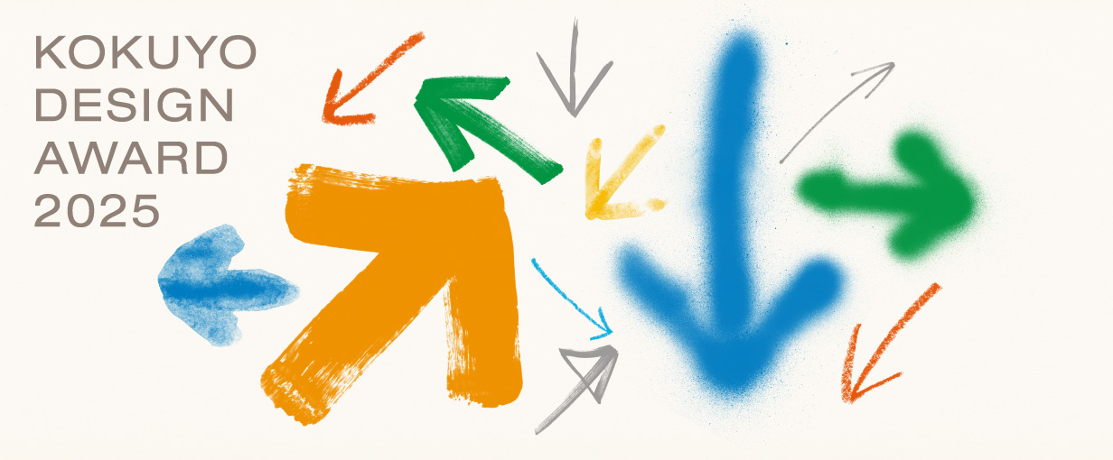
2025 Theme: “prototype”
We have received 1,448 works from in and out of Japan (716 from Japan and 732 from overseas).
The 9 designs that passed the second round judging will undergo final judging on March 15, 2025.
One Grand Prix winner and three Merit Award winners have been selected.
Grand Prix
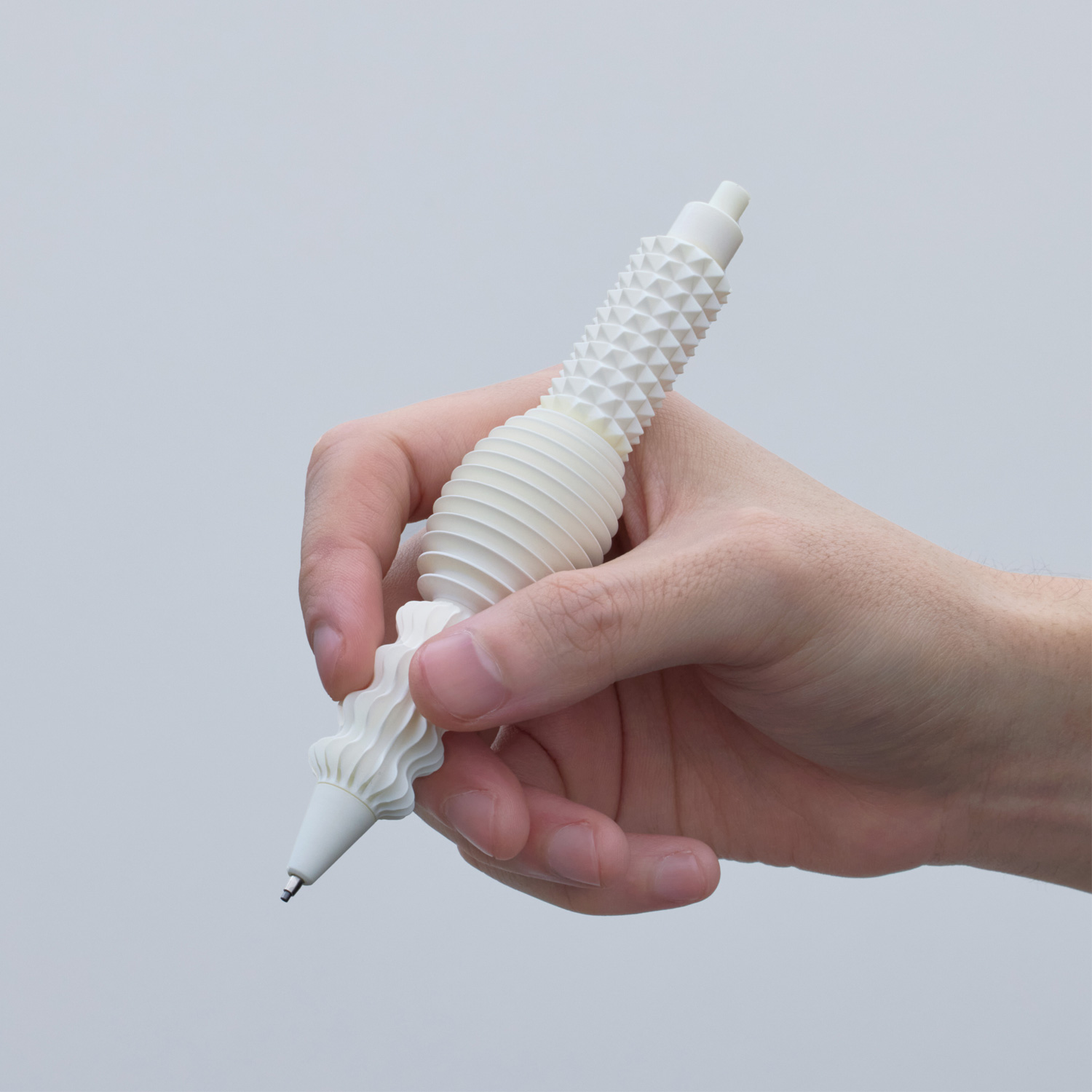
- title
- NEWRON
- creator
- Toshiyuki Kawada
Description
Many nerves are concentrated in the human fingertips, and brain function is activated by stimulating the fingertips. “NEWRON” is a pen with variously shaped protrusions on its grip section. It is a “pen for generating ideas” that supports creative activities by stimulating brain activity from the fingertips while “drawing” at the same time.
Perhaps it was because the design was created with the sense of touch, and it looked different from conventional product design. Despite its visual impact, when you hold it in your hand, you will find that you will want to draw smoothly as the concept suggests, because it was considered in terms of the sense of touch. It was a work that was not within my imagination, but I think it was a wonderful work that gave me a sense of the future.
Merit Award
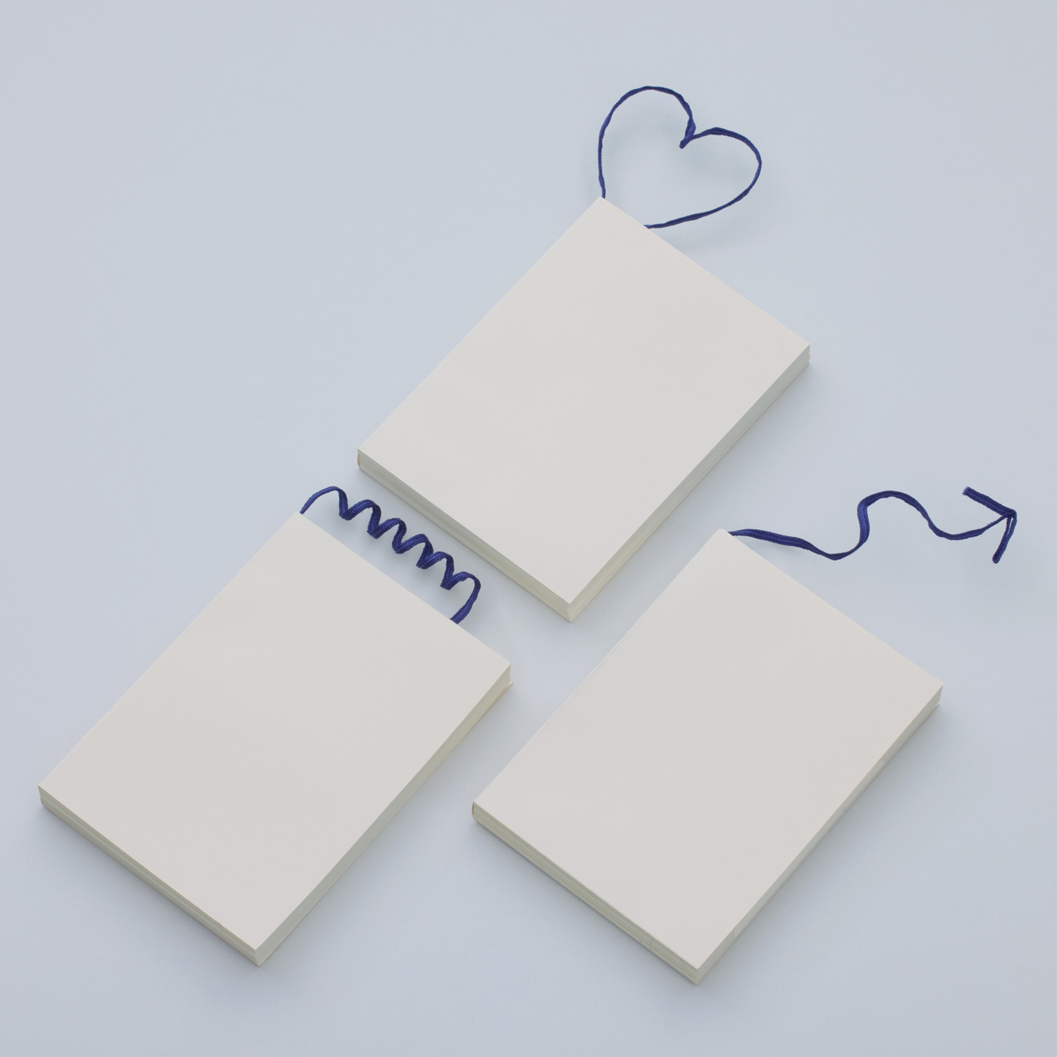
title
spinning
creator
Haruki Ichijo
Description
Spin, a string attached to a book.
A thin little string that you play with and twirl while reading a book, and before you know it end becomes frayed.
By adding a core material to the Spin, we open up the possibility for it to become "something" else, something a little freer.
It could be a sticky note that crosses the page.
It could be a gift for the next reader.
It could be the shape of the mind when you read it.
It could be a creation independent from the book.
It could be something that does not yet have a name.
This is how such small possibilities exist.
The theme this time was the process of thinking, and the works came out with a great deal of depth and quite a few experiments in the process. Among them, "Spinning" was beyond my imagination, and I was puzzled as to how to evaluate it until halfway through. I heard that the mindset was to submit a work that would be difficult to judge. This is not something to be commercialized, but rather a suggestion for a new direction, and was evaluated as a wonderful "prototype."
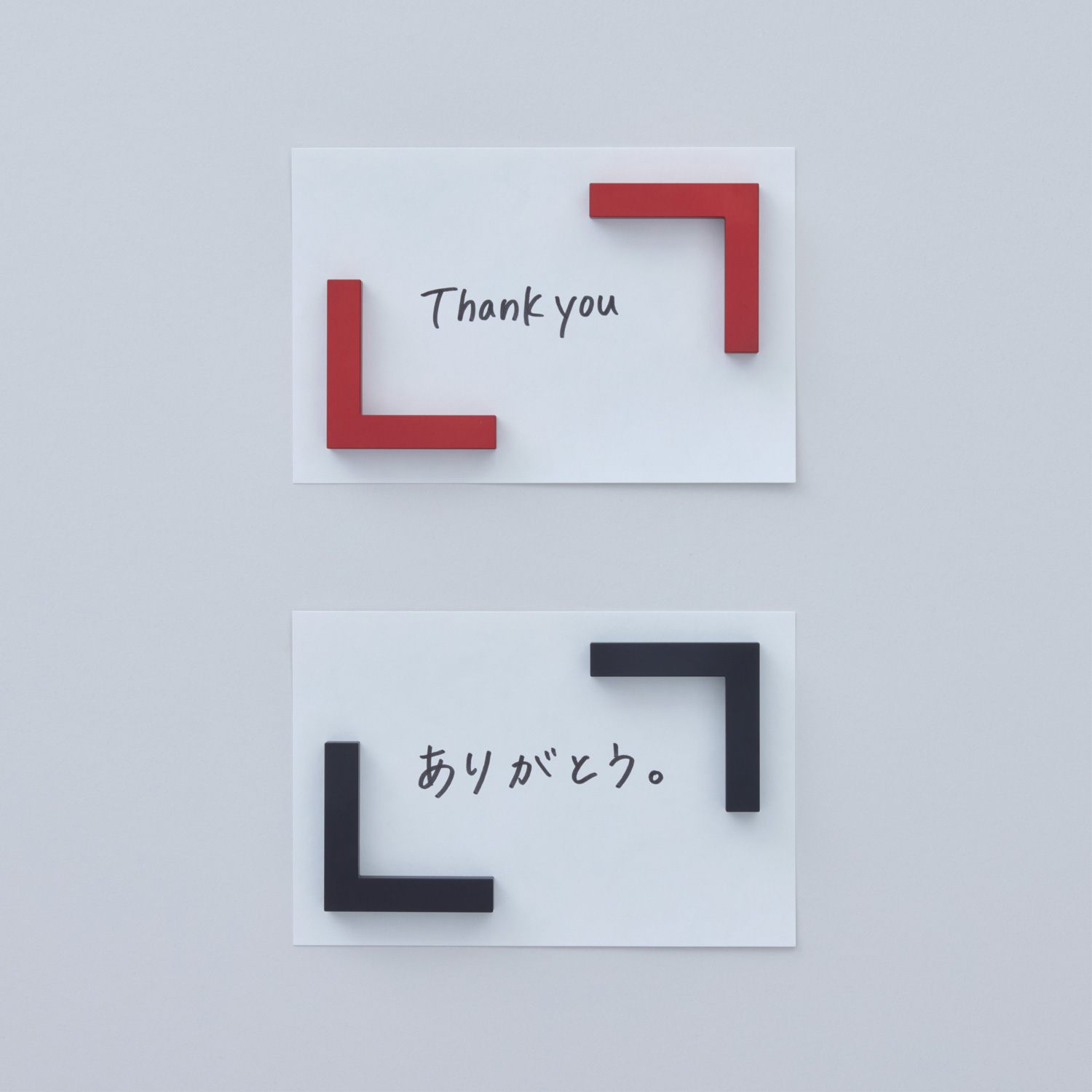
title
KAKONET
creator
Yoshihiro Matsumura
Description
The "" emphasizes the word and leaves a strong impression on our minds.
Words and lines enclosed in "" in books and movies sometimes move us to tears, make us smile, give us happiness and courage, and strongly affect our emotions.
When we hold something in place with a magnet, we may also be holding something inside our minds that we don't want to forget, something we are aware of, or a thought that we don't want to forget.
KAKONET is a magnet to further visualize, strongly impress, and hold your inner thoughts, consciousness, and memories through "".
A simple magnet has become an item that puts emotion on information and speaks to emotion. I think the idea of enclosing something in Japanese quotation marks to make it special is a neat idea that can be applied to other things as well. On the other hand, if you design it too much, it can end up looking like miscellaneous goods, which can be a problem. There is a big gap between Japanese quotation marks (a device that conveys emotions) and magnets (a tool + function), so it was important to bring them together through the power of design. I feel that this is an item that has the potential to develop further in the future if we dig deeper into the details.
title
Secret
creator
weiweichen (Gaowei Liu, Cheng Chen)
Description
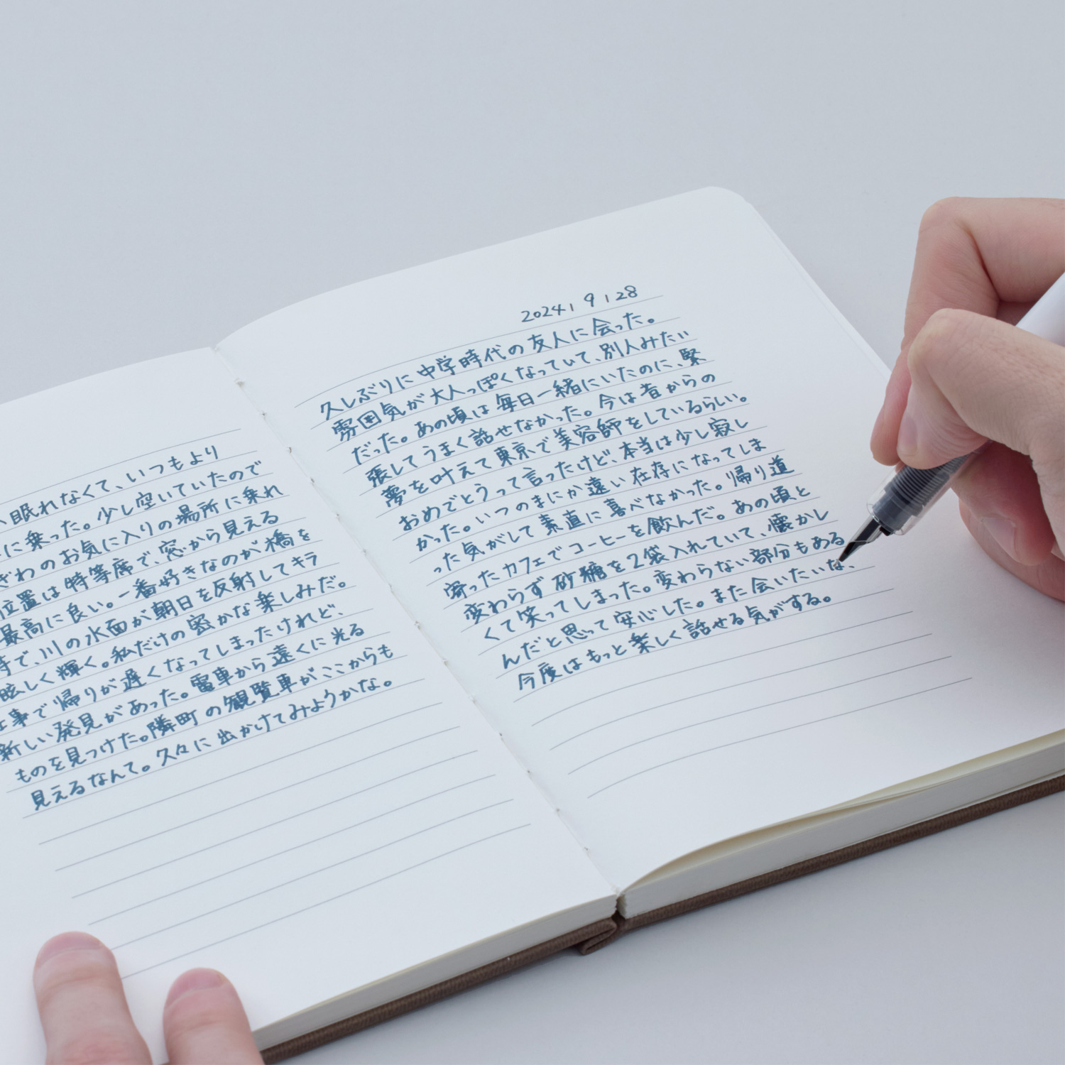
What is a diary? I think the best answer is the “secret words” hidden in our hearts.
By shrinking the horizontal lines of the diary toward the center, it feels as if the “secret words” are hidden deep within it.
I often feel that a design is good when I can get as close to an idea as possible with as few steps as possible. This work, "Secret," is a simple idea that, simply put, shows how they have confined their emotions by pulling the writing part inward. That's all it is, but somehow it just seems that way. The idea of a diary was interesting and I felt that a new format had been created. A great deal of testing has been done on the size, line differences, etc., resulting in a high-level work that looks natural to everyone.
Finalist
title
Universal sticker
creator
Yasuyuki Yamada
Description
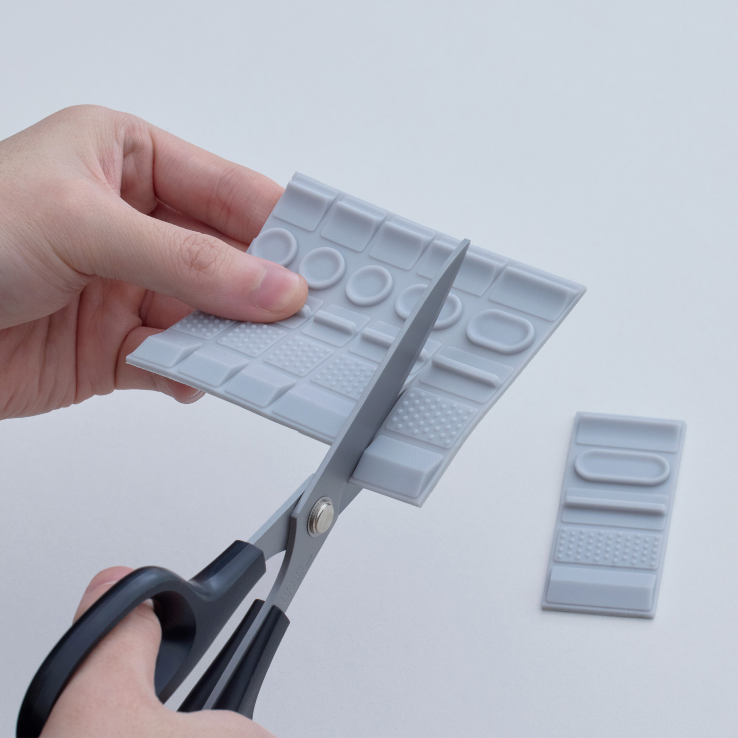
Stickers that can be easily attached to small protrusions. The moment one feels a slight discomfort or dissatisfaction with a familiar ready-made product, thinking, "This is hard to use, or maybe it would be easier to use if I did this," or the moment one makes an improvement, may be the start of an idea. Universal stickers are stickers with various shapes of protrusions that are easy to grip, easy to stick, and non-slip. Anyone can easily try them out by sticking them on equipment or tools in front of them or changing their position, creating ease of use by allowing trial and error.
title
Color-it
creator
8000000studio (Tomoki Batori, Yuze Chen)
Description
I love reading books and carry them with me everywhere I go.
Whenever I encountered a beautiful phrase or a useful word, I would put a sticky note on it, but unfortunately it would fall apart in my bag.
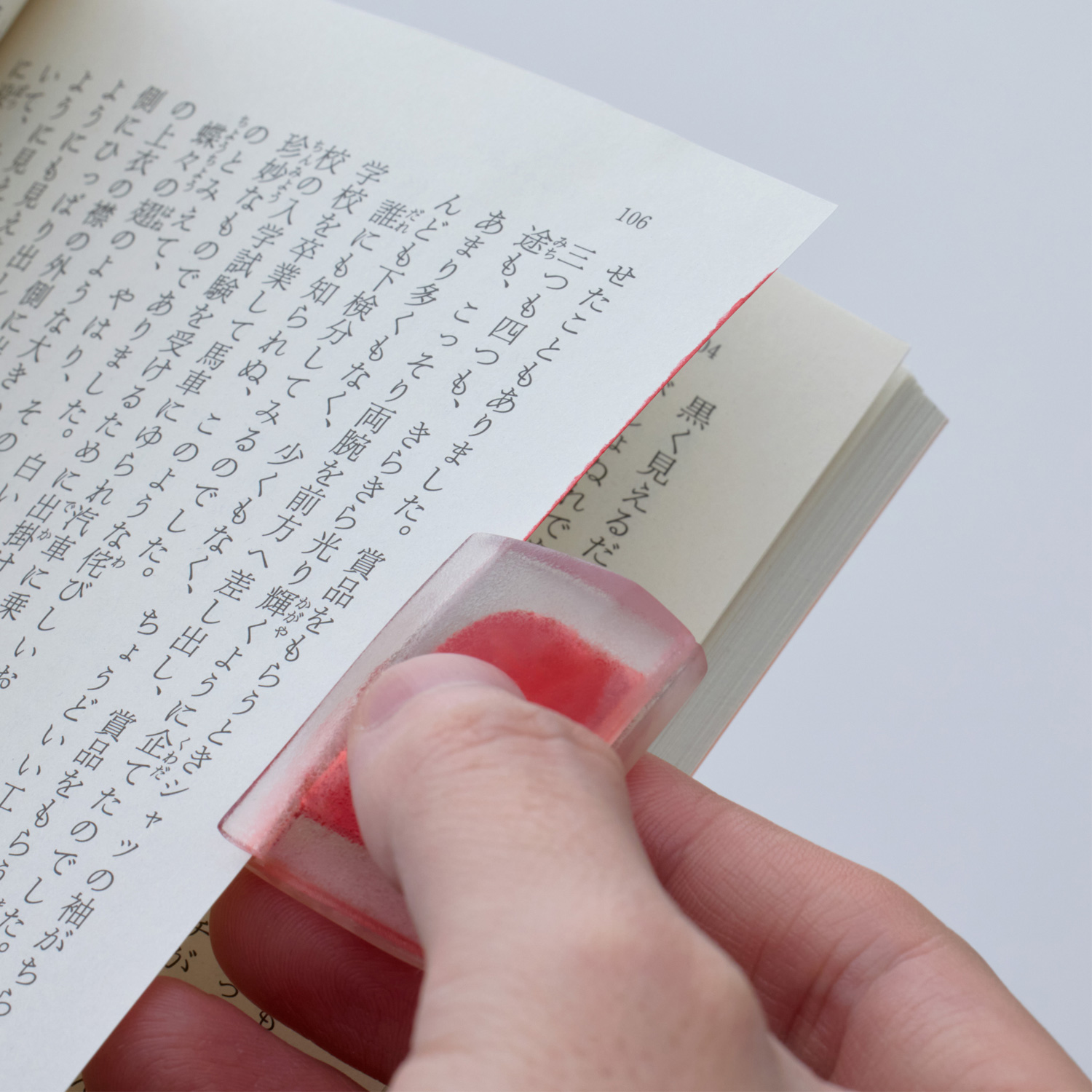
"-FUSEN-" is a new product to keep your precious books beautiful.
Its slim body has a clip so it can be carried on the spine of a book, and by sliding it over the edge of the page you are interested in, the ink dyes and colors the edge of the paper.
When the ink runs out, it can be used repeatedly simply by replacing the cartridge.
title
6°note
creator
Shingo Iwasa, Atsushi Tanaka
Description
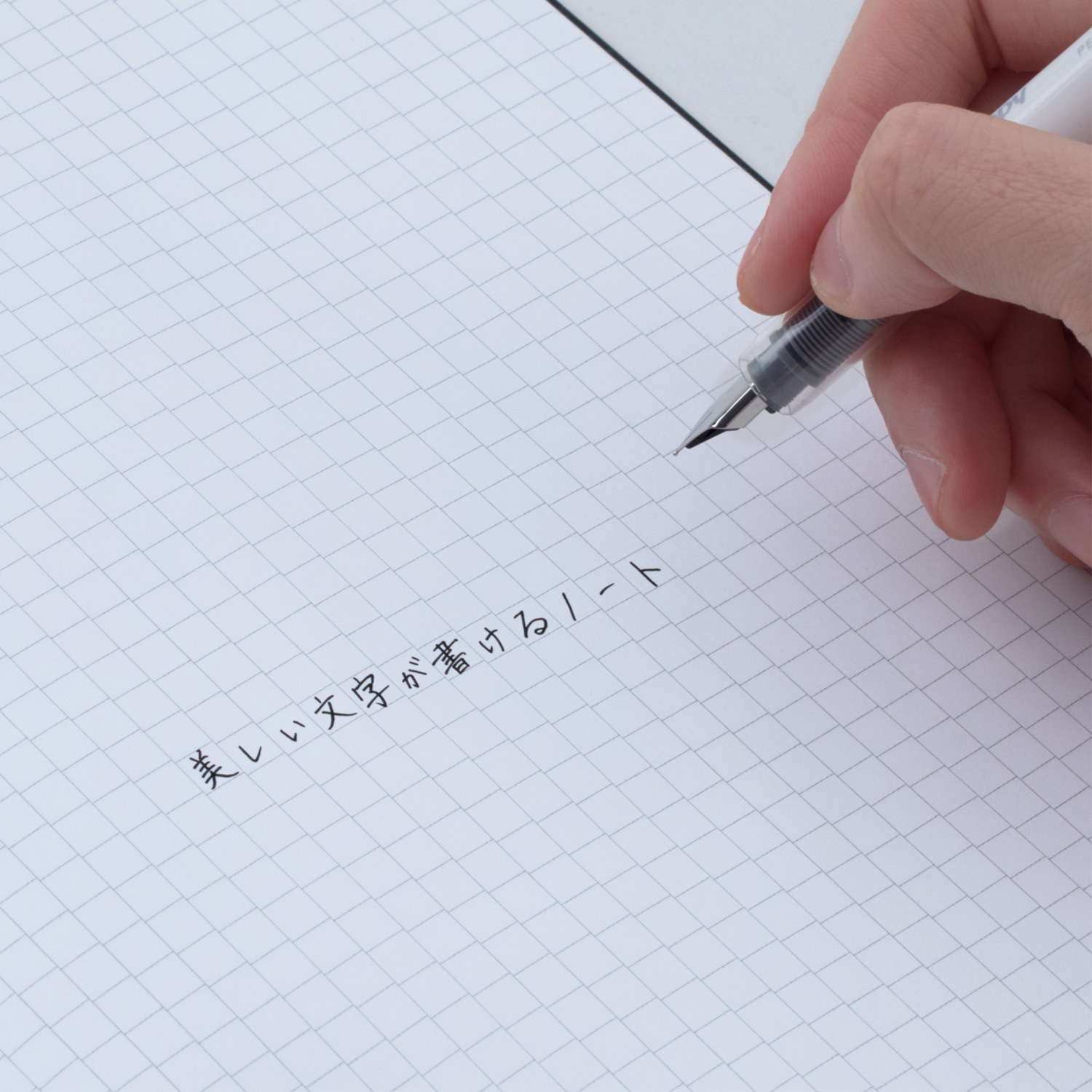
Unconsciously, your letters will become beautiful.
Letters show a person's unique "habit" of writing.
While it is considered to be an individual characteristic, many people suffer from a lack of confidence in their own handwriting.
This notebook takes the commonly known principle that beautiful letters "slant up 6°" and incorporates it into a square grid.
The 6° tilted grid subconsciously encourages letters to rise to the right, creating beautiful, unified letters.
This proposal has the potential to reconsider the uniformity of the "grid" and to create a new "Prototype."
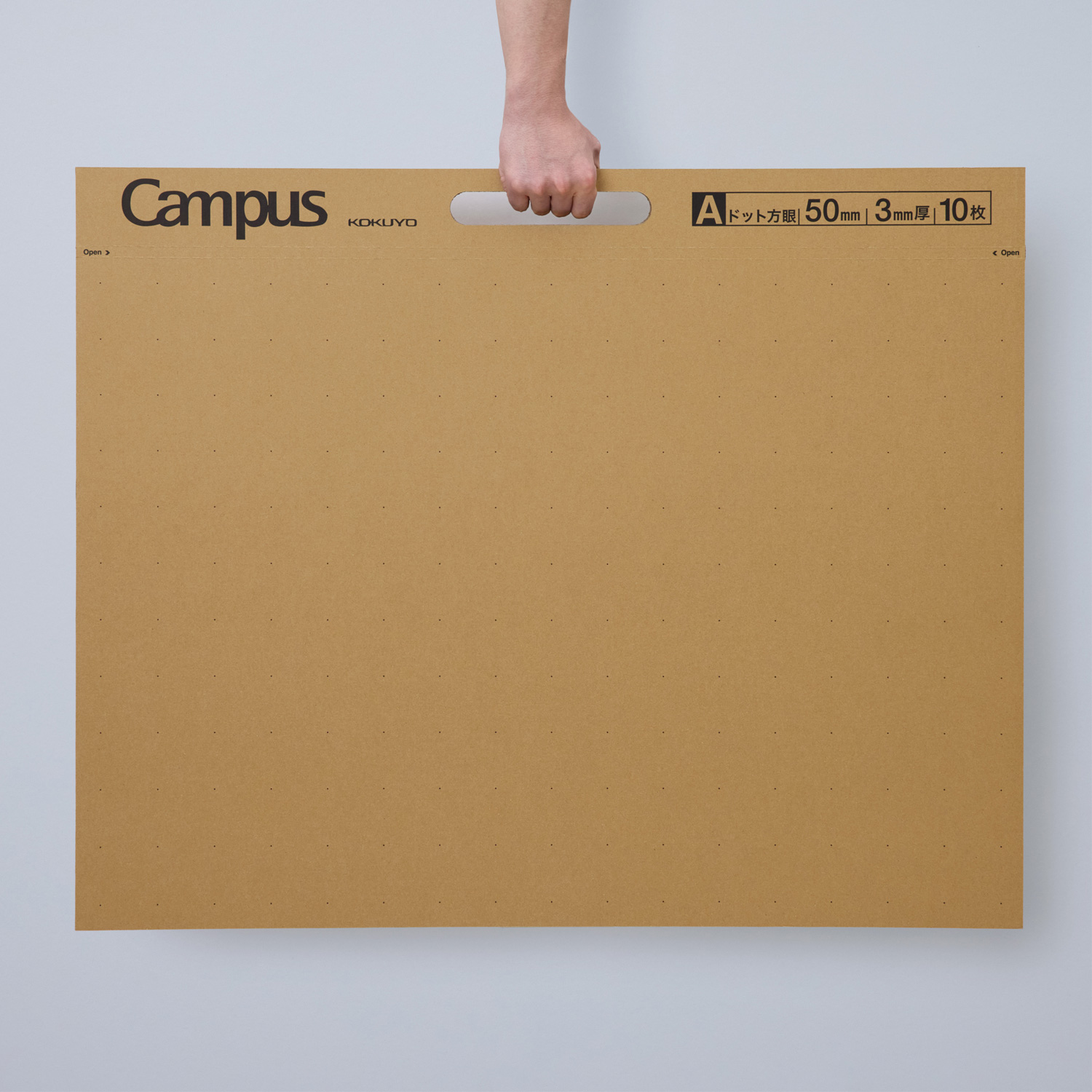
title
Campus Cardboardpad
creator
HASNICCA (Shunya Kokubo, Keishiro Nakahira, Ryunosuke Taketomi)
Description
When I was a child, I used cardboard as a material for crafts, and it was tough and responsive to all kinds of ideas.
I believe that this experience of repeatedly cutting and pasting was an original experience of prototyping.
Campus Cardboardpad is a book that brings together such "cardboard" as a material for making things.
Children's inspiration spreads wildly at will.
Designers' inspiration through repeated trial and error.
Campus Cardboardpad is designed to be tough and responsive to all kinds of inspirations.
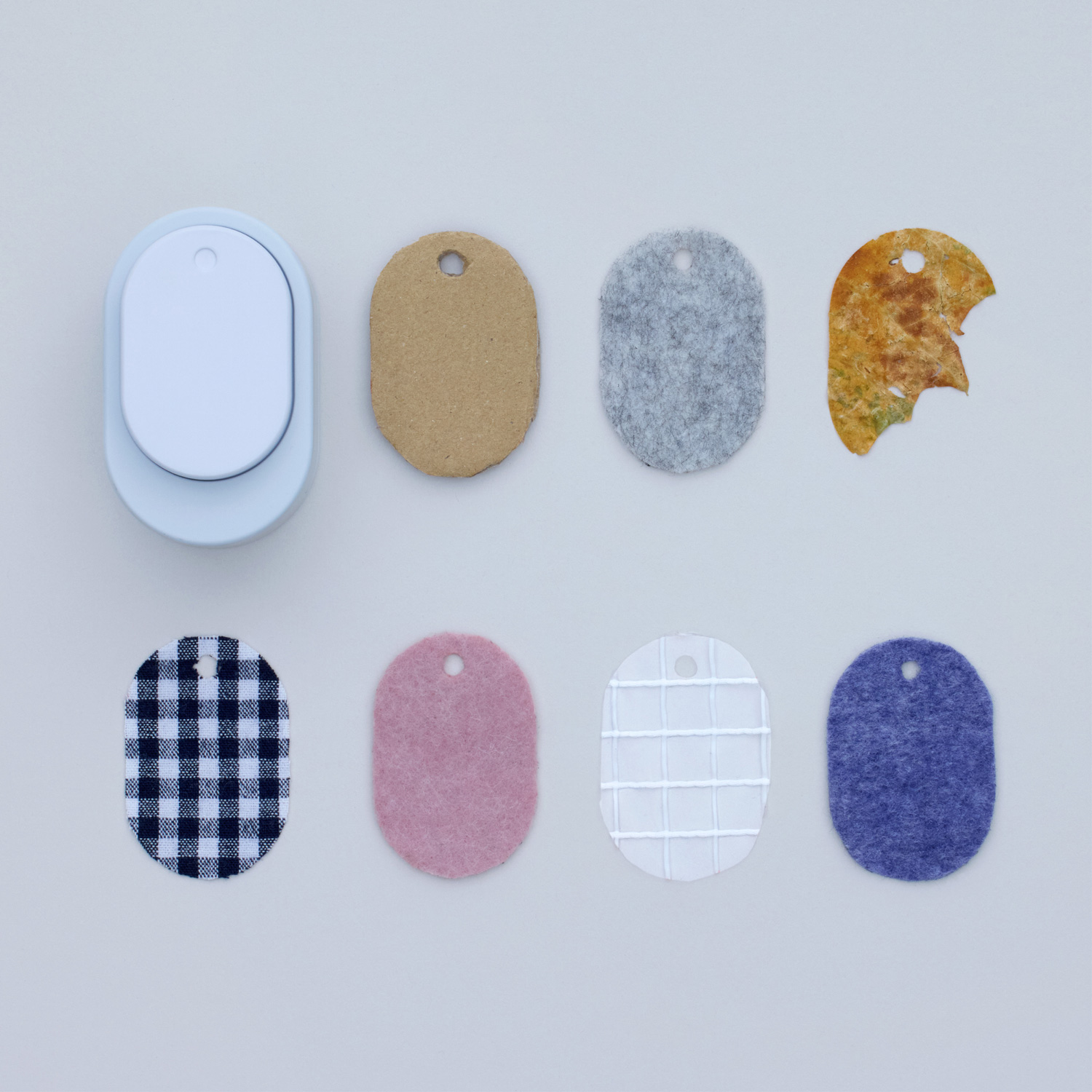
title
material tag punch
creator
Yukiko Iwasaki, Ryo Matsuoka
Description
Material Tag Punch is a product for tagging and storing materials found in everyday life.
Examples include leaves you picked up in the park, wrapping paper you found fascinating, or favorite clothes you can no longer wear.
By punching in a variety of objects, you can stockpile tips for new ideas.
Genral comments by the judges
* Judge occupations and titles current as of the time the individual served as judge.
Shogo Kishino
Representative of 6D-K / Art Director and Graphic Designer
There are various possibilities before a prototype can be created, and these situations are depicted as arrows in the key visual. There were many different interpretations of the word "prototype," but most of the entries were high quality and showed the applicants' seriousness and enthusiasm. These were wonderful works that showed layers of thought and a chain of thought.
Tsuyoshi Tane
Architect, Representative of Atelier Tsuyoshi Tane Architects
I believe that the sincerity of the proposals that addressed the theme of "prototype" led to the high quality of this competition. The accuracy of the participants' mock-ups (samples) was also very high. The last time I complained that this was not enough, they took it seriously and confronted the problem. I felt it was highly worth seeing. Various types of testing were carried out, not just testing of objects and materials, but also testing of emotions, and the level of thinking had reached a high level. This year's competition was outstandingly good, generating essential design discussions even among the judges and providing an opportunity to learn a lot.
Nao Tamura
Designer
I was concerned that the theme would be considered a "prototype" and that the level of perfection would be low, but in fact, all of the works were highly complete. They interpreted abstract themes from their own perspectives and presented them well. For designers, the prototyping phase is an exciting time when they can genuinely give shape to their ideas without restrictions. The applicants also showed fun and flexible thinking, rather than being logical. I think it was a theme that allowed pure ideas to take shape.
Teruhiro Yanagihara
Creative Director and Designer of TERUHIRO YANAGIHARA STUDIO
An unprecedented discussion arose. For designers, prototypes are indispensable for development and ideas, and it was both refreshing and expected that they dared to question the meaning of the theme, as well as to consider the essence of what it means to be a designer. The works gathered responded to this. It was so paper-thin that the outcome of the awards depended on the way the judges thought and discussed the issues. The review generated meaningful discussion.
Satoshi Yoshiizumi
Designer, Representative of TAKT PROJECT
They were all excellent works. We had considerable discussions about how we interpreted the theme and what our evaluation criteria would be. One guideline for the judging was the term "catalyst" used in the theme description. As society changes, people are asking themselves what product design is. Not only giving the intended use, but also triggering the recipient's ideas and feelings like "catalyst." I feel that this was an opportunity to think about and open up the possibilities for the "prototype" that such product design can have.
Hidekuni Kuroda
Representative Corporate Officer and President, KOKUYO Co., Ltd.
Even the judges had different perspectives and criteria for evaluation, and the judging was a lively exchange of opinions. It was a difficult topic, but the presentations continued to be inspiring. It was a high-level competition that made us share the experience of what design really is. In times when the future is uncertain and the right answer is not clear, it is important to give shape to ideas. It is a great clue that so many people participated in the creative approach to design and that great work was gathered. The number of applicants from overseas is also increasing. We would like to develop this competition into one that is open to a wider range of young people as well.
Trophy
Shogo Kishino, one of the judges, worked on the key visuals and art direction of the trophy and award certificate. KOKUYO’s representative designers Chise Sumida and Yume Goto, also had a part.
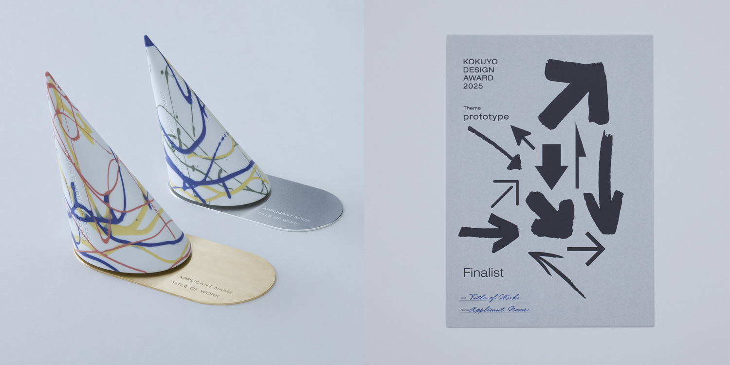 Left: Trophies Right: Certificates
Final Judging / Winning Design Announcement / Talk Show
Final Judging
Nine finalists met this year’s theme “prototype” head on, and gave impassioned presentations.
The judges listened to them earnestly, and judged the entries with five points in mind: The idea’s clarity, The idea highlights social issues, The design’s potential to become a product.
Winning Design Announcement
On March 15, the final judging for KOKUYO DESIGN AWARD 2025 was held. One Grand Prix winner and three Merit Award winners have been selected. Out of the 1,448 works (716 from Japan and 732 from overseas), Toshiyuki Kawada’s “NEWRON” was selected as the Grand Prix.
NEW GENERATION AWARD
The NEW GENERATION AWARD was established to encourage the young generation who will lead the next age to challenge themselves. Works submitted by students to the KOKUYO DESIGN AWARD 2025 are judged based not on whether they can be commercialized, but on whether they have appealing ideas and viewpoints.


