


KOKUYO DESIGN AWARD 2022
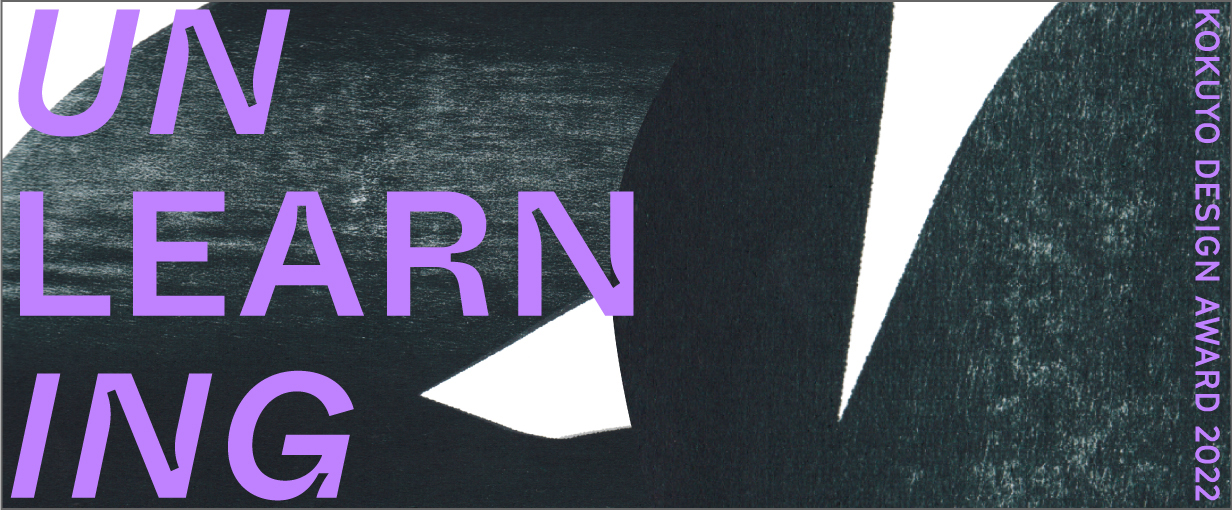
2022 Theme: “UNLEARNING”
We have received 1,031 works from in and out of Japan (555 from Japan and 476 from overseas).
The 10 designs that passed the first round judging will undergo final judging on March 12, 2022.
One Grand Prix winner and three Merit Award winners have been selected.
Grand Prix
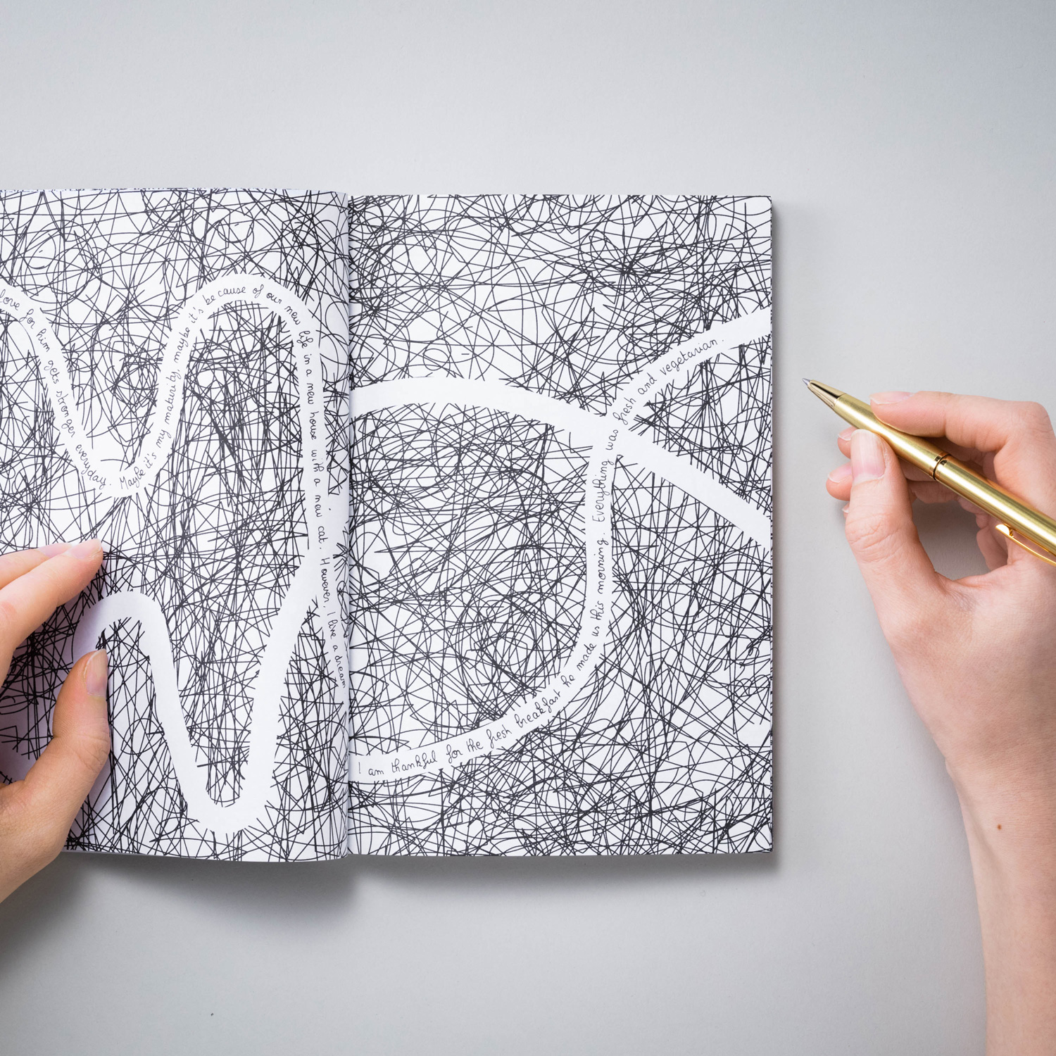
- title
- Flow of Thoughts
- creator
- Emilie & Joseph (Emilie-Marie Gioanni, Joseph Chataigner)
Description
“Flow of Thoughts” will be the diary to sort out your thoughts. A minimalist journal made for a maximalist world. Day after day, unload the unnecessary words into the scribbles, write the important ones in the line of thoughts.
The ultimate goal is to silence the multiple voices in our heads, decrease the mental load while creating a meaningful memory. It is important for our mental health to become a minimalist of thought by selecting them carefully.
“Flow of thoughts” is a personal development tool in itself.
Take care of your head, write a line.

This entry encourages new ideas by rethinking the traditional white notebook, restricting writing space to one area with scribbled lines covering the rest.
How effective those restrictions are will need to be checked out, since everyone organizes their thoughts differently, but this is a great start. We disagreed in the Final Judging about this becoming the Grand Prix winner based on how effective it would be for idea flow versus writing freely, but I did personally accept it as it was a diary rather than a notebook.
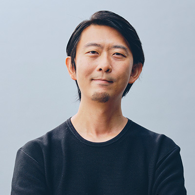
Masashi Kawamura
We judges kept finding new value in entries as we discussed them during the Final Judging, but this one was particularly difficult. My experience working in France led me to believe that designs need the sturdiness to go up against others and open a path for the future of our existence, intelligence, and thoughts. This entry is clearly limited in how it can be used, and it asks what exactly design is. Perhaps from its insight into the act and spirit of writing words in the midst of digitalization progressing, I felt this one had a rare charm: as I looked at it, I could see more and more how creatively it could be used.
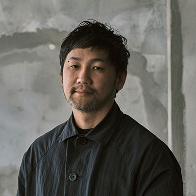
Tsuyoshi Tane
This entry takes a unique approach to the UNLEARNING theme and is well-suited to the Grand Prix prize. I'd also like to praise the fact that the designers' concept didn't waver from the start, and they tried to improve it even further. The pages were completely black aside from the white lines in the first round of judging, but they changed that to scribbled-in noise for the Final Judging. Being able to write negative things on that noise but not see them, thus allowing you to also write things you want to forget as entries, broadened the scope of who may use this. It's really impeccable—a conceptual entry that you can still envision in use.
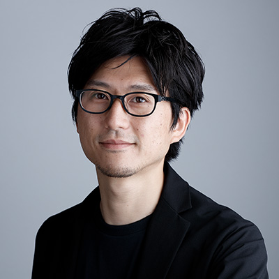
Teruhiro Yanagihara
I wondered at first if the concept's print placement was too restrictive, but others helped me unlearn during the judging, and I ended up voting for it. Designers can put their own subjectivity aside and create for completely objective reasons when proposing new values and rules through designs, but this entry, with its swirling scribbles and white lines, show the creators' worldview. That's a strong point for this one, and it'll really intrigue people.
Satoshi Yoshiizumi
From a commercialization standpoint, we have to consider whether or not the winning entry is both experimental and feasible. This one had a great balance of those two. Commercialization may be tough in some aspects, but I hope those at KOKUYO will put their heads together to figure it out. An overseas entrant won the Grand Prix again this year—just like last year—and I'd be happy if this award becomes a way for KOKUYO to connect with overseas customers, too.
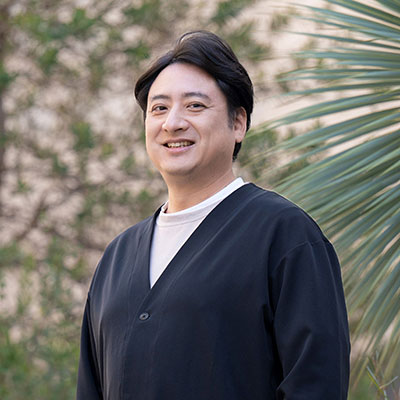
Hidekuni Kuroda
Merit Award
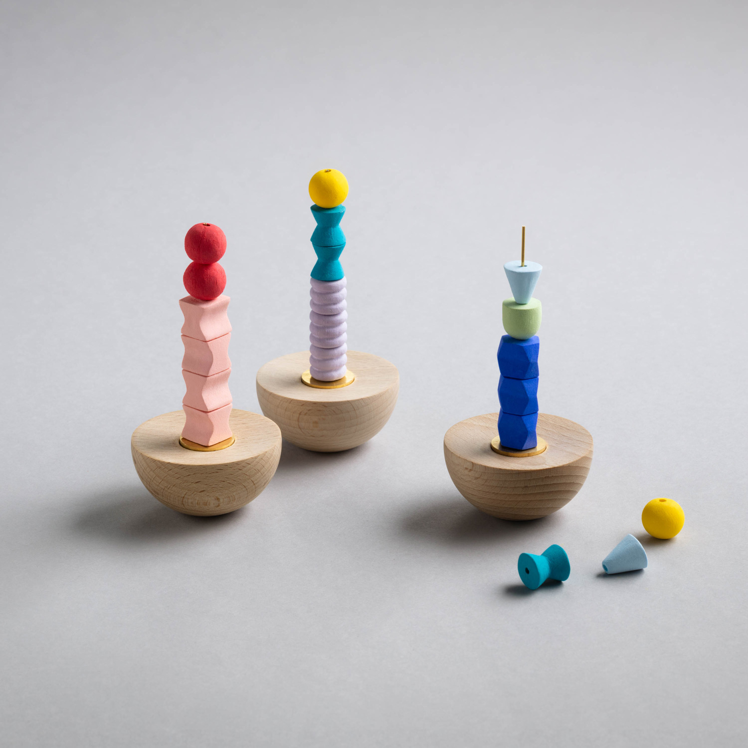
title
tokiwokumu
creator
mrk (Miho Takeichi, Kazumi Ueda, Ryo Kobayashi)
Description
This incense clock combines a variety of shapes and fragrances to design your next hour through incense blocks. It was born from the thought that I wanted my own rhythm back within my hectic daily life. The changing fragrances gently let you know time is passing through your sense of smell, and at the same time, change the mood. I would like people to use it when drawing, writing, reading, practicing mindfulness or yoga, doing outdoor activities, or anything else that feels like me time.
It's very cute, and I can easily imagine time passing by with the changing fragrances; this entry made me want to try it out.
Although hurdles may arise when commercializing it, I appreciated its appeal as an item, how the creativity jumped out, and how well the design was crafted.
Masashi Kawamura
We've seen scent-related proposals before, but there were always doubts about the compatibility between stationery and scents, and I was never able to praise them. This entry feels somewhat like listening to music. I felt the design's meaning within the idea of entrusting time to the scents that change along with it, just as I'd do with tracks on an album. I hope to see further improvements after their technical tests.
Tsuyoshi Tane
The novelty of their idea to turn a certain time's emotions into a scent, along with them checking that their colors and shapes fit the concept, were both good points. Despite that, I'm worried that these good points will become issues when this is released as actual incense. I look forward to seeing them continue improving it.
Teruhiro Yanagihara
Time is an extremely vast concept that creates a common perception, so I think many designers planned to create something related to it. Among those, this entry effortlessly linked the elements of time and scent. However, some parts of the model left unanswered questions about how useful it is for the UNLEARNING theme.
Satoshi Yoshiizumi
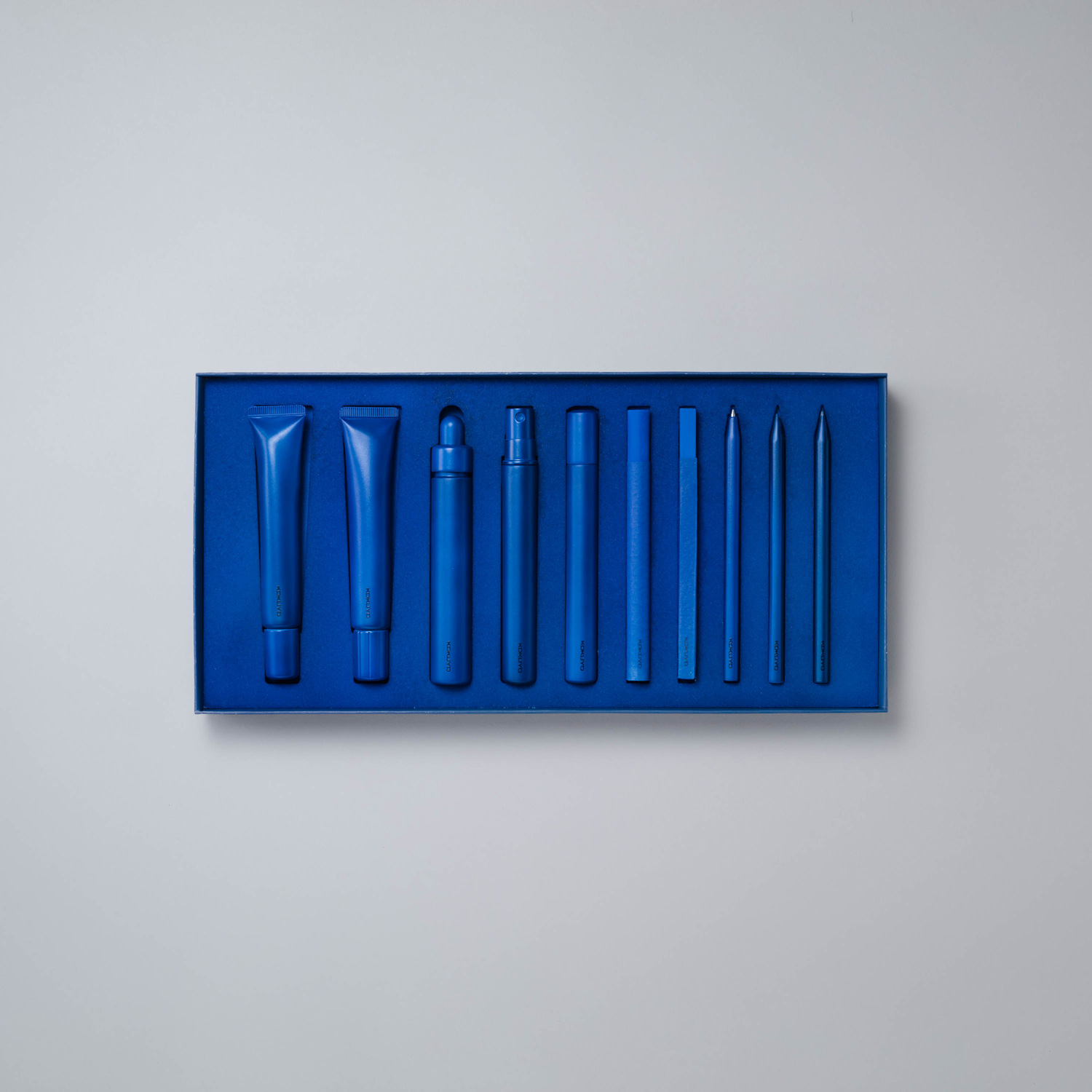
title
Texture Sketchers
creator
21B STUDIO (Shotaro Tokioka, Koeda Kobayashi, Daijiro Arimura)
Description
This proposal is for an art supply set that lets you draw various textures. This product expands the world of texture that you wouldn’t usually notice—like materials and artistic effects—through working with supplies of the same color that have different properties.
Like some artists are skilled in color usage, others may discover they are skilled in texture usage. Some children may play with texture differences as if they were color differences. You may find that you think and choose an item by texture rather than color.
I hope this product brings about a future where it’s normal to draw in multiple textures, just as it’s now normal to draw in multiple colors.
This wonderful idea focuses on differences in texture by offering only a single color, encouraging users to discover that the colors they draw with actually have textures.
Sadly, it couldn't win more than a Merit Award because the pictures drawn with it in the workshop didn't entirely convey what's great about using it. We may have liked it more if we could've seen different artistic effects mixed to create an interesting outcome.
Masashi Kawamura
The designers' idea and presentation were great, and their talent is thrilling. However, it was hard to understand their hierarchy of thoughts, or what they thought at what stage. Whether they're just throwing it out there and giving their entry freedom or entrusting the possibilities to the user was questionable, and that caused controversy during judging. Designs aren't just about ideas, so I want them to trust the process of making things and think hard about everything from how to make to how to use their design. I hope to see progress in the future.
Tsuyoshi Tane
We've seen entries that focus on color before, but the concept of limiting the colors to give users new perspectives and insights felt fresh. These tools being limited to a single color and thus having both a color and textural element highlighted a value that's been overlooked, and I thought that fit the idea of UNLEARNING.
Teruhiro Yanagihara
This was a strong, vibrant response to the theme. Products themselves stipulate our viewpoints and ways of thinking surprisingly often, and color is part of that. While it does shake up a perception that was previously considered standard, it also offers a strong degree of unlearning. Thus, the designers need to consider how they can reach users with existing perceptions and whether they'll accept it.
Satoshi Yoshiizumi
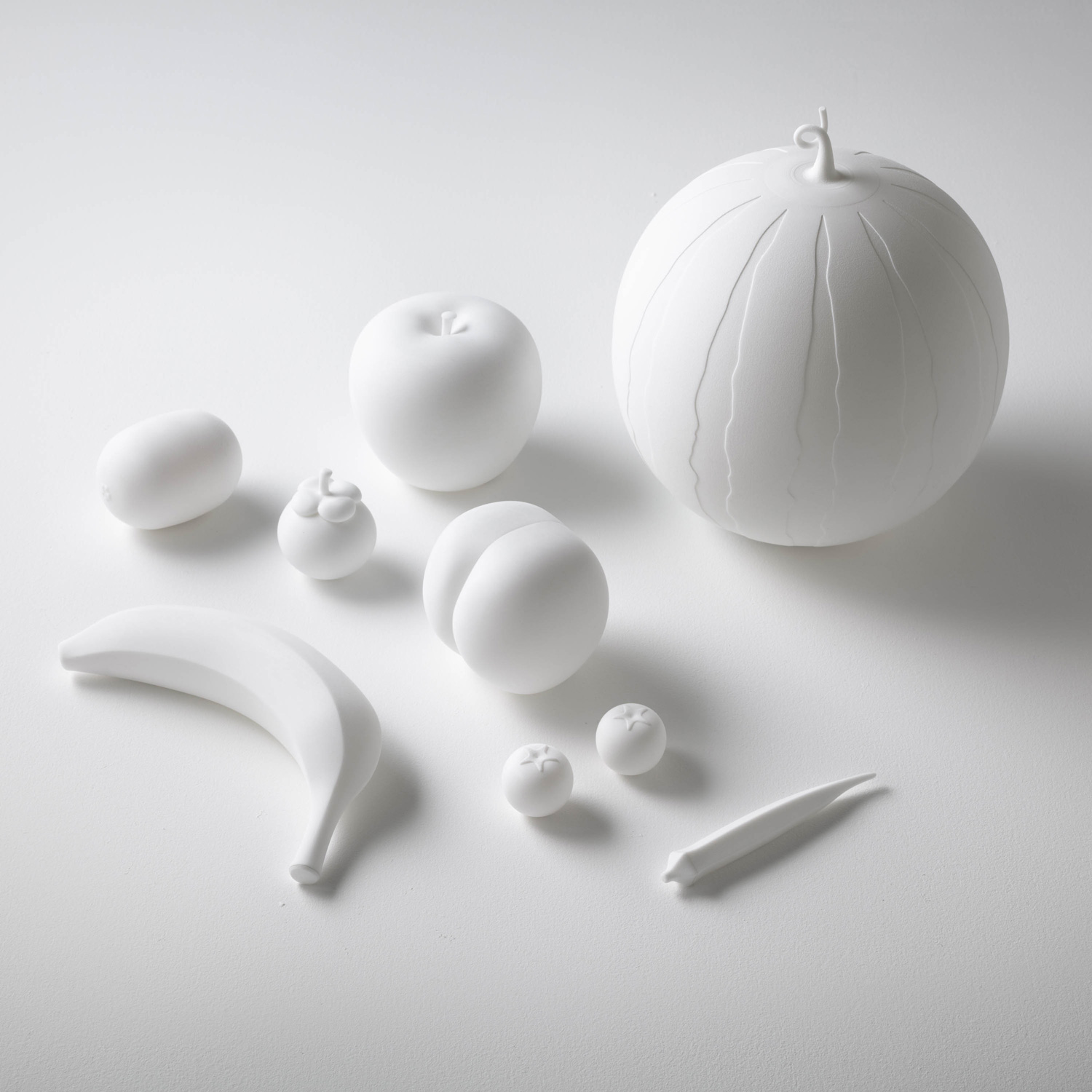
title
Fruit Instruments
creator
21B STUDIO (Shotaro Tokioka, Koeda Kobayashi, Daijiro Arimura)
Description
These shakers mimic the structures of fruit down to seeds and bunches. Through shaking or rolling them, each fruit makes its own unique sound.
This product promotes interactions between sensations—listening with the eyes, and seeing with the ears—through imagining sounds based on shapes and imagining contents based on sounds. This gives you a new perspective on the five senses.
I hope that using these instruments to explore the five senses will lead to a rich imagination.
This entry is a smart idea—the beautiful shapes make you want to try them out, and they're fun when you do make noise with them.
I might've been more impressed if I could've seen how well they aligned with the UNLEARNING theme. They could be nice products, so I hope the designers aim to commercialize them while paying attention to the materials and details.
Masashi Kawamura
I think the advantage of being a unit is that they can discuss from various perspectives when creating a concept. The idea of non-visual information from rattling fruit seeds giving way to imagination is wonderful. However, if they had tried a bit harder to create situations where various people use their product instead of just having conforming discussions, they could've possibly made something even better.
Teruhiro Yanagihara
The concept and story are interesting, the entry looks good, and they did an amazing presentation. When I looked at the items themselves, though, I was a bit concerned that they're made of plastic. Humans perceive what things are with their whole bodies, so the plastic feel didn't resonate well with the concept for me. I hope to see them further improve these in the future by instead using the shapes to highlight the parts that can't be explained in words.
Satoshi Yoshiizumi
KOKUYO also has businesses related to early learning and education, and this entry fits well into those areas. Making the inner seeds from wood was also a great improvement. However, it would've been even better if the designers proposed when they could be used, such as an adult and child using them to communicate and stimulate their intellectual curiosity.
Hidekuni Kuroda
Genral comments by the judges
* Judge occupations and titles current as of the time the individual served as judge.
Masashi Kawamura
Chief Creative Officer of Whatever Inc.
The UNLEARNING theme was probably difficult because it can be interpreted in so many ways, but we received a plethora of entries from within Japan and overseas. All of us judges had to decide together what we should choose based on as we went through the judging, and that dialogue taught us a lot. I think we placed more emphasis on the prototypes and presentations this year than usual during the Final Judging. The part of the prize-winning entry that served as an answer to the theme was well-refined.

Tsuyoshi Tane
Founder of Atelier Tsuyoshi Tane Architects / Architect
The aim of the UNLEARNING theme is to rethink common sense and assumptions in places like this stifled society, our production system until now, and modern mindsets. We received a variety of entries as a result, and it became an opportunity for us judges to rethink ourselves, our points of view, and how we judge. During the Final Judging, us judges were even divided in our discussions and we discovered value in each entry as we went along. I also felt that the judging happened as we went through that process.
Teruhiro Yanagihara
Designer
I worked on key visuals this year, and I also thought deeply about UNLEARNING. The word has no direction and can be perceived many different ways, so the entrants' intent wasn't fully conveyed through the sheets in the first round of judging this year, unlike last year, and many entries made me want to see the real thing. I was also impressed that the judges were judging from abstract mindsets and perspectives, using the word UNLEARNING in a number of ways and consciously circling back to the theme.
Satoshi Yoshiizumi
Principal of TAKT PROJECT Inc. / Designer
This was my first time joining the judging, and I felt that each entry was very advanced. The UNLEARNING theme is very free, so individuals' starting points—what they focused on, how they viewed the world, etc.—were more important than ever. Expectations were high for creativity that differed from solutions to problems that had already surfaced. We judges also had to unlearn and go through the judging while unraveling issues by coming to agreements. We appreciated designers that unabashedly expressed their own viewpoints and entries with strong convictions related to UNLEARNING, and we felt the primordial power of design.
Hidekuni Kuroda
KOKUYO Co., Ltd. President and CEO
Momentarily letting go of the common sense they've known until now through UNLEARNING must've been difficult for the designers. We saw them struggle in the first round of judging, but our assumptions were betrayed—in a good way—in the Final Judging. KOKUYO is also making more efforts to reinvent ways of thinking, so everyone's challenges have become a great learning experience for us. We're also very pleased to have established ourselves as a global design award, given factors like over half of the entries coming from overseas.
Trophy & Certificate
The trophy and the certificate of commendation have been newly designed in line with the theme “UNLEARNING”. A virtual trophy allows one to share joy with others in the remote communication age, and a certificate of commendation is a “card key” to access the trophy.
One trophy with 1031 elements, which are the same as the total number of applications, is completed every month, and one can enjoy 12 types of trophies in one year. One year after all the changes are shown, the 3D data with NFT will be given to the award winners.
The certificate of commendation is made of copper plate instead of paper, in appreciation for its original bronze one. The surface is finished using the coloring technique of Toyama Takaoka copperware, and each piece has a different texture.
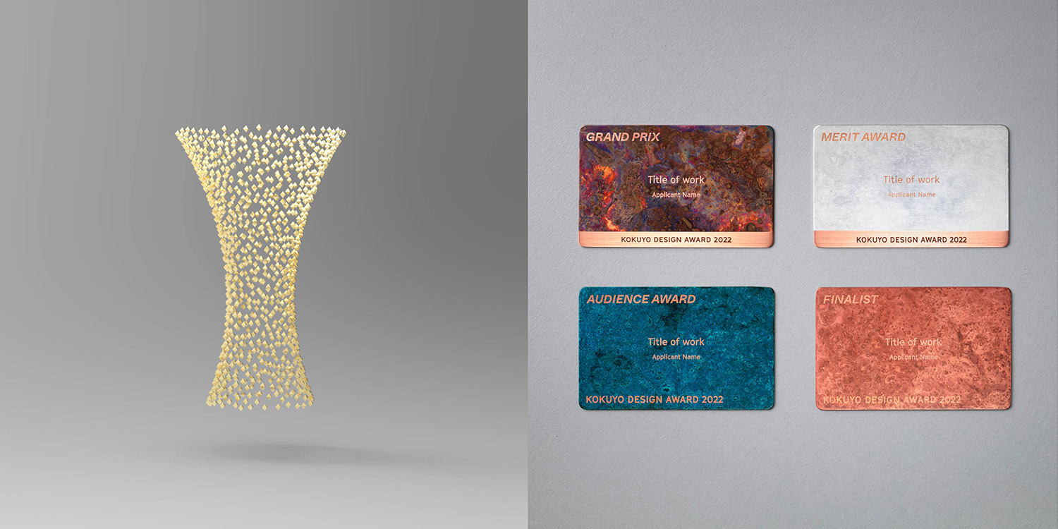 Left: Virtual trophy Right: Certificates
Final Judging / Winning Design Announcement / Talk Show
Final Judging
Ten finalists met this year’s theme “UNLEARNING” head on, and gave impassioned presentations.
The judges listened to them earnestly, and judged the entries with three points in mind: how the theme was interpreted,how finished the product designs were, and whether the design could be made into a commercial product.
Winning Design Announcement
The KOKUYO DESIGN AWARD 2021 Grand Prix winner is “Flow of Thoughts.”
This year again, owing to the spread of COVID-19, the Final Judging and judges' talk show took place without an audience, and were streamed live online.
The entries were of high quality, and almost half were from abroad. We were able to demonstrate the quality of the design competition and its high level of global recognition.


