


KOKUYO DESIGN AWARD 2018
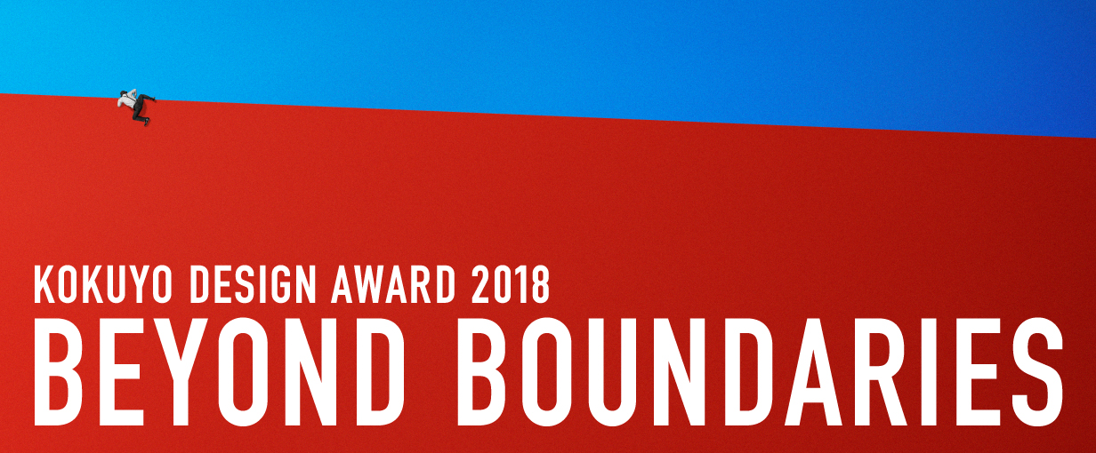
2018 Theme: “BEYOND BOUNDARIES”
We have received 1,289 works from in and out of Japan (766 from Japan and 523 from overseas).
The 10 designs that passed the first round judging will undergo final judging on Janualy 18, 2019.
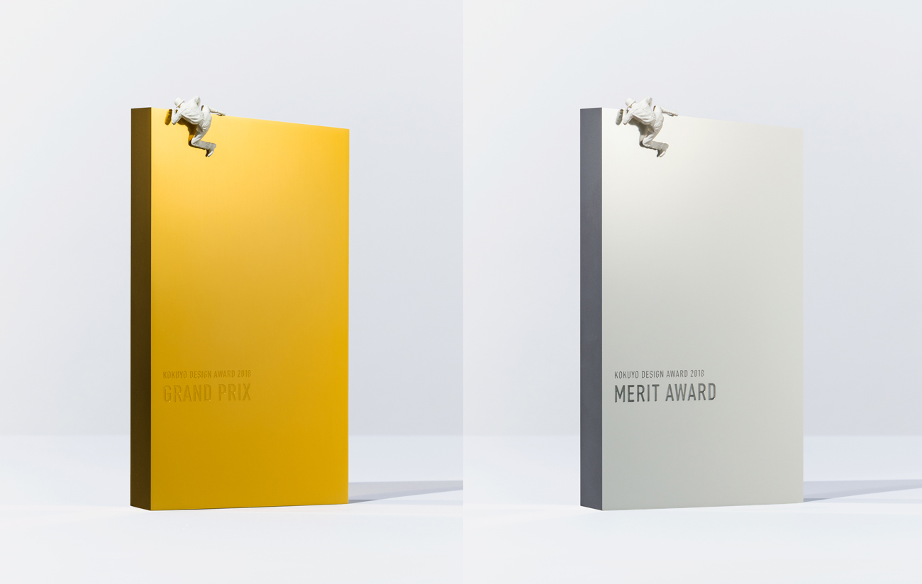
One Grand Prix winner and three Merit Award winners have been selected.
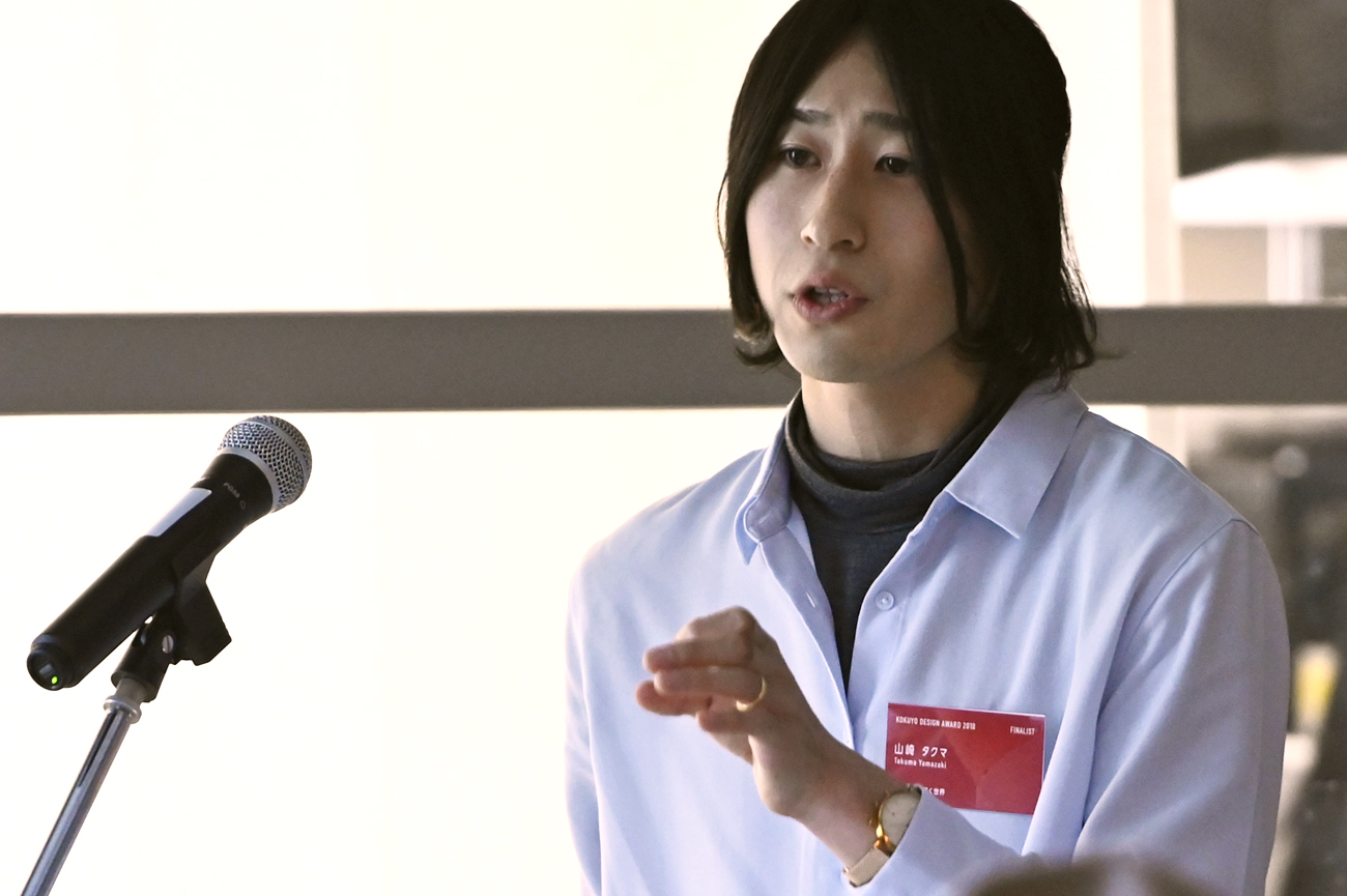
Grand Prix
title
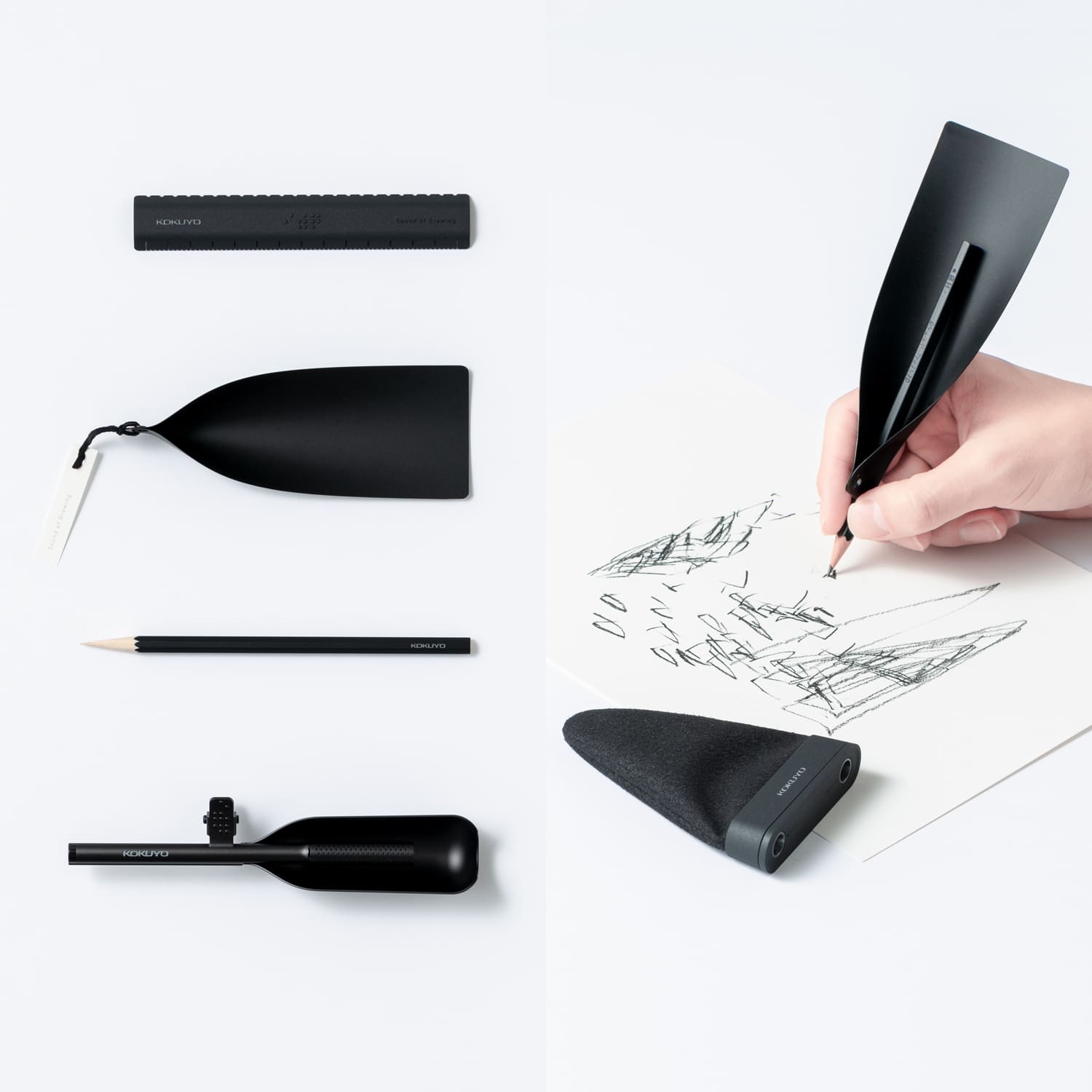
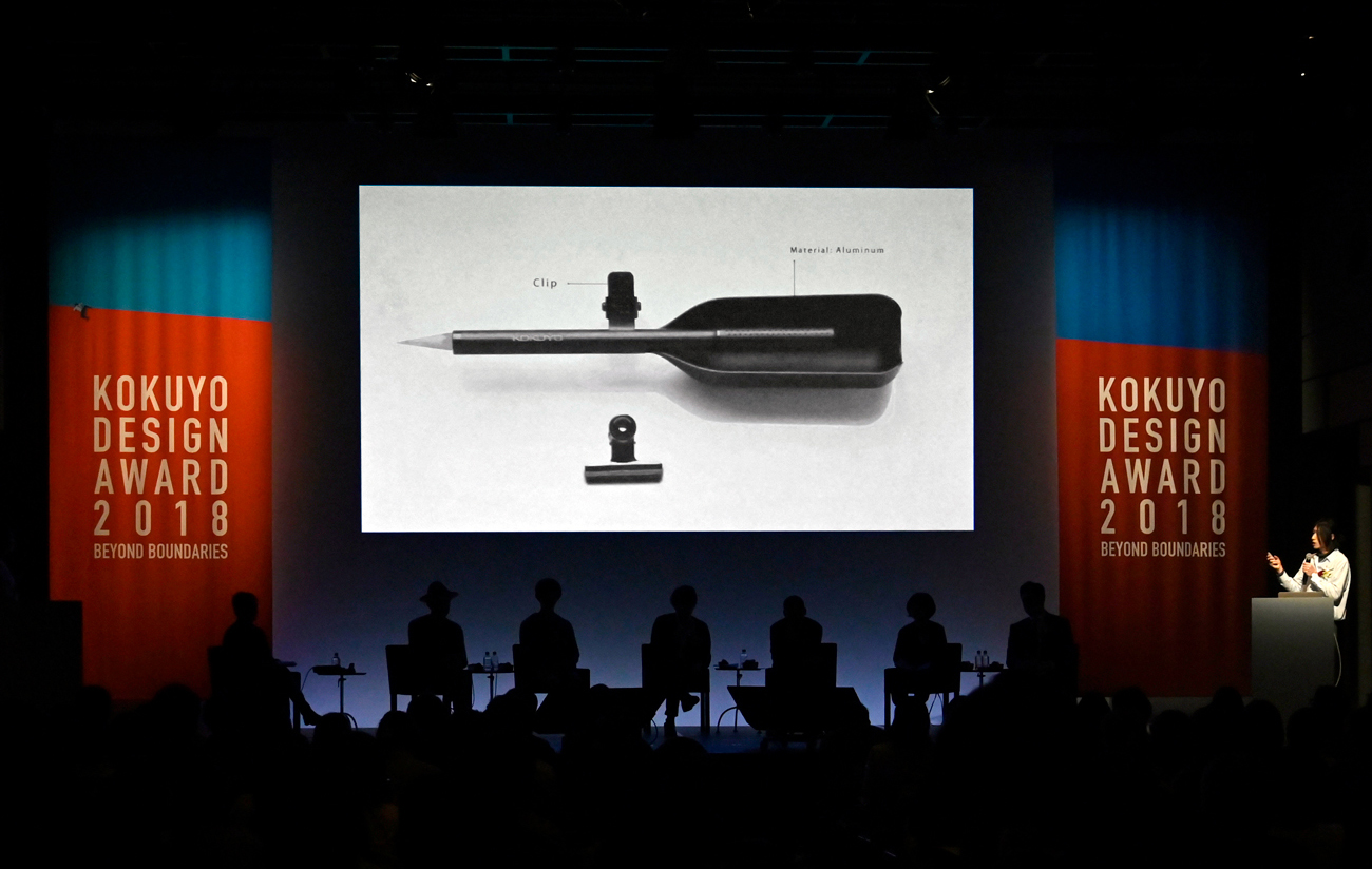
Sound of Drawing
- creator
- Takuma Yamazaki
Description
By amplifying the faint noises created by the friction between pencil and paper, this project represents a new way of communicating with stationery. I reflected on the meaning of drawing, and discovered that stationery can be not only writing instruments, with the purpose of leaving visual information, but also musical instruments. By redefining stationery as creative tools for drawing sounds, this pencil offers a fresh creative experience for both people who are sighted and those who are not.
→ Work Introduction Video(YouTube) ![]() *English/Japanese Subtitles
*English/Japanese Subtitles

Comments by the judges
Through the workshop with completely blind people, the designer pursued the possibility of stationery as a tool for feeling and enjoying sounds. I got the impression that his proposal has opened a new door for stationery. The form of the product has its own charm, just like how musical instruments are unique in shape.
It stimulates our imagination and makes us imagine what kind of sound the product is going to create even before use. The proposal inspires us to dream about a new style of stationery for the future.
Ryosuke Uehara
A pencil is originally a tool for expressing visual information. However, the device he invented based on a pencil stimulates our five senses other than vision and entertains people. His idea completely beat our predictions. He gave a concrete shape to his idea and made the product beautiful and simple. He also proposed a group of products, including a ruler and pencil sharpener, without changing the core of his concept. I have high expectations that his proposal will develop into something even greater.
Masashi Kawamura
The sharp point of view in setting the theme, the process of holding a workshop, how well-designed and well-finished the prototypes were, the experience created through his design— everything was high in quality. He didn’t let his idea remain a random thought, and gave a concrete shape to it. It was exactly what the KOKUYO DESIGN AWARD asked for and he proposed the design in an ideal form. For instance, a group of his products was colored uniformly matte black, and I sensed his strong will that his products would stay true to his original concept of ‘being independent on visual information’.
Oki Sato
The designer created a new way for us to use our senses, and he did it in an analog way, without any modern electronic technology. He created a simple tool that attaches to a pencil—an object that we’ve all been familiar with since our childhoods. I was shocked by the way the design fulfilled a subconscious desire. While I was writing with this pencil, I started to wonder if I was listening to the sounds with my ears, or if my entire body was listening to the sounds through the pencil. I’d never experienced anything like that. It was as though my senses were expanding.
Yasuhiro Suzuki
The sound of pencil was utterly delightful. I kept writing and drawing during the designer’s entire presentation, just wanting to listen to the sound. His idea of perceiving writing with the sound of friction was so innovative—I bet no one has ever thought about that. I look forward to see how this idea is going to develop in the future.
Yoshie Watanabe
Merit Award
title
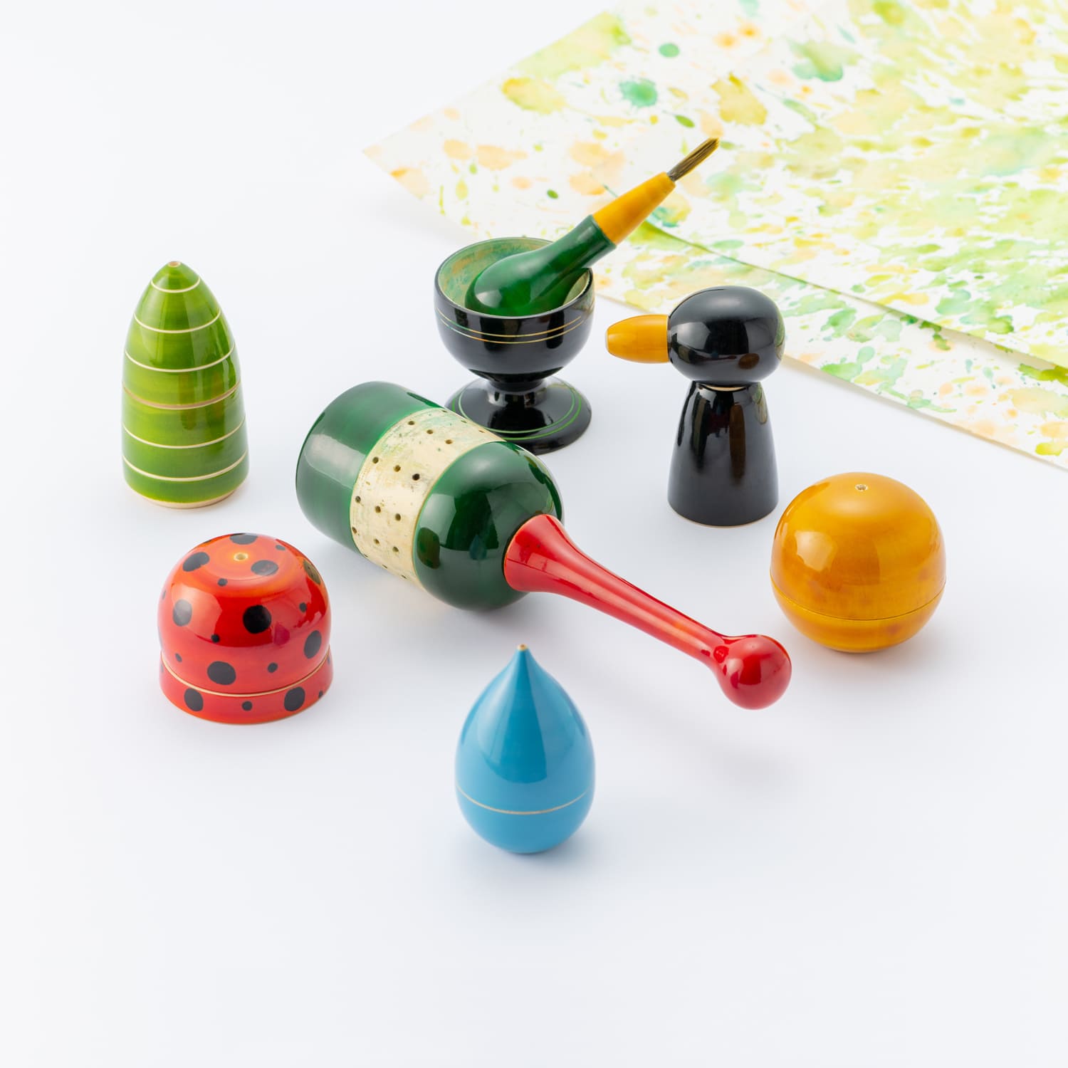
Palletballet
creator
Soch (Athul Dinesh / Ghufran Ahmed / Pranav Kishore Bidwe)
Description
In today's world people are hesitant to showcase their creativity and thoughts in form of art due the fear of judgement and disapproval, especially children. The product is an immersive painting kit which makes the children go beyond the boundaries of conventional painting practices and enjoy the process of drawing and painting. The product will encourage the child to be more free in making their creations and empowers them to explore more. The redesigned painting kit makes it easy for the child to mix colours and create a new colour. The colour pigment boxes in this kit are designed to make this process easy and intuitive. There is also a paint spinner which has a play factor in it, which will give the child a different, playful experience and the paintings made with it will be unique every time.
→ Work Introduction Video(YouTube) ![]() *English/Japanese Subtitles
*English/Japanese Subtitles
Comments by the judges
I felt something that goes beyond logic. This tool also allows adults to draw and paint pictures however their heart desires, calling back their childhood creativity. When you use the spinner, paints fly and spatter, going beyond the boundaries set by flat, square paper. I felt the design went “BEYOND BOUNDARIES” in a lot of ways.
The build of the work is skillful and, at the same time, the product itself is absolutely charming. It is interesting that the design stimulates both the right and left sides of the brain.
Ryosuke Uehara
In an era where new technologies get the most attention, this design has the excellent quality of being created in an old-fashioned way. This sort of approach that brings traditions and old things back to life may be something that attracts universal sympathy—just look at how the judges were fascinated. I love the fact that a design with a traditional, hand-crafted feeling like this one was so highly evaluated in a competition for new designs.
Masashi Kawamura
This could be a design that changes the future of the KOKUYO DESIGN AWARD the way that Commodore Perry's black ships changed the history of Japan. I have the impression that many of the ideas we received from overseas in the past were more difficult to develop into a refined final design. However, although it still has some rough patches, the team created the design with such a high level of quality. This design also responds well to the theme of the award. Many people tend to give up on drawing and painting after early childhood, but the experience offered by this design gives the impression that the boundaries that form as we grow up can be easily overcome, and that is amazing.
Oki Sato
Users create and color pictures with a pottery wheel. The design is the result of prioritizing craftsmanship and pursuing minimalism while maintaining usability. It is not a design that has been polished to perfection to meet the designers' intentions, but it has the elegance of a straightforward design that doesn't try harder than it needs to, which moved me. The palettes and tubes of paint that already exist on the market have a certain coldness. This work, however, offers a new experience—paints burst from this curious object, and you paint a picture by letting things flow naturally, rather than trying to control them. The design holds countless possibilities within it for someone trying their hand at painting for the first time.
Yasuhiro Suzuki
When I first saw the picture of the design, I just thought, "Wow, that's nice." How it might be used was an afterthought. The process of how the work was made in India and the images of children playing with their new toy were included in the presentation, and that left an impression. On top of that, the quality of the actual work was extremely high. Everything about the design, including the color and shape, was beautiful, and I just want to buy it as it is. I think it has great appeal to both adults and children.
Yoshie Watanabe
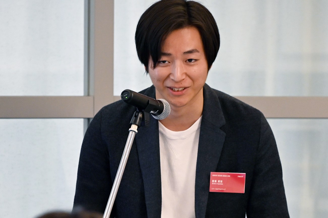
title
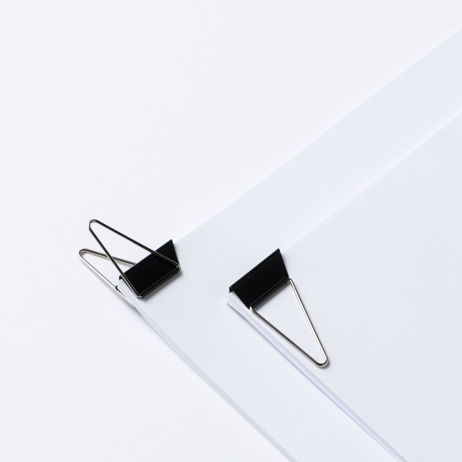
Smart Double Clip
creator
Akihiro Toyofuku
Description
Double clips are very useful when organizing materials, because they can hold papers together and are easy to use. However, they may make documents harder to see when you turn the page. “Smart Double Clip” has the same triangular shape as the corner of a piece of paper when you turn the page, so it allows pages to be turned smoothly. This new double clip is designed not for consumers, but for users.
→ Work Introduction Video(YouTube) ![]() *English/Japanese Subtitles
*English/Japanese Subtitles
Comments by the judges
This design conveys the essence of KOKUYO. Although the idea is simple, it brilliantly surpasses a timeless design that hasn’t changed since its inception 100 years ago. It goes “BEYOND BOUNDARIES” in that way.
Ryosuke Uehara
The design offers a new way for users to interact with documents. One can see how it could be used in everyday life and the potential it has as a commercial product. If this product were sold in stores, I would buy it without hesitation. However, its triangular shape sets a new condition the traditional clip never had: users have to put the clip “in the right direction.” I’m a little concerned that the users will have to stop to think for a moment to make sure that it’s facing the right way before using the clip. Also, the work does not tie in to the theme of the awards very well. However, the design has the power to overcome those weaknesses.
Masashi Kawamura
I think this design might be as big a hit as the "Kadokeshi Plastic Eraser” if it were commercialized. The designer’s presentation skills were also amazing. This design could easily be commercialized, and he could have expanded his scope and proposed a marketing strategy, for example, but he didn’t bite off more than he could chew. He simply refined the strong points of the design, and presented it perfectly.
Oki Sato
This design redesigned the double clip—a great invention that has endured a century. It excited me more than I expected, because I’ve also felt that the existing clips make documents harder to read when you turn the page. At the Initial Judging, I was worried that the clip may become imbalanced when it is opened. However, the prototype exerts force in the right direction and is very well-made.
Yasuhiro Suzuki
He took the design of the double clip, which hasn’t changed for 100 years, and he turned that timeless design into something beautiful and easy to use. Although we’re so familiar with the existing design, he questioned whether it is actually easy to use, and that standpoint was fascinating. I have a feeling that this design is going to be a hit once it is a commercial product.
Yoshie Watanabe
title
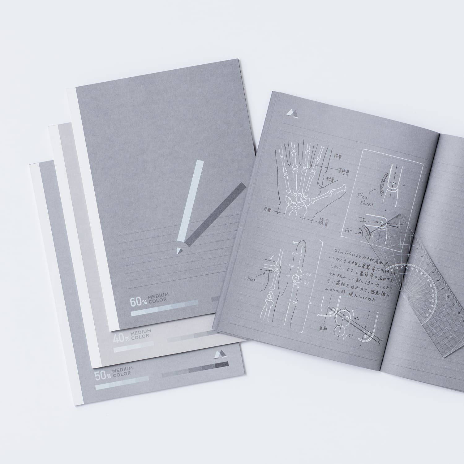
Monochrome Notebook
creator
Kunihiko Nakata
Description
I would like to propose a gray notebook that you can write in with both black and white pens. This notebook utilizes the nature of human eyesight—namely, that letters in bright colors and dark colors on a paper cannot be easily read at the same time. When someone reads a series of black letters and then switches to white letters, they have to change visual channels. By using two different colors, you can concentrate on one color at a time when reading. Use this effect to highlight important parts, indicate additional information, add light and shadow to illustrations, and more. “Monochrome Notebook” takes advantage of the limits of human vision to bring forth new uses for notebooks.
→ Work Introduction Video(YouTube) ![]() *English/Japanese Subtitles
*English/Japanese Subtitles
Comments by the judges
I kept drawing pictures in this notebook throughout the presentation. Unlike with normal sketchbooks, you can express light in this notebook by using white pens. It is very unique and new. Creating a sketchbook with no lines may be a good idea, too.
Although it may be slightly different from the creator’s intention, his design could easily be developed in that direction. I was concerned about one thing: its front cover. It could have been improved if the designer hadn’t overthought it and simply adopted the same front cover as KOKUYO’s Campus Notebook. Then, we would have been able to focus on the ways to use the notebook, which is what he originally wanted to present.
Ryosuke Uehara
I also created a black-colored notebook myself, because I wanted to write with a white pen. So, I really understood how great the creator’s idea was. I understood the logic behind the idea that this notebook increases readability by utilizing different brightnesses. However, anyone would wonder why white paper and colored pens aren't good enough, and he should have given a more persuasive answer to that question, and included examples of situations in which the notebook would be used.
Masashi Kawamura
Although the idea was great, he should have come up with a better structure for his presentation. He prepared some intriguing stories—he included data that showed that the brightness of color is more easily recognized than the hue, and he designed accessories, such as a ruler and protractor. However, the order in which the material was presented was not effective, and he didn’t fully explain his design. I think there was some room for improvement in that respect.
Oki Sato
To tell the truth, I made a pencil based on the theme of the limits of sight more than 15 years ago. But I never thought to change the color of the pages in a notebook. This design was a revelation. We live in the age of digitalization and the Internet, we often see white letters displayed on a black background. This design took that color scheme and turned it into an analog notebook. It was an excellent idea. This notebook offers an exciting experience, both for people who love writing by hand and people who don’t.
Yasuhiro Suzuki
I kept writing and doodling on this notebook throughout the presentation. I feel like new discoveries can be made when drawing with black and white pens on gray paper, even more so than when drawing with colored pens on white paper. It is really fun. I want everyone to use this product once it is commercialized.
Yoshie Watanabe
Genral comments by the judges
* Judge occupations and titles current as of the time the individual served as judge.
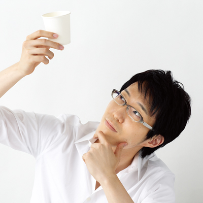
Ryosuke Uehara
CEO, Art Director & Creative Director of KIGI
Today, a variety of creative fields are integrated, and the world of design is freer than it's ever been. I felt the theme of “BEYOND BOUNDARIES” fitted with the times. I was amazed by how unprecedentedly high the quality of each design was at the Final Judging. They presented various ways to overcome boundaries—breaking down the walls of existing genres, connecting individuals in new ways, and more—and showed us the possibilities of design in the future. Everyone who participated in this competition looked like they were having fun, and I have the impression that the award is growing into something that cannot be found anywhere else in the world. I want this award to be known by as many people as possible.
Masashi Kawamura
Creative Director & Chief Creative Officer of Whatever
In this age, the world is connected through the Internet, and boundaries that were once hidden are now surfacing. Entries from overseas have increased, and we have received a wider variety of designs than ever before. Seeing designs created in different countries with different backgrounds was refreshing. This award encourages people to fearlessly break through their shells and move forward together, even if they don’t know what they'll find at the end of the road. I hope that this award evolves into a flexible competition that accepts designs that aim to change society while continuing to value its fundamental themes.
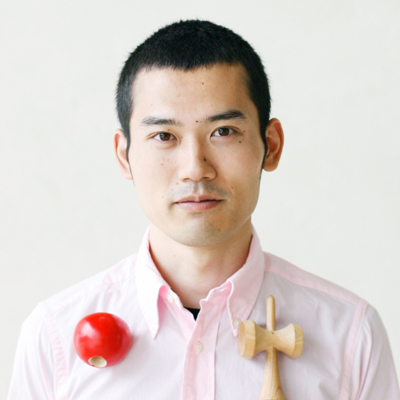
Oki Sato
CEO & designer of design office nendo
This year, the level of each design was extremely high compared to the entries in your average design competition. I was honestly blown away. In the past, many of the entries from overseas were dragged down by rough patches in their designs. However, each of the designs that made it to the final round were high in quality. The KOKUYO DESIGN AWARD has appeared on the international stage. As for the Grand Prix winner, both its concept and the experience that the prototype provided were excellent. Our idea of what design entails continues to broaden. Designing intangible things like experiences comes with the risk of one's ideas being misinterpreted or misused. However, the results of the competition made me feel that designers should never give up on creating.
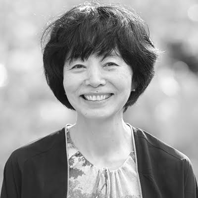
Yasuhiro Suzuki
Artist
The winner commented, “The people around me related to this design and believed in it, and I was finally able to prove its appeal.” In an era of increasing globalization, people tend to focus on finding universal value that everyone desires. However, his design made a leap from an environment close to home and instantly spread to the public sphere. The way he went beyond the boundaries impressed me. The winner of the Grand Prix also stated, “It’s not just about creating things. What I want to convey is what surrounds the creation of things.” I felt that these words hinted that he had ideas for further developments for his design, beyond just commercialization.
Yoshie Watanabe
Art Director & Designer of KIGI
The theme for this year was set in hopes of discovering something beyond just designing objects. It was a difficult theme, but all the finalists created fantastic designs, and I was genuinely amazed. Every design continued to up its level of quality from the Initial Judging on through the Final Judging. I believe that some of the designs that were not chosen for the Final Judging would also be highly evaluated if they had a chance to present. Many of the winners of this competition have sent in their designs many times before their entries were chosen. I hope this award keeps giving creators opportunities to challenge themselves and grow over and over again.
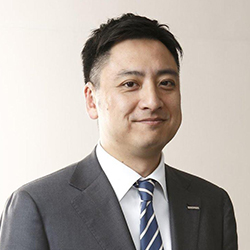
Hidekuni Kuroda
President and CEO of KOKUYO Co., Ltd.
All the presentations given by the finalists were excellent. In particular, the winner of the Grand Prix considered the target audience he was going to create the product for, and his process for creating value and verifying its worth were very moving. Our society is overflowing with things, many of which are being digitalized. Going into the future, what must KOKUYO consider as it creates things? What are the most important things? I felt his entry gave us a supportive push. I hope that this award evolves into a competition that provides great opportunities for both KOKUYO and creators’ careers.
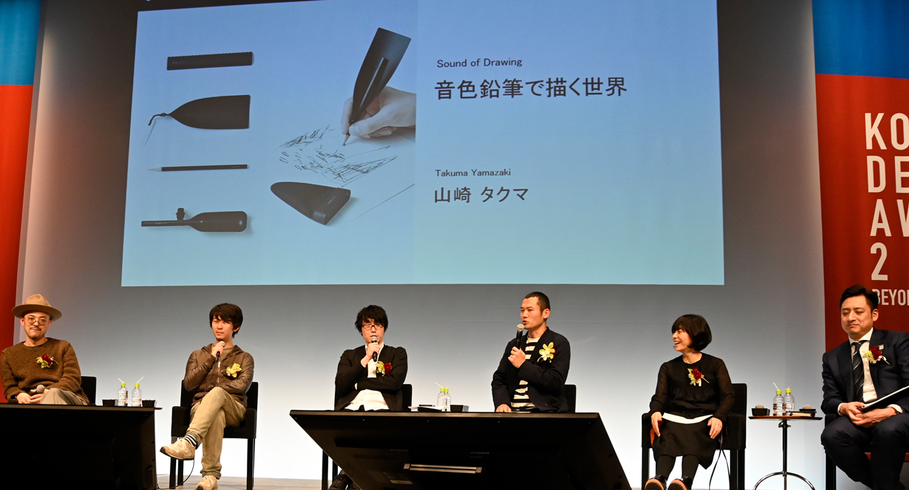
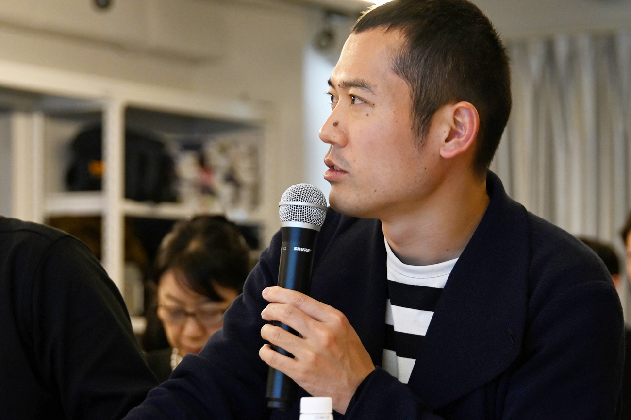
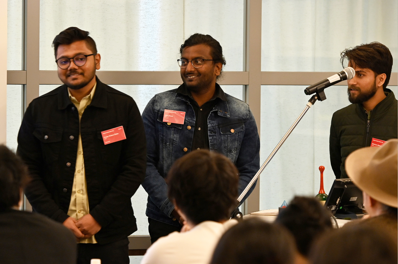
Final Judging / Winning Design Announcement / Talk Show
Final Judging
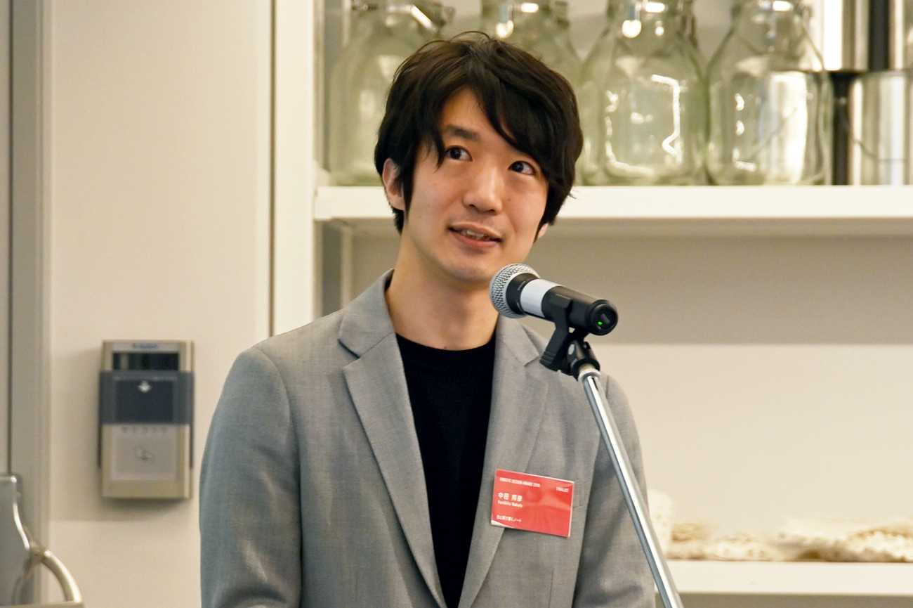
The 10 finalist groups faced up to this year's theme of “BEYOND BOUNDARIES” and gave passionate presentations.
The judges listened attentively to the presentations, carefully considering the concepts, design, and market potential of the designs.
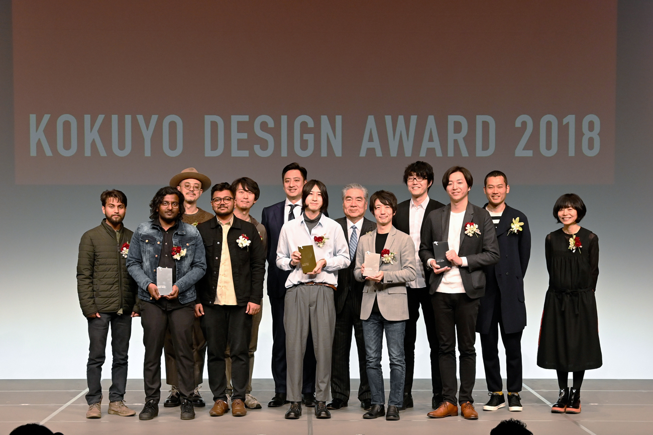
Winning Design Announcement
“Sound of Drawing” was selected as the 2018 Grand Prix winning design.
The prototype of the winning design was on display in the hall, viewed with intense interest by many in attendance. At the event venue, past prize-winning products were also on sale.
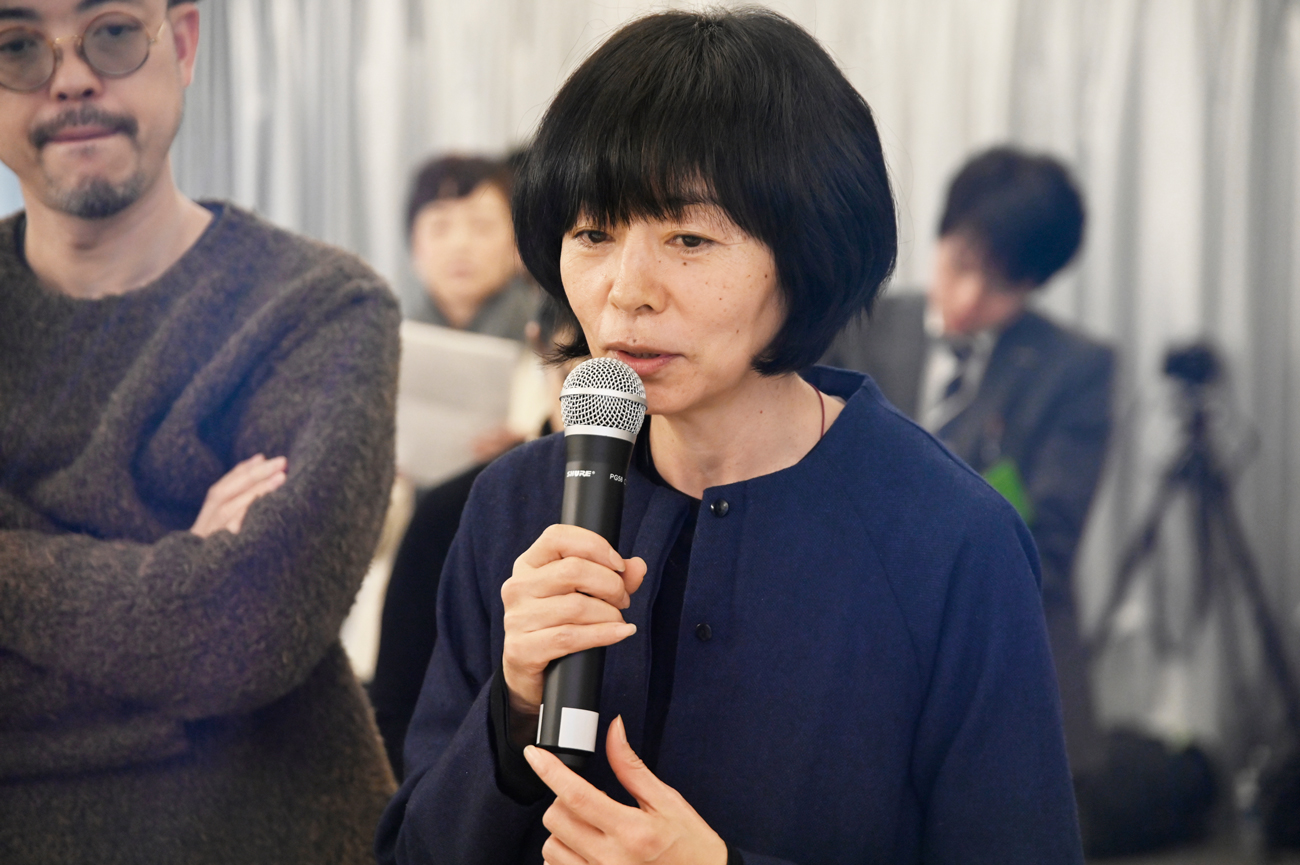
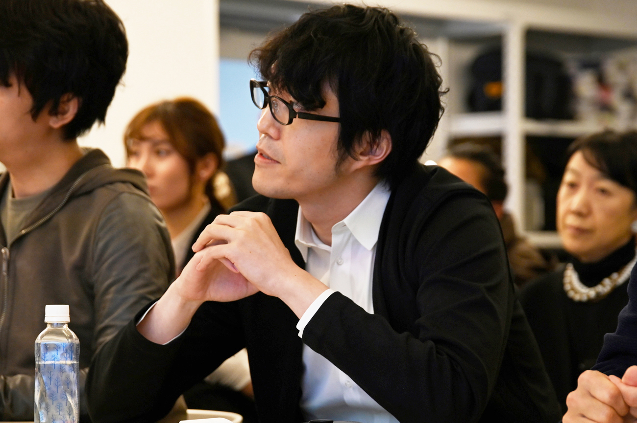
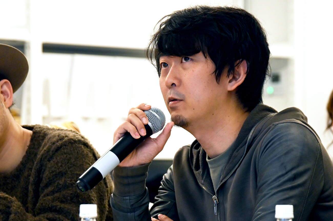
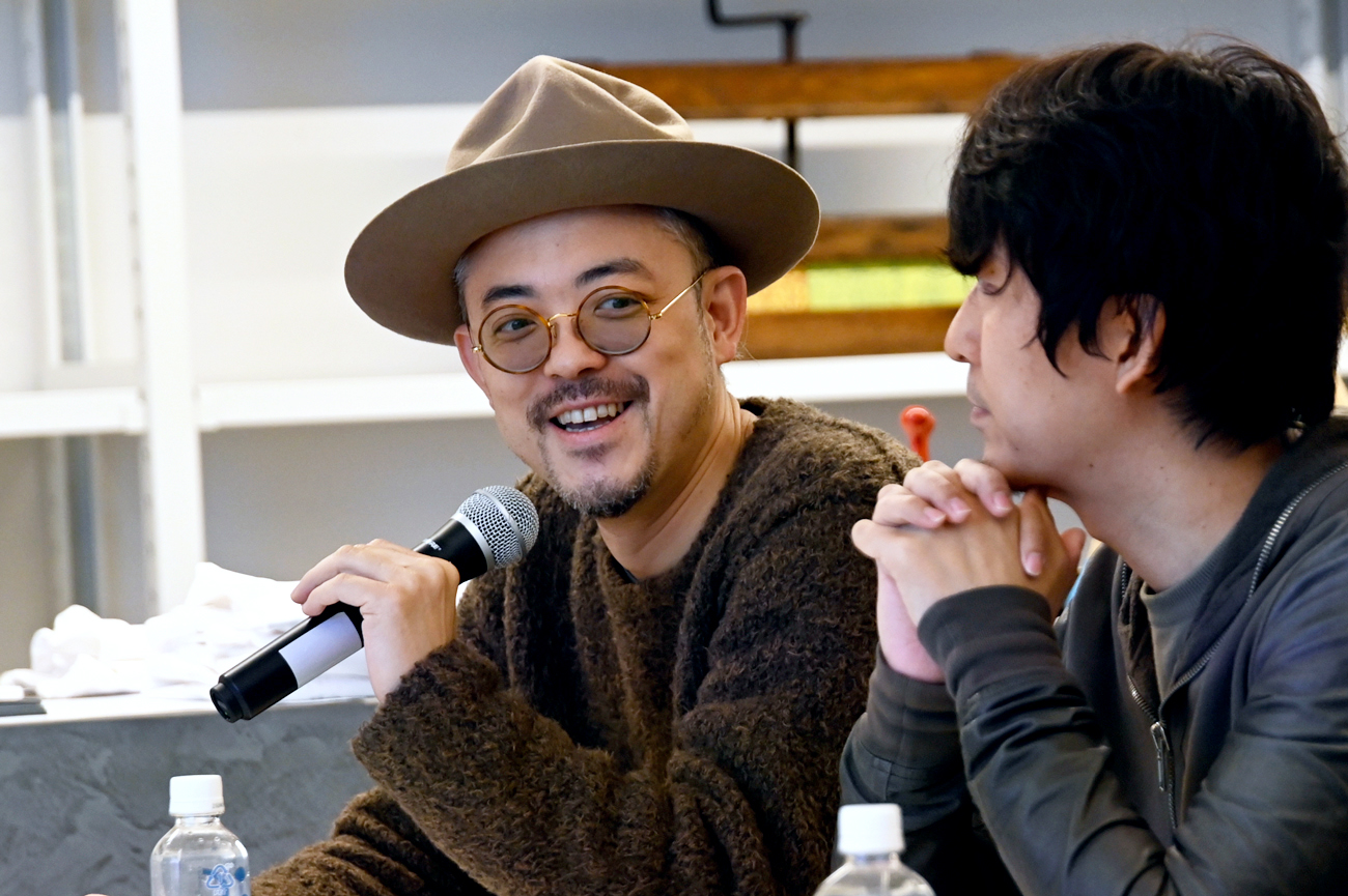
Talk Show
Judges discussed how they evaluated the winning designs based on the contest theme “BEYOND BOUNDARIES”.
Event attendees were enthusiastic and attentive, listening to the insight of judges currently working across a wide range of fields.