KOKUYO DESIGN AWARD 2020
2020 Theme: “”
We have received 1,377 works from in and out of Japan (771 from Japan and 606 from overseas).
The 10 designs that passed the first round judging will undergo final judging on March 14, 2020.
One Grand Prix winner and three Merit Award winners have been selected.
Grand Prix
- title
- Somewhere, Sometime
- creator
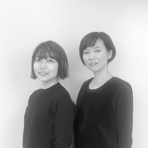
- OBAKE (Natsuki Tomoda, Mai Miura)
Description
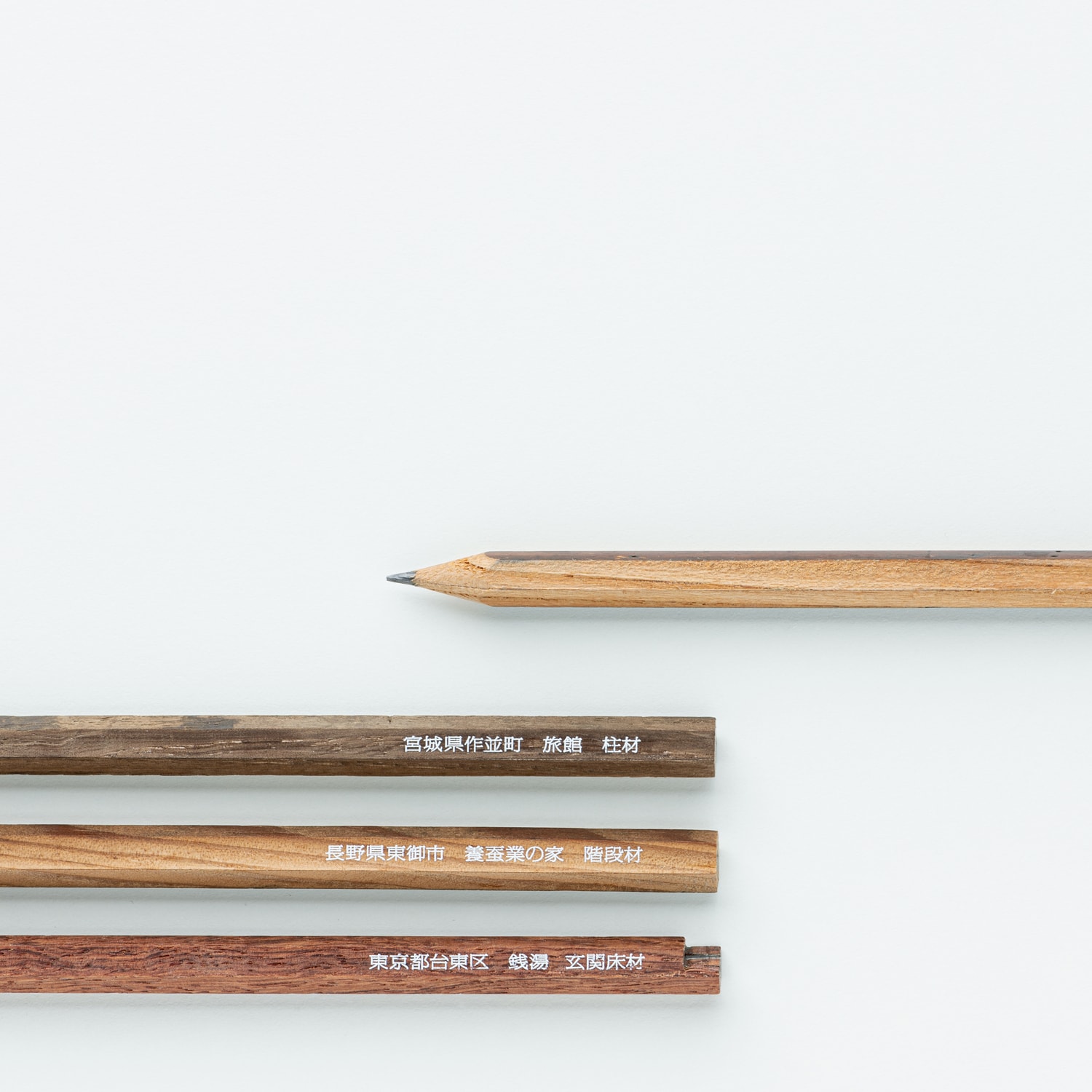
This pencil has a past life. It is crafted from scrap wood that should have already disappeared from the world. The address and material name written on the side of the pencil tell the location of the former building and piece of furniture that this scrap wood was part of. The uneven feel and stiffness, that faint scent, the scratches, those tan lines, the color of the paint, the grain... You will find that each individual pencil is like no other, from the instant you first hold it. Memories only known to this wood are transferred to the pencil, and will live on. Try to picture some time that is not now, and somewhere that is not here.

→ Work Introduction Video(YouTube) ![]() *English/Japanese Subtitles
*English/Japanese Subtitles

The theme might’ve been a little too difficult. The entries were often too elusive, or just the opposite—too straightforward. I could feel the entrants’ indecision. I guess the judges must’ve had a hard time, too. The idea behind this entry was to give form to communication. That means the way the idea was conveyed and presented and how the package was designed were very important.
I personally wanted to see more of how the designers had taken those elements further and developed on them. Still, the concept fitted the theme the most out of all the finalists, so I decided that it was worthy of the Grand Prix.
Ryosuke Uehara
In the KOKUYO DESIGN AWARD, a Grand Prix winner should fit the theme, contain a leap of ideas, be feasible as a commercial product, and demonstrate high-quality design work—and it needs to meet these criteria at a high level. In the past, the norm has always been that entries that are outstanding in those respects get chosen for the Grand Prix, but if I’m honest, I didn’t see anything like that this year. This entry was the one that was most well-balanced. The context and background of the concept were the key points, rather than the novelty of the design itself. I chose it for the Grand Prix because I could see how pursuing the project would have the potential to get a lot of people and communities involved.
Masashi Kawamura
It captured the theme and responded to it well. This work sends a nostalgic message of sharing memories, but more than that, it also questions the process of a consumer society where things are produced and consumed in large quantities, and asks if that isn’t something that should change. And the high-quality feel and texture when you hold the pencil conveys that more than anything else. We’ve entered a digital age, which is precisely why it’s going to be the quality rather than quantity of things that shapes the future. The wood that had once been used as building material had a weight to it, and I was impressed by the idea that that weight could become “quality” and surpass the existing industrial system that is “mass production.” When they turn the design into a product, I want the designers and KOKUYO to develop it carefully so they don’t detract from that quality.
Tsuyoshi Tane
Actually, this entry didn’t grab me in the Initial Judging. It was an ordinary pencil, and I didn’t feel it had much story to it based on just the presentation sheet. However, when I held a model in the Final Judging, I was amazed by the overwhelming quality, and lots of different stories started popping into my head through that substantial feel. It didn’t take me long to feel convinced that this was the Grand Prix winner. Wood used in buildings and furniture serves out its role, then gets a new life as pencils. Just hearing that makes it sound like nothing more than a recycling product, but the idea was a design for a story about infinite possibilities carried inside a little pencil. If it’s developed and promoted as a project through workshops and things, it will become a social project that will get support from a lot of people. When I voted for it, I was imagining all the possibilities that the designers might go on to develop and offer society together with KOKUYO.
Teruhiro Yanagihara
There were more works that appealed to people’s emotions than in past years, and among those, this entry made a particular impression. On its side, the pencil has a description of what kind of building the wood had originally been used in. People will definitely feel happy if they can preserve their memories in a form like this when their old elementary school closes, or they part with the house they grew up in when nobody lives there anymore. I also hope they can create a system that lets people share those feelings. The pencil’s texture is really good, so I want them to turn it into a commercial product while still preserving the rough, handmade feel.
Yoshie Watanabe
Merit Award
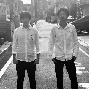
title
Music Box Tape Cutter
creator
Shouta Toriyama, Shun Yanagisawa
Description
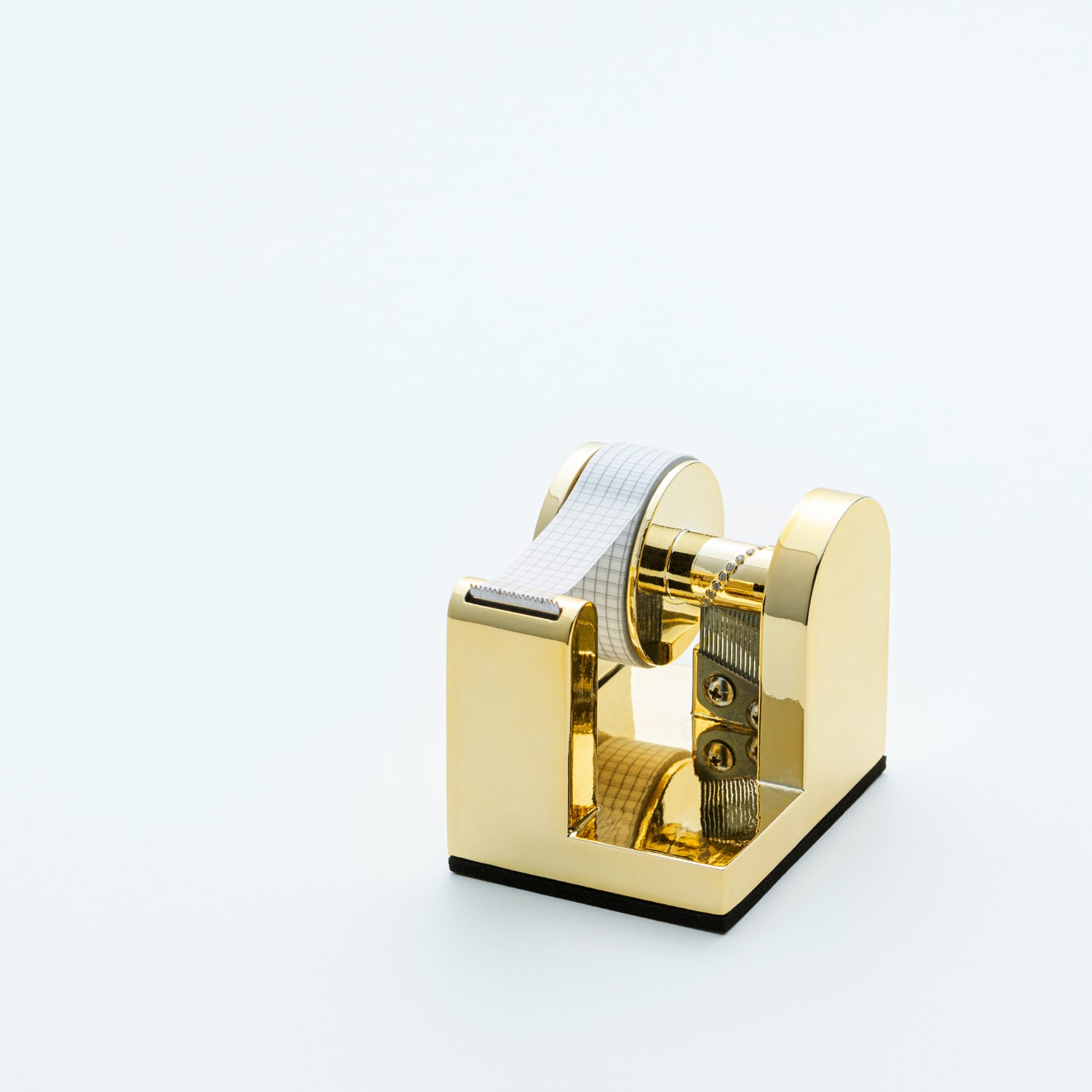
This tape cutter has been embellished with elements of a music box. We have crafted it so that beautiful sounds play as you pull the tape. The sound the tape cutter plays when you pull the tape helps you intuitively measure its length, so you can cut it to just the right amount as you use it. You can also enjoy listening to it longer than usual, for example when something good has happened, or when you have put in your favorite tape. This submission allows you to enjoy using tape sensuously through your ears and eyes.
→ Work Introduction Video(YouTube) ![]() *English/Japanese Subtitles
*English/Japanese Subtitles

The designers said they’d pursued the idea of making the design look like a music box, but I think it would’ve been more interesting if they’d developed on the early prototype, which had the light feel of plastic and the mystery of not knowing where the sound was coming from. I think this would’ve been more interesting than the metallic final prototype, which directly brought to mind the idea of a musical instrument.
Ryosuke Uehara
I do want the designers to rethink the gold color of the final prototype, but there are other points where I think there’s even more potential for further development. For example, what if the cutter wasn’t designed to cut masking tape, but was big enough to cut duct tape? What sound would it make then? What melodies could it play? Would it make packing work more fun? I’d like them to develop their ideas further, without insisting on sticking with the current shape.
Tsuyoshi Tane
The moment I actually used this product in the Final Judging, it was more fun than I’d expected. Masking tape is often used for private purposes, and it’ll put you in a merry mood if something like this plays some sounds when you’re making something at home.
Yoshie Watanabe
title
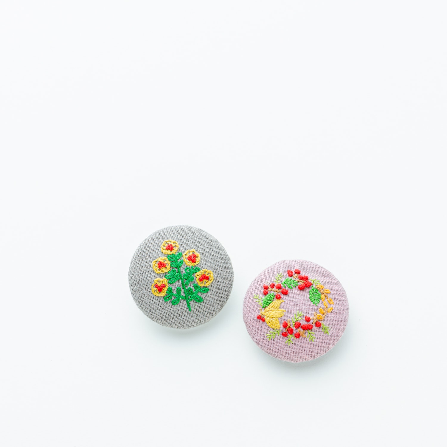
Dearhearts
creator
Yohei Yamakawa
Description
From the moment you press “Dearhearts” to when the battery runs out, this broach-shaped IoT device will continue to send its current location and SOS messages at regular intervals. Parents’ hearts want to know where their children are in case something happens, while children’s hearts feel rebellious about having their parents always know where they are. Secretly though, they want to ask for help when something really happens. And their parents want them to ask. We wanted to answer those kinds of needs in parent-child relationships.
→ Work Introduction Video(YouTube) ![]() *English/Japanese Subtitles
*English/Japanese Subtitles

The product had some very system-like aspects, and I wasn’t sure it would be suitable for a commercial launch from KOKUYO. But I was moved by the story that the theme of had inspired the designer to make something that would protect people’s lives, and his hope that even just one life might be saved by it. I definitely want the product to become a reality.
Tsuyoshi Tane
The idea and interpretation of the theme based on social issues and the entrant’s own love for children were both good points. I believe the entrant’s sense of mission and passion to make it into a product influenced the judging. There are many things to consider before it can be turned into a commercial product, such as its safety for use by children and how people should interact with it.
Teruhiro Yanagihara
I was shocked to hear in the entrant’s presentation that a lot of children go missing in Japan. Although there will be many hurdles before people can actually start using it, I liked the story it had of this ordinary-looking, cute brooch that could help save children.
Yoshie Watanabe

title
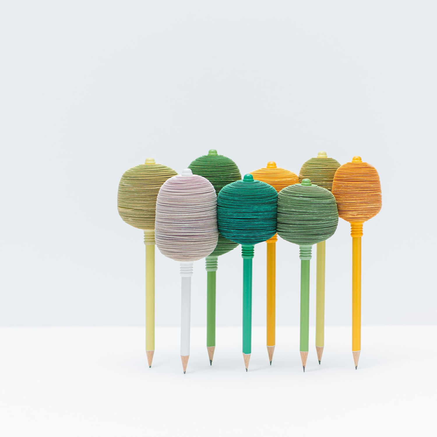
FROM TREE TO FOREST
creator
Tuncay Ince
Description
The product is a visual and functional stationery design that refers to the relationship between tree and human, forest and society. The product; pencils symbolize the tree trunk and sticky notes symbolize the tree branches. When we put the pencils side by side and nest the sticky notes together, they form the forest form. As you use the sticky notes, sharpen the pencils, reflects destruction of trees, depletion of forests to users. In recent years, the destruction of forests in the world began to occur frequently. We humans, if we do not feel this terrible situation and take precautions, we will end our own. The main purpose of this product is to make the users feel this situation and make them more respectful and protective of nature.
→ Work Introduction Video(YouTube) ![]() *English/Japanese Subtitles
*English/Japanese Subtitles

Among all the finalists, this entry makes the strongest impact particularly when seen at a glance, and has the most cuteness and presence about it. Although there are issues about the production process being complicated and costly, the appearance deserves a Merit Award.
Ryosuke Uehara
If making it means having to destroy the environment, then we can’t deny that the idea and reality don’t match. Maybe the designer should try going back to the interesting way the layers of paper fit together to keep themselves standing upright, and to the beauty of the design as a piece of craft, rather than insisting on making it a kind of stationery.
Masashi Kawamura
When we heard the presentation, the product made us really feel the destruction of forests, and we felt an urge not to use it. But with a surprising and bold theme like the “” we had this year, a product that we “wouldn’t want to use” was, conversely, something we felt was new and had potential.
KOKUYO
Genral comments by the judges
* Judge occupations and titles current as of the time the individual served as judge.
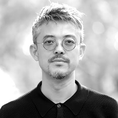

Ryosuke Uehara
CEO, Art Director & Creative Director of KIGI Co.,Ltd.
It was my fifth time serving as a judge, and the themes have been getting more difficult each year, and the level of the entrants has been rising, too. With people’s sense of values shifting from the material to the immaterial and the meaning of design getting broader, it’s definitely getting harder to come up with the themes and judge the entries. This time around, we decided to try an abstract theme, in the expectation that it would make things less difficult and attract a diverse range of ideas. As it turned out, it might’ve actually made things more difficult for the entrants. However, in a design competition, easy-to-understand themes are nice, but it’s also important to tackle things that are profound and complex. All the judges thought hard about the decisions, and I think we had a good discussion.
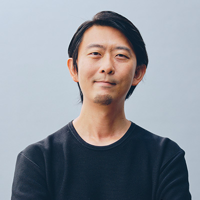

Masashi Kawamura
Creative Director & Chief Creative Officer of Whatever Inc.
The setting of the theme is a crucial element that affects how the DESIGN AWARD will go, and this year’s theme was especially experimental. Having the kind of atmosphere that says “Let’s try it” is what’s so good about the KOKUYO DESIGN AWARD. I believe it really helped us take another step forward. Having said that, the major challenges will still always be about how we set the theme. Many submissions used the shape of “” just as it was, but we’d really wanted them to go for a deeper interpretation. If the reason was that our guidance wasn’t enough, then we should examine it thoroughly, and make sure we come up with a theme that will spark interesting ideas and draw out diverse possibilities next time around, too.
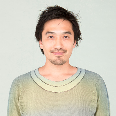

Tsuyoshi Tane
Founder of Atelier Tsuyoshi Tane Architects / Architect
Competitions like the KOKUYO DESIGN AWARD involve dreams. It’s an opportunity for over 1,300 people from all over the world to put some idea out there into the current times and society. It’s not a job or duty—people enter it purely to test their design skills. When their intentions and the insight of the judges who try to discern them meet, a Grand Prix winner is decided. The entrants and judges create a story, and when it has taken form as a product, something will get to be communicated widely. This is a much less common occurrence with architectural competitions, which are more realistic and involve tough debates. Taking part in the judging for a product design contest for the first time, I found it was driven by the idea of creating the future together. That was very fresh and appealing.
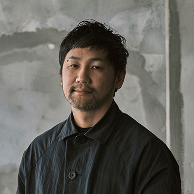

Teruhiro Yanagihara
Designer
As a designer, I’m involved in a wide range of fields besides product development, so I was hoping to evaluate the entries from a different standpoint from KOKUYO’s when I took part in the judging. The social significance and background of a product—the reasons why we should make “that” product—have become more important than simply being a good product or doing product development with a focus on making something that will sell well. This means that entries might equally come away with the Grand Prix or an honorable mention, depending on how the judges interpret the theme and the designs. In this sense, the competition tested the judges’ abilities, too. It was good that we were able to evaluate the entries on the basis of diverse ways of thinking, but it’s possible we missed some truly good ones in the Initial Judging. As judges, we should work on understanding the true nature of each individual submission.

Yoshie Watanabe
Art Director & Designer at KIGI Co.,Ltd.
Since there’d been a trend to setting the themes in the past few years, it was a fresh challenge to move away from that and present the theme as a symbol this time around. In the Initial Judging, we saw a lot of submissions that directly saw the “” of the theme as a shape, and proposed things that were actually -shaped. Of course, that approach could still be interesting, but I wished they’d delved a little deeper into the intentions behind the theme. On the other hand, many of the finalists presented ideas that appealed to people’s emotions, rather than suggesting a functional product. Although they still had issues to overcome as designs, their backgrounds and stories swayed me. It was really interesting to see once again how the kinds of designs that make it to the Final Judging vary depending on the theme.

Hidekuni Kuroda
President and CEO of KOKUYO Co., Ltd.
By using the symbol “” for the theme, we tried a new approach of leaving the interpretation up to each entrant. In fact, the make-up of the entrants and their design tendencies were different from past years, and the evaluations varied depending on the judges’ interpretations. All in all then, this AWARD was more difficult than any before. At the same time, we were joined by new judges, and I felt some new chemistry among us in the judging, as well. Extraordinary circumstances meant we ended up streaming the final presentations and judging online, but I believe that had meaning because it meant we were able to convey the entrants’ passion and the judges’ suggestive comments to even more people. Through this AWARD, I want to continue to provide creators all over the world with an opportunity to take on a challenge, and turn the ideas and inspiration they offer us into challenges for KOKUYO.
Final Judging / Winning Design Announcement / Talk Show
Final Judging
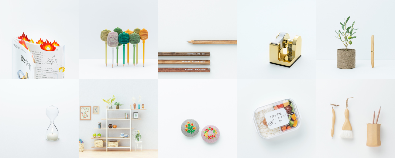
Ten finalists met this year’s theme “” head on, and gave impassioned presentations.
The judges listened to them earnestly, and judged the entries with three points in mind: how the theme was interpreted, how finished the design and idea were, and whether the design could be made into a commercial product.
Winning Design Announcement
The KOKUYO DESIGN AWARD 2020 Grand Prix winner is “Somewhere, Sometime.”
Owing to the spread of the new coronavirus, the Final Judging and judges’ talk show took place without an audience, and were streamed live online.
Compared to previous years, more of the entries were ones that seriously addressed social issues—the question of why we should make “that” product. This result brought with it a strong sense of the times.


