


KOKUYO DESIGN AWARD 2023
2023 Theme: “embrace”
We have received 1,023 works from in and out of Japan (515 from Japan and 508 from overseas).
The 10 designs that passed the first round judging will undergo final judging on March 18, 2023.
One Grand Prix winner and two Merit Award winners have been selected.
Grand Prix
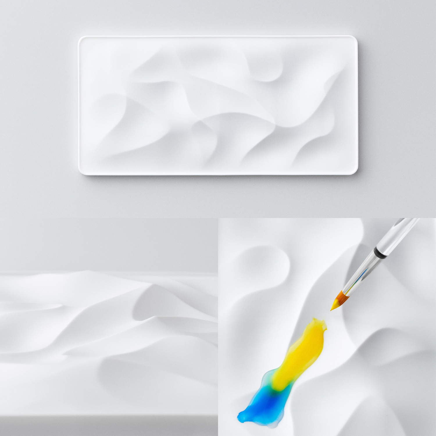
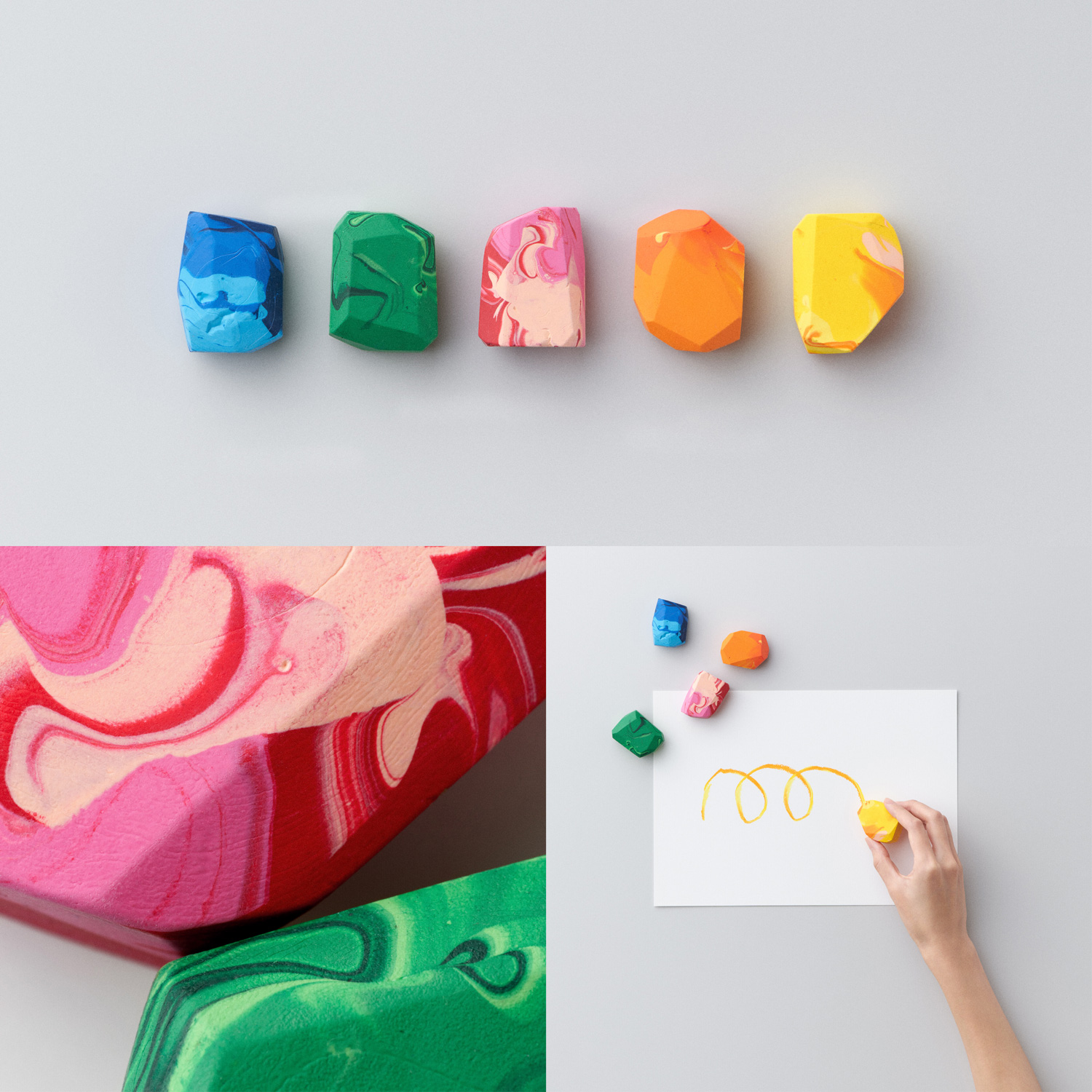
- title
- Sahara
- creator
- Hitoshi Ohbi
Description
It is a painting palette that looks like a desert. “For easygoing painting, don't you need a similarly easygoing set of tools?” “Sahara,” which was born from this idea, proposes a form of tool that draws out and embraces our unrestrained creativity. A series palettes without barriers to gently embrace our creativity with the vastness of the Sahara Desert.

A typical palette works to separate paints, but this proposal allows more freedom for mixing colors.
Merit Award
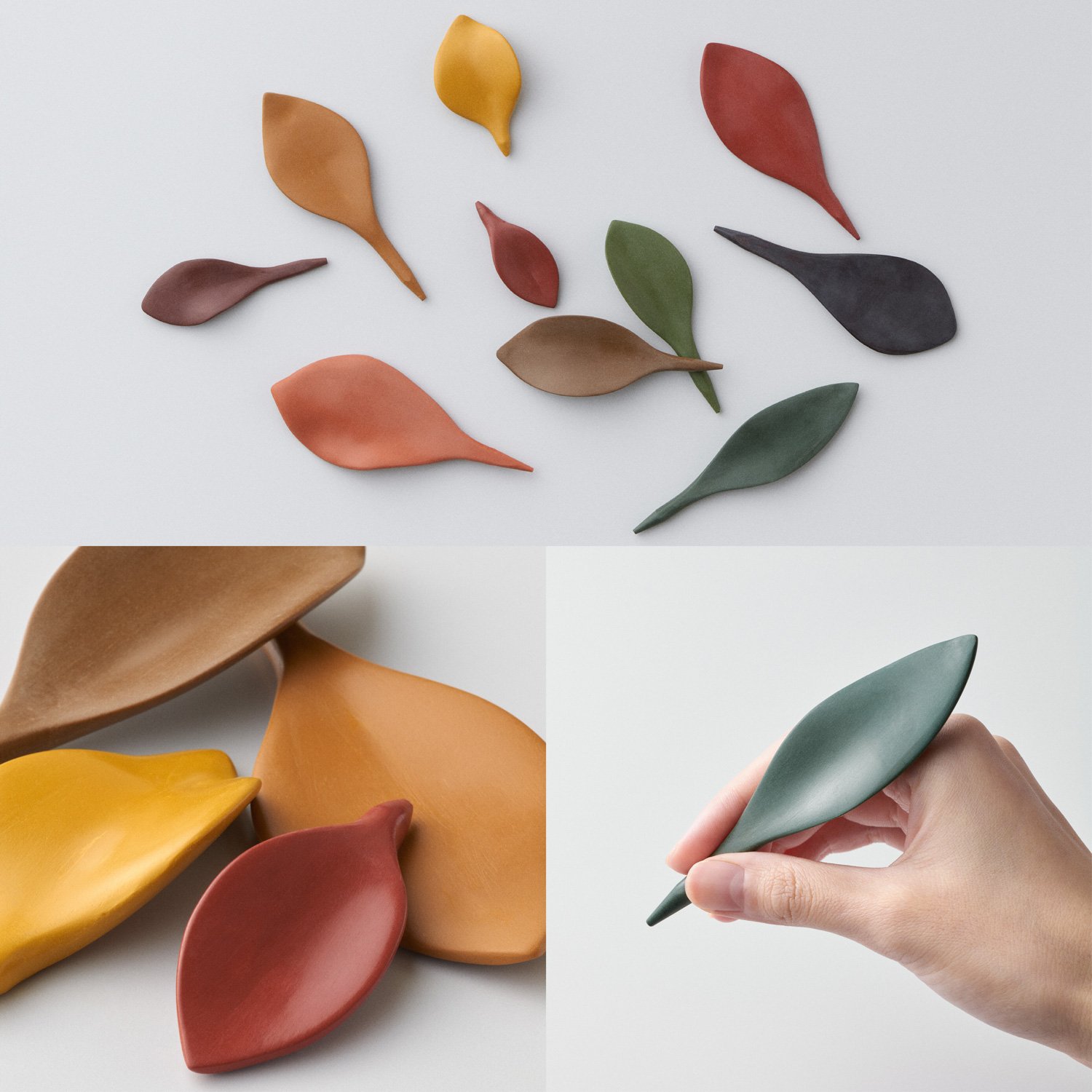
title
Fall Leaf Colored Pencils
creator
Shunsei Yoshida
Description
Colored pencils that resemble untouched fallen leaves, create an atmosphere that is more than the typical tidy desk. It is commonly said that an untidy state is disorganized, but if you don’t feel uncomfortable in a cluttered state, beauty can be found in a new perspective. “Fall Leaf Colored Pencils” is a product that will open doors to new values and create even more passions.
Organization usually comes to mind when things are scattered around, but this presents a different way of thinking that creates beauty by leaving it just the way it is.
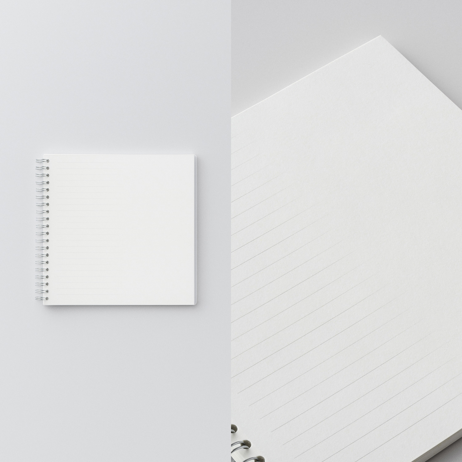
title
EMBRACE NOTE
creator
Guo Chenkai
Description
Things that develop from reason to sensibility, from known to unknown, from order to chaos are not mutually exclusive. In the “EMBRACE NOTE,” the underlines are thinner and blend with the margins, making the borders softer. Depending on the purpose, it can be used flexibly as a notebook or schedule book, and it also provides a natural and ever so comfortable writing experience.
The idea behind this design is such a subtle one that it was difficult to see its value in the initial judging.
Finalist
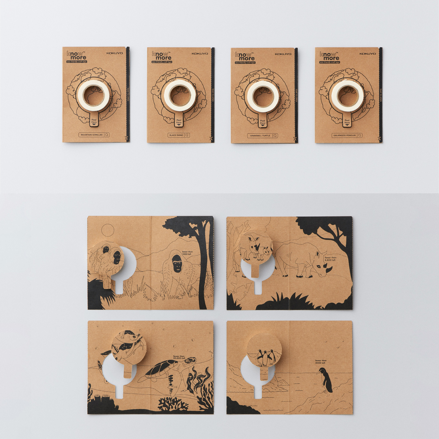
title
Know more
creator
Quolt Design (Aditya Dilip Kulkarni, Rohit Bisht, Vishnu Raj Azhikodan)
Description
“Know More” is a packaging design concept aimed at bringing awareness to save the critically endangered species. The unpacking experience is intended to evoke a feeling of separating a creature from its herd symbolizing the vanishing of that species from the face of the planet and at the same time giving the user some information about the species’ endangered status. Since a tape is a stationery tool used for fixing the broken, the act of sticking pieces together with a tape symbolizes the human endeavor to reverse the damage caused.
title
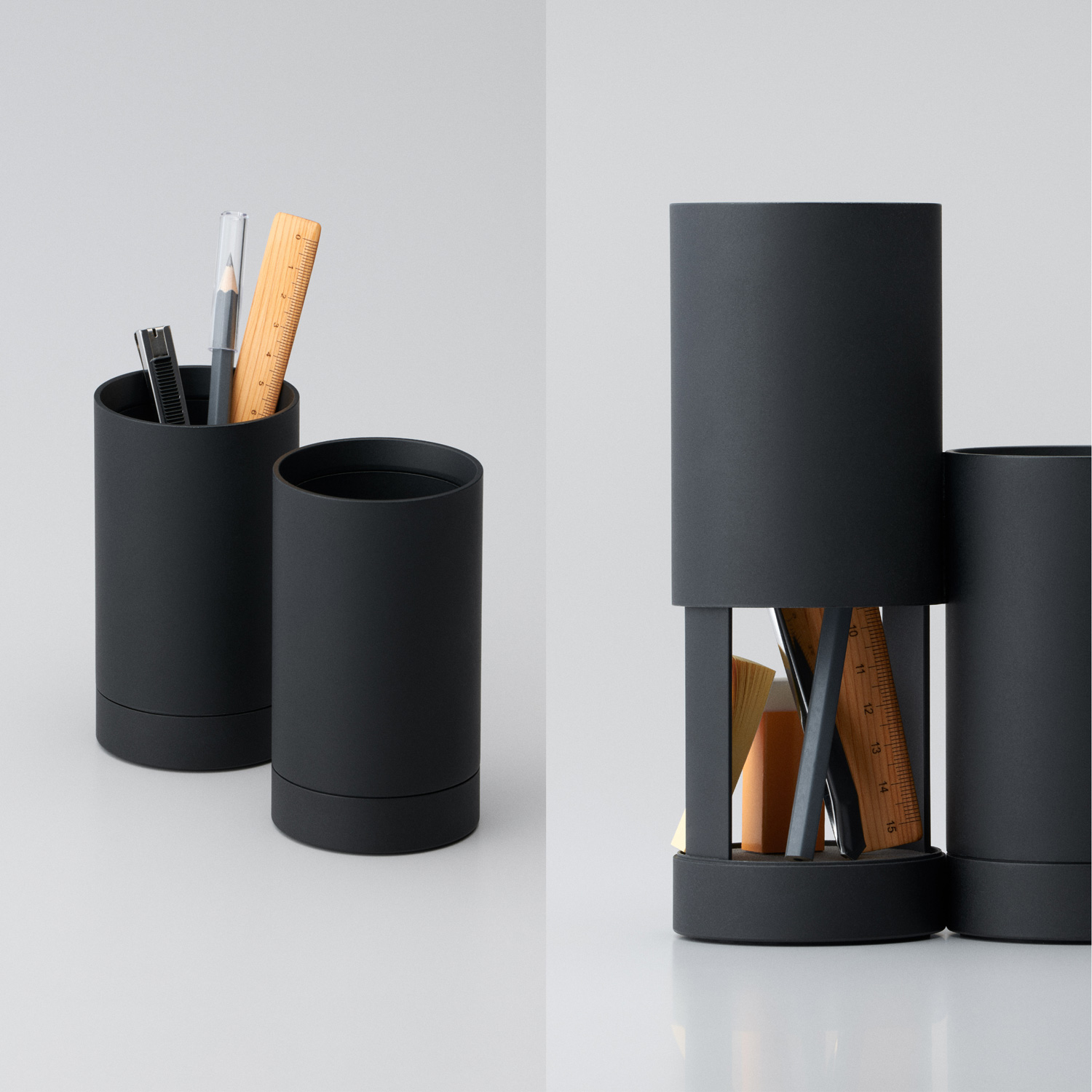
JITSUWA.NOBI-RU
creator
Tatsuya Fuchigami
Description
It should be there, but it isn’t. I can’t find it when I look for it, but then it comes out later. This is a recommended pen stand to eliminate the “small daily stress” that everyone has experienced. By sliding the top of the main unit, you can easily check the condition of the bottom surface, which is normally difficult to see. Stationery with different shapes according to the purpose, and a pen stand to store them all together. It is a “subtly helpful” product that adds a little bit of functionality without changing the traditional purpose.
title
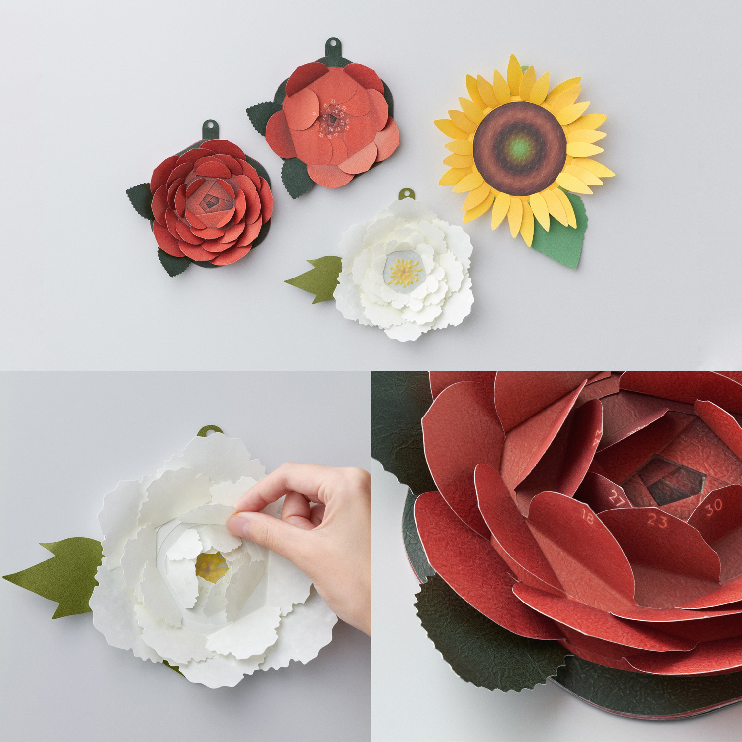
blooming days
creator
Lasagna (Yuri Hara, Ryohei Yabusaki)
Description
Appreciating the time seeing buds blooming day by day while commuting to work or school . The blooming days calendar is designed by layering such scenes and days. The petals are flipped one by one every day, and a flower blooms at the end of the month. As we pass through the days, it gradually opens up, and the layers of petals add more color to the week a day at a time. It was made with the hope that by using this calendar, you can feel your progress and the days you have experienced at the end of the month.
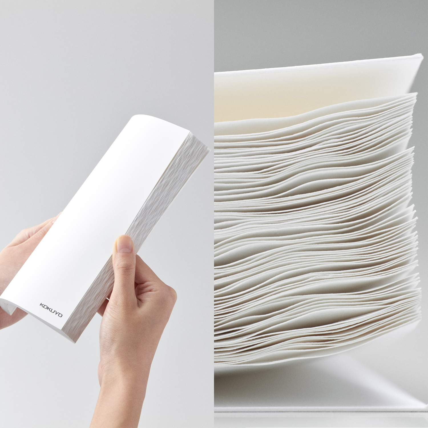
title
waves
creator
MOKEKO (Ken Kobayashi, Takayuki Tsutsui, Shunta Naruse, Shoma Furui)
Description
“waves” is a positive interpretation of the wrinkles of wet paper. By rolling the edges of the notebook, you get a beautiful texture of overlapping waves, and a comfortable space makes it easier to turn pages one by one. Realize a new world with individual perspectives not bound by fixed concepts. That is our idea of embrace.
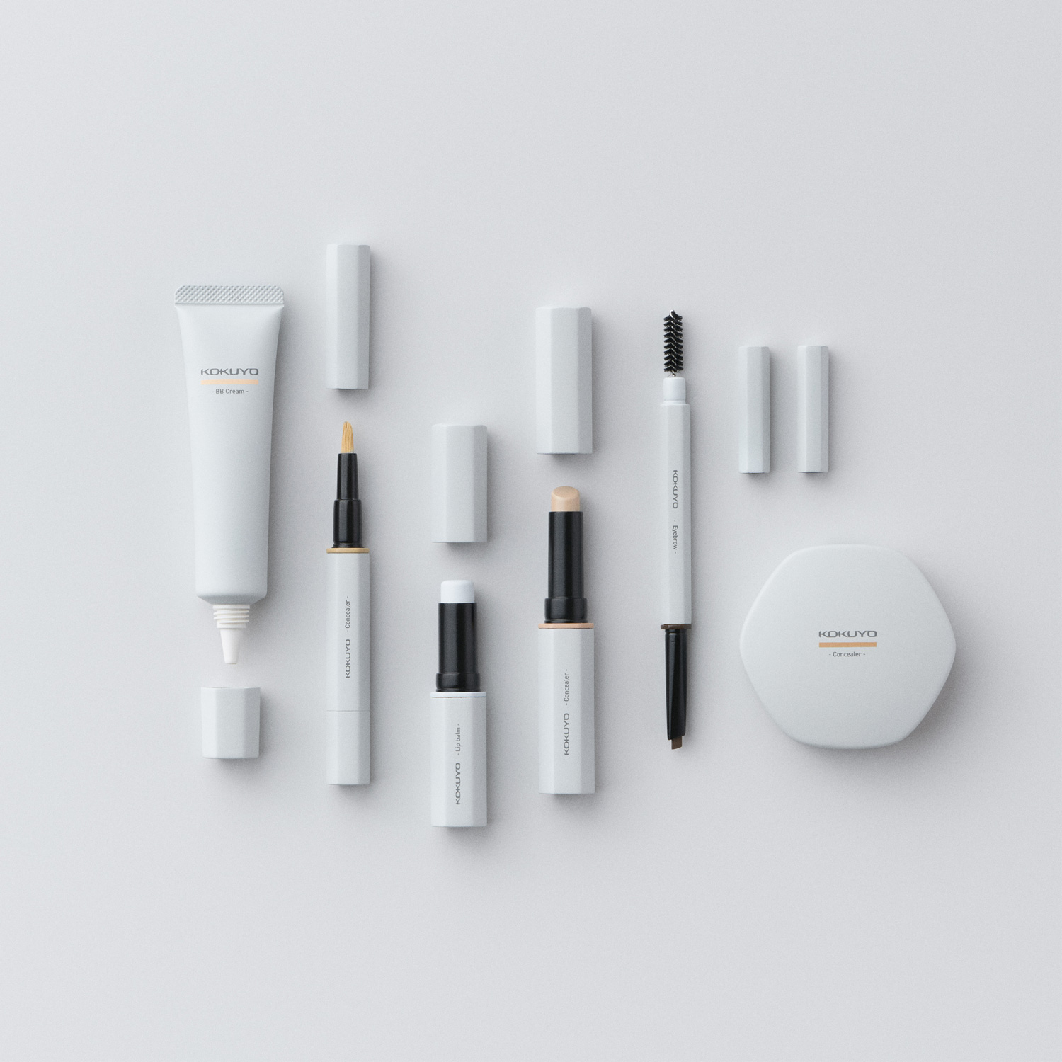
title
Cosmetics of Stationery
creator
Shingo Iwasa, Atsushi Tanaka
Description
“Cosmetics of Stationery” are cosmetics that conceal the shortcomings of the skin and leave you feeling full of confidence as a “face-up.” With makeup that brings out the beauty of the individual, you can expect to feel positive emotions. You can be more confident and productive in your work and daily life with that extra added positivity. We can all agree that cosmetics can no longer be called only a work tool. By embracing the familiar “stationery” and “cosmetics,” we hope that cosmetics with high hurdles will become less intimidating for beginners.
title
Ocean Plastic Crayon
creator
yururaka (Koro Yagi, Nana Fukasawa)
Description
The amount of ocean plastic will be higher than fish in 2050. What can we do to change this potential future? This is a crayon that transforms ocean plastic into art. The widely colorful ocean plastics are processed into the colors that are used in the crayons. The shape of the crayons imitates the unique shapes of the small plastics that crumble and drift through the ocean. When you pick one up, you will be able to think about the journey that the plastic making each crayon traveled to arrive in your hand. It is with this idea that the sea and society will drift towards a brighter future.
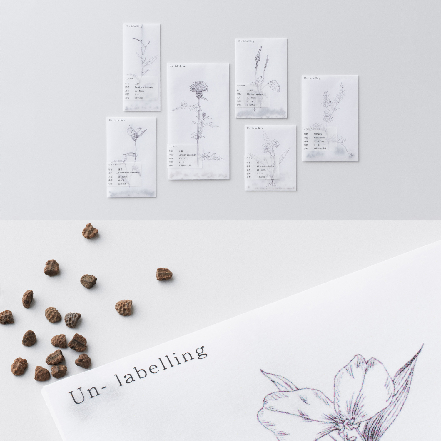
title
Un-labelling
creator
Satsuki Aritome, Tomoaki Uchiyama
Description
“Un-labelling” is a seed bag that removes the “weed” labelling. The seeds of a variety of plants commonly referred to as “weeds” are packaged in semi-transparent packaging with illustrations of each plant. The experience observing and growing each plant that gets grouped together as “weeds” is an opportunity to realize the importance of overcoming the labelling and categorization facing each individual.
Genral comments by the judges
* Judge occupations and titles current as of the time the individual served as judge.
Masashi Kawamura
Chief Creative Officer of Whatever Inc.
The message to accept differences in thinking and values under the theme of “embrace” was in line with the debate on whether to open borders during the transition period of the global pandemic. I feel like the applicants were able to freely interpret this theme and create their works. All the finalists were full of positivity and showed us their capacity to embrace and accept from various perspectives. The prototypes were all very high quality, and I think the judges were able to find more potential together rather than just judging them critically.
Tsuyoshi Tane
Founder of Atelier Tsuyoshi Tane Architects / Architect
It was a very good theme when considering design. While I looked through over 1,000 entries, I could feel that design was something capable of increasing the acceptance that embraces and blends not only people, but the entire world. I personally felt that for the first time in three years I could judge the submissions by evaluating what I had seen in the presentation sheets and what happened when these ideas were manifested as a real prototype, all while keeping in mind the qualities of each designer. Although perfection is an important aspect to consider, in the end, we chose the work that conveyed the warmth and potential of “embrace.”
Nao Tamura
Designer
In the West, the term embrace is often used when trying to look at differences like those in sexuality, nationality, and race from a more holistic perspective. At this KOKUYO Design Award, I think we were able to discover the unique “embrace” of KOKUYO that focuses on small changes in daily life and the movement of the mind. Each of the finalists’ works captured the theme of this year’s event from their own perspectives, and each of them had an irresistible charm. I felt that I had to take various aspects into consideration when selecting the Grand Prix, but I’d love if those who applied this time would use this experience as a source of inspiration for future products.
Teruhiro Yanagihara
TERUHIRO YANAGIHARA STUDIO. CO LTD. / Designer
We gathered a plethora of ideas from various genres under the “embrace” theme. We took a different approach to evaluating these works, and rather than giving blunt assessments, we broadened our perspectives and opened our minds to all the potential behind each of the works. While we assessed the functionality and quality of the works in the final judging, we also got a glimpse at the effort and values that were poured into the prototypes which I found to be incredibly interesting. Half of the applications that we received were from Japan, and the other half from overseas, and I think it’d be great if globalization progresses in the future.
Satoshi Yoshiizumi
Principal of TAKT PROJECT Inc. / Designer
Based on the rules that humans made before they knew it, the content was like looking back over things set in stone again with a warm perspective and watching it melt away like snow. I likened the situation to a forest where a variety of things live together as they are, and created a key visual based on dyeing with the plants that make up the forest, but many of the works were also very relaxed and offered warm feelings. We evaluated these works on their use and the happiness they could bring people, and eventually came to decide on the works that we felt inspired through the power of things. This competition became one that reaffirmed the value of physical products.
Hidekuni Kuroda
KOKUYO Co., Ltd. President and CEO
Over the past 20 years, these awards have adapted to the changes of society and KOKUYO. With this theme, we wanted to put out a message to change the world through holistic and tolerant perspectives by respecting one another regardless of differences in opinion or point of view. I was a bit anxious when I saw there were some contestants that spoke languages not commonly used in Japan, but all of the applicants had no problem understanding and brought a variety of ambitious works. KOKUYO also held the YOKOKU Award as a new initiative that gave us the opportunity to evaluate the submissions of students, and I feel that the company was also inspired through this award.
Trophy & Certificate
For the trophies and commendation certificates, judge Satoshi Yoshiizumi worked on the key graphics and creative direction, and Minami Tajiri and Akira Hojo were also involved as designers representing KOKUYO.
The main visual for the theme of “embrace” uses the “kusakizome” dyeing technique to create a complex, natural-looking design that‘s a like a forest or hot spring where a wide variety of things coexist in their raw state.
The trophy concept is about focusing on complexity and diversity, and peering into the glass dome offers a shifting perspective as the kusakizome design gets enlarged. The glass dome motif represents the ideas of observing things and having a historic impact on them.
The commendation certificates each bear a hand-dyed kusakizome design. The way the dyes soak in and intermingle diversely lends each one a unique, chaotic beauty that powerfully expresses the theme of “embrace.”
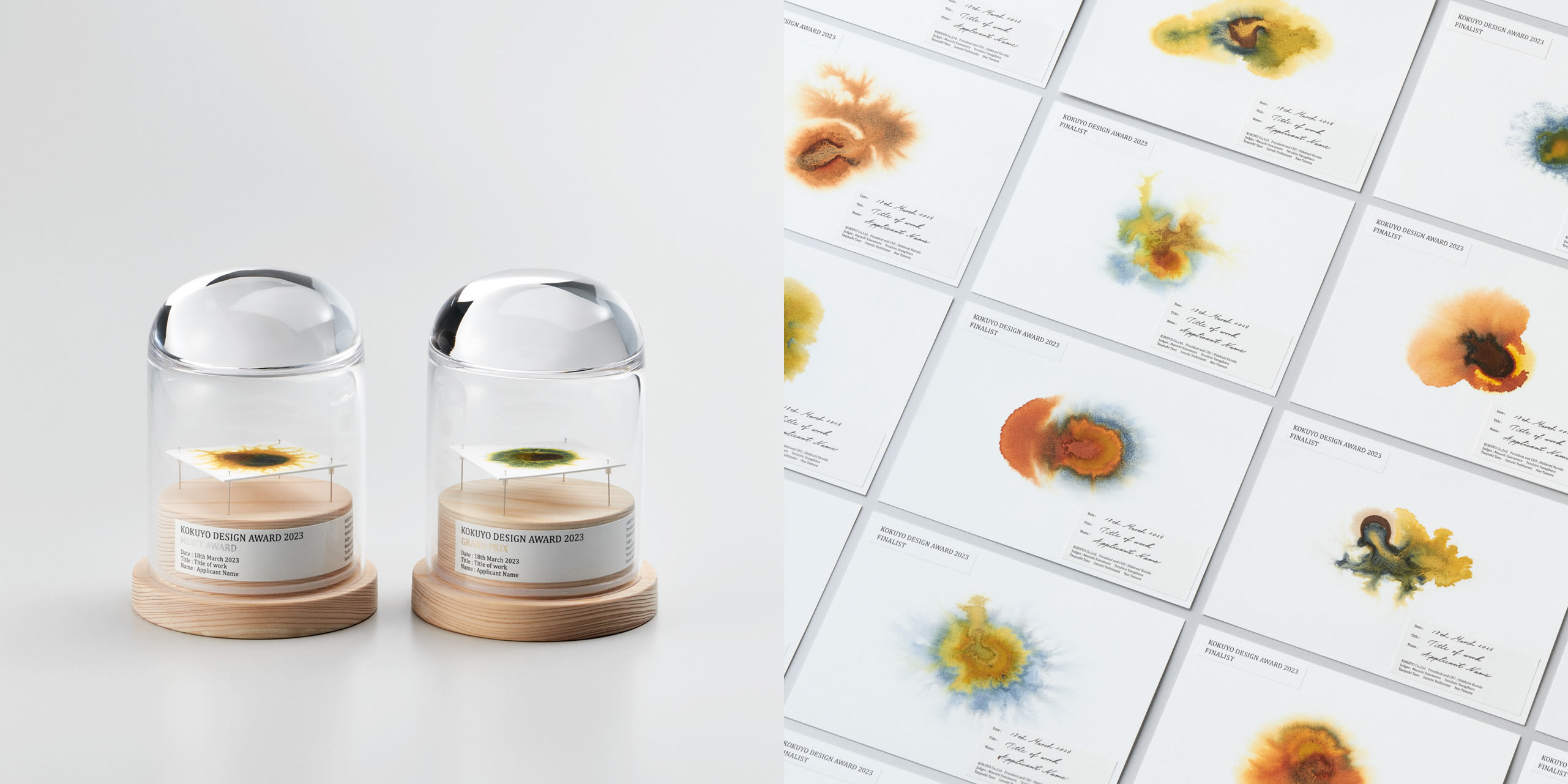 Left: Trophies Right: Certificates
Final Judging / Winning Design Announcement / Talk Show
Final Judging
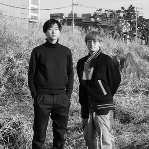
Ten finalists met this year’s theme “embrace” head on, and gave impassioned presentations.
The judges listened to them earnestly, and judged the entries with five points in mind: The design includes a proposed solution to some social issue, The design has components that make people feel positive,The idea’s uniqueness, The product design’s feasibility and whether the design could be made into a commercial product.
Winning Design Announcement
On March 18, 2023 the final judging for KOKUYO DESIGN AWARD 2023 was held, and one Grand Prix and two Merit Award winners were decided. We received 1,023 applications from all over the world—515 from Japan and 508 from overseas. “Sahara,” by university student Hitoshi Ohbi, was awarded the Grand Prix.
YOKOKU Award
The YOKOKU AWARD, a special award given to commemorate the 20th anniversary of the KOKUYO DESIGN AWARD, was established for the purpose of challenging and supporting young leaders of the next generation by selecting works that are appealing in their ideas and perspectives, without premise of commercialization, from among all entries submitted for the KOKUYO DESIGN AWARD 2023.


