The 20th KOKUYO DESIGN AWARD Special "YOKOKU Award"
The YOKOKU AWARD, a special award given to commemorate the 20th anniversary of the KOKUYO DESIGN AWARD, was established for the purpose of challenging and supporting young leaders of the next generation by selecting works that are appealing in their ideas and perspectives, without premise of commercialization, from among all entries submitted for the KOKUYO DESIGN AWARD 2023.
YOKOKU Award
- title
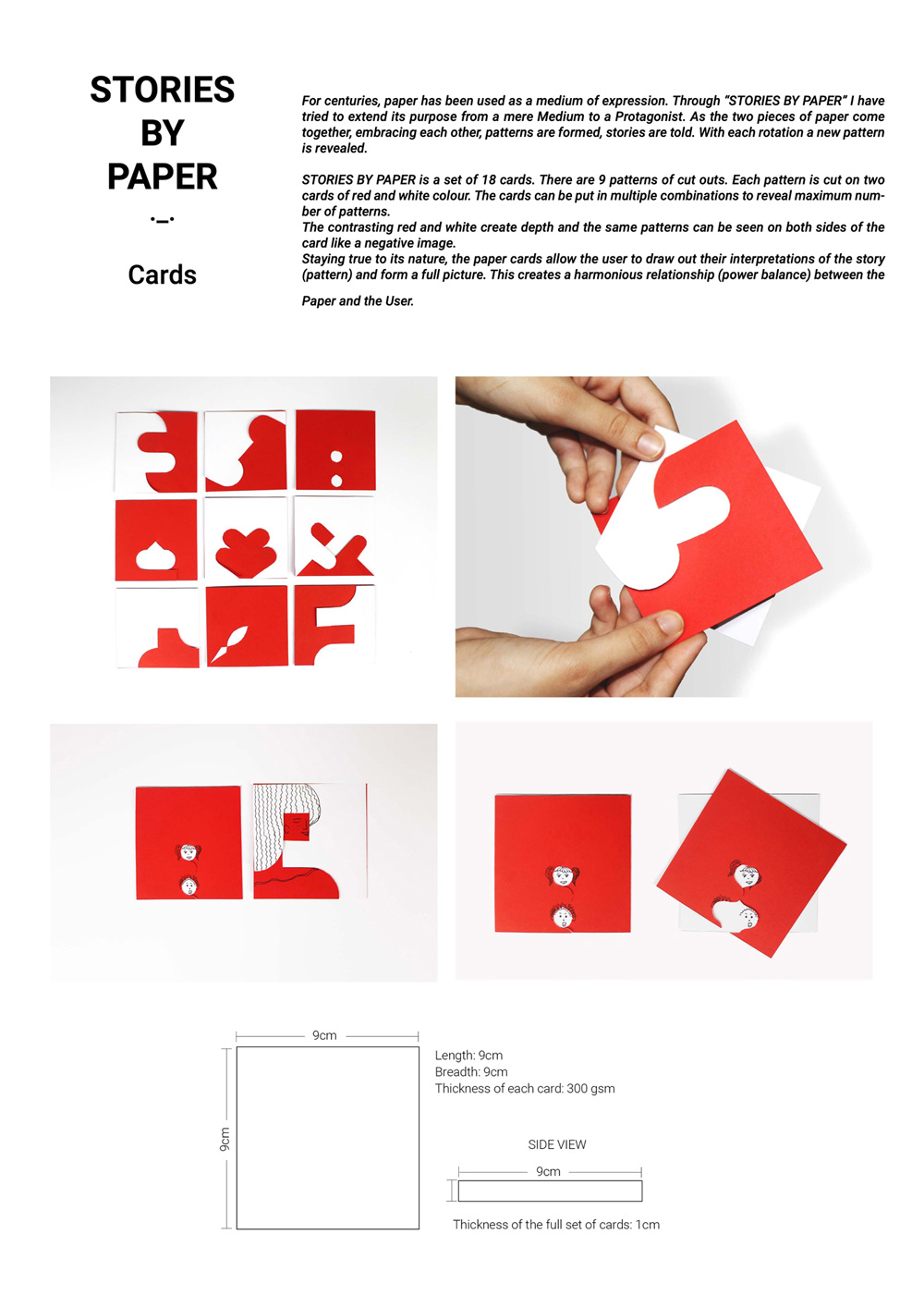
- Stories by Paper
- creator
- Yashika Munjal
Description
“Stories by Paper” tries to seek potential in ordinary material as paper and see it more than just a medium of expression. It gives paper the power to inspire. By cutting precise cuts in these paper cards they can be connected and rotated generating various patterns. Like Yin and Yang, these patterns can be seen on both sides of the card in opposite colours. Staying true to its nature, these cards allow the participants to draw their interpretation of the patterns and form a full picture. This creates a harmonious relationship (power balance) between Paper and Participant.
Evaluation Comments
The combination of two different things brings back that childhood nostalgia that changes your perspective and broadens your imagination. A work that conveys the importance of past experiences to adults who have difficulty changing their perspectives from preconceived notions.
- title
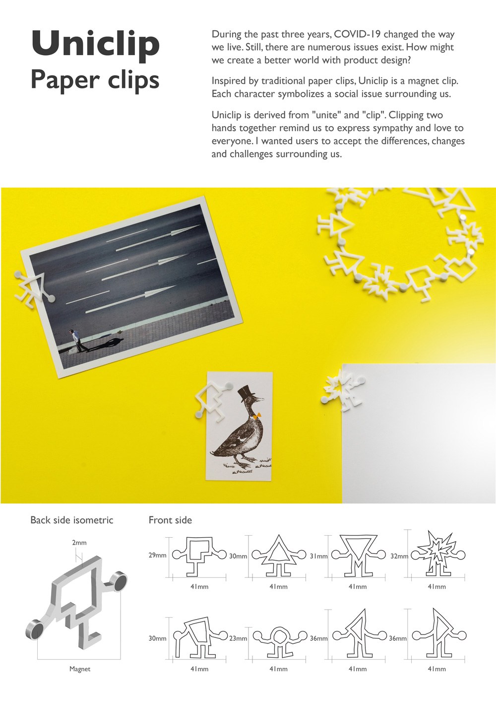
- Uniclip
- creator
- Ma Kwan Lam
Description
During the past three years, COVID-19 changed the way. we live. Still, there are numerous issues exist. Inspired by traditional paper clips, Uniclip is a magnet clip. Each character symbolizes a social issue or a person surrounding us. Uniclip is derived from “unite” and “clip”. Clipping two hands together remind us to express sympathy and love to everyone. I wanted users to accept the differences, changes and challenges surrounding us.
Evaluation Comments
A product that’s familiar to our daily lives which provides an opportunity to contemplate its message about the division caused by the COVID-19 pandemic. The different shapes of the clips represent all kinds of people in society, including minorities.
- title
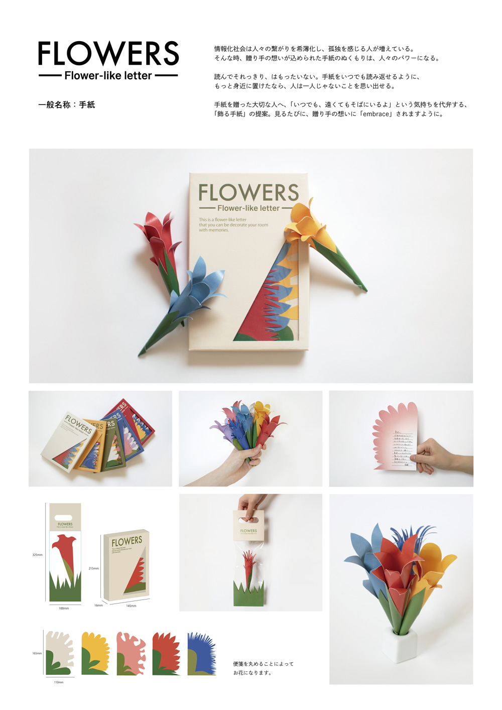
- FLOWERS
- creator
- Mizuho Anzai
Description
“FLOWERS” is a proposal for “decorating letters” like a bouquet you would give. The stationery becomes a flower when rolled up. Letters usually end up in places that they are not often seen despite their importance, but as a decoration will allow the recipient to truly feel and appreciate the emotions behind the gift. These letters that take on the appearance of flowers were designed to seamlessly become decorations.
Evaluation Comments
It’s fascinating that it expresses the feeling of “always being there” to the recipient, not only in words, but also through decorating the room. The attractive design when it became a flower makes you want to send and receive them even more.
- title
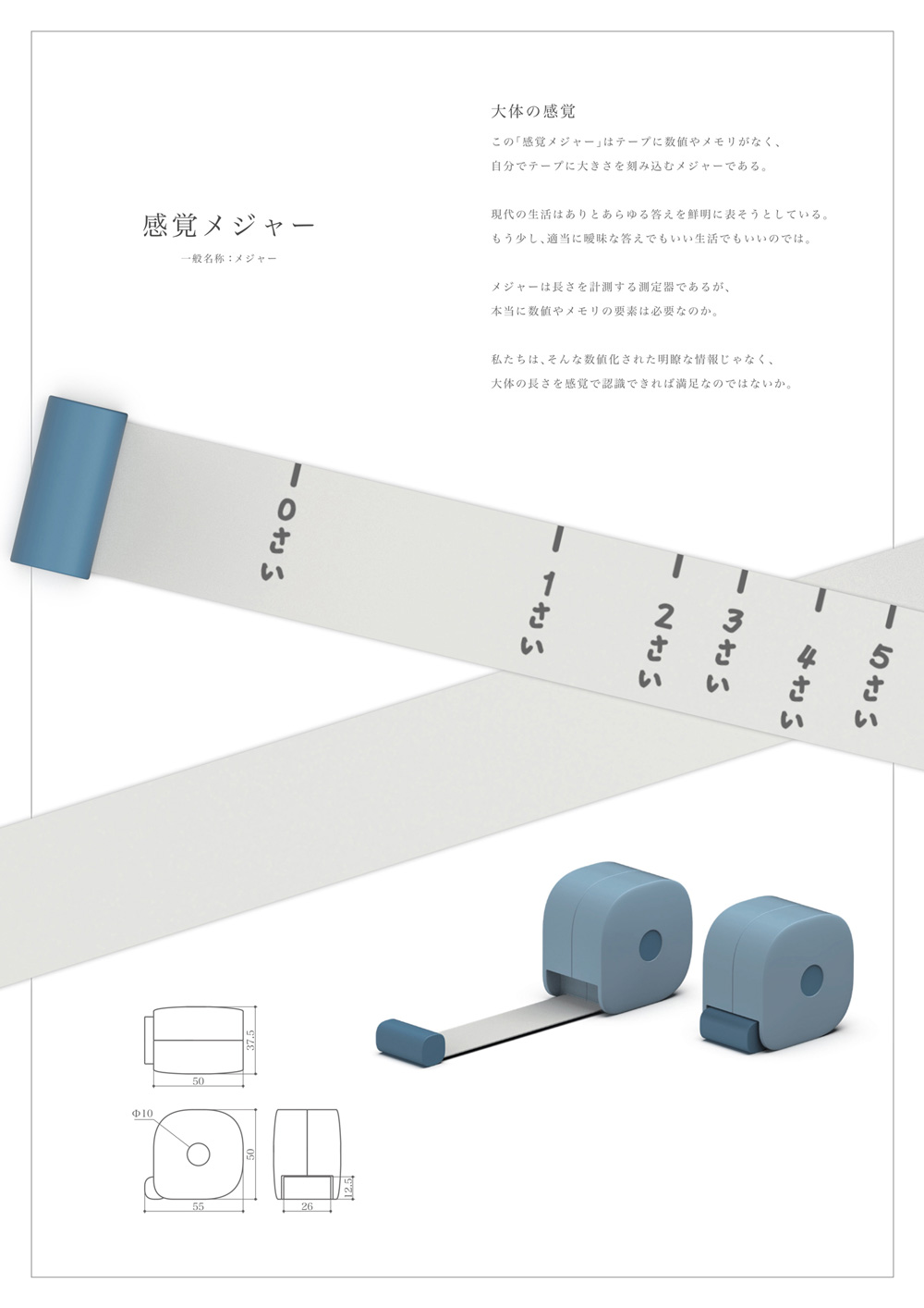
- Sense measure
- creator
- Taishin Hirai
Description
The “Sense measure” does not have a scale, allowing you to add one at your discretion. Conventional measuring tapes are devices for measuring length, but do we really need the numbers? For example, if something is explained as 〇〇 cm long, or as long as a 〇〇, which one are you more likely to be able to visualize? We would wager it is probably the latter. If you can recognize the approximate length rather than the exact numeric information, you can compare it with other objects of similar size.
Evaluation Comments
There’s joy and novelty in being able to create your own units. It leads you to think that you can believe in the original sense of human nature even more. It is also interesting that the measuring tape itself becomes something with a story to tell.
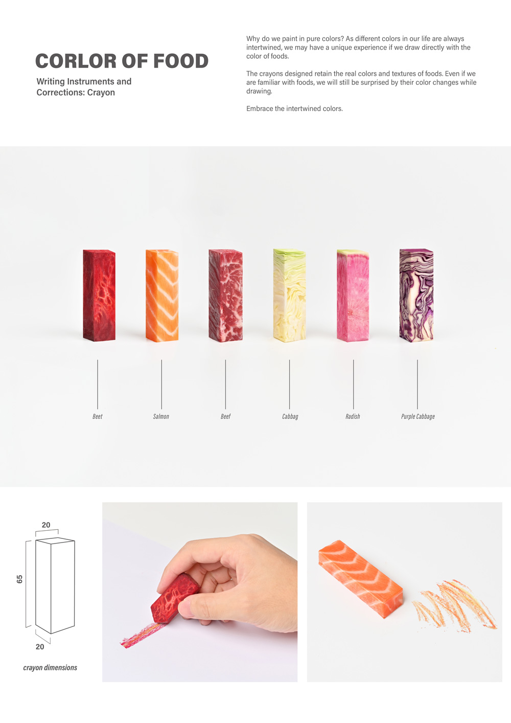
- title
- Color of food
- creator
- Huimin Zhou
Description
Why do we paint in pure colors? As different colors in our life are always intertwined, we may have a unique experience if we draw directly with the color of foods. The crayons designed retain the real colors and textures of foods. Even if we are familiar with foods, we will still be surprised by their color changes while drawing. Embrace the intertwined colors.
Evaluation Comments
You can feel the impact made by the appearance of the real foods. By using it in cases like food education, it seems like it can be used in various ways, such as thinking about food loss with children. A sense of expectation for further development can be felt, such as bringing out the reality of textures.
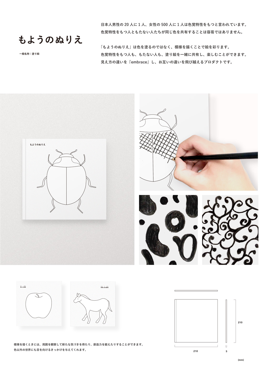
- title
- Pattern Coloring Book
- creator
- Kai Kishita
Description
In Japan, it is said that 1 in 20 men and 1 in 500 women have color blindness. Distinct differences in colors can be difficult to see for people who do not have color blindness, while those that are colorblind may have trouble distinguishing colors from one another. The “Pattern Coloring Book” is a coloring book that focuses on patterns, not colors. This coloring book can be enjoyed by all, regardless of visual perception.
Evaluation Comments
You can feel the potential for expanding creativity by thinking of limitations as opportunities with possibilities, not something negative. The proposed focus on patterns which can be embraced and enjoyed regardless of vision is greatly appreciated.
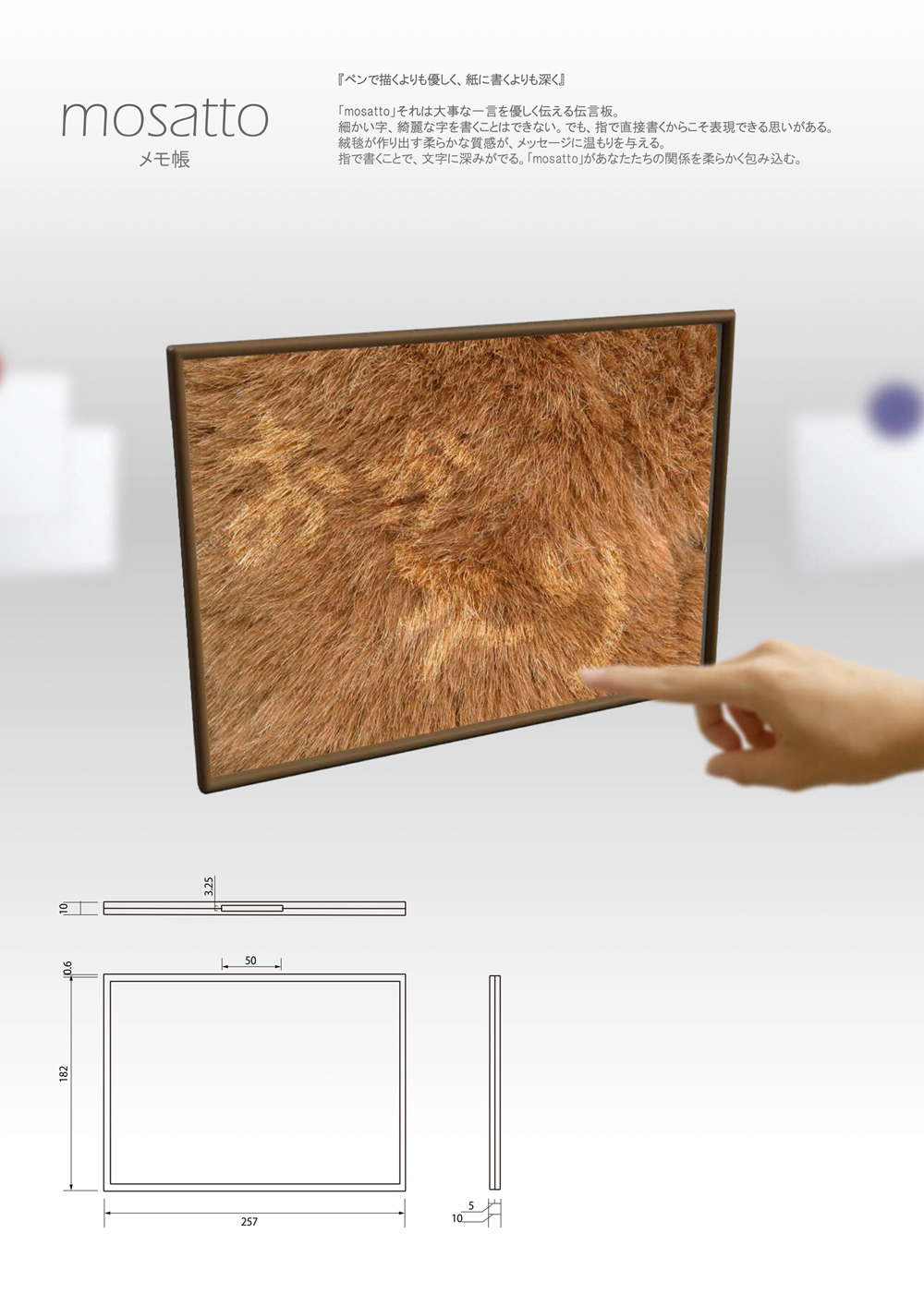
- title
- mosatto
- creator
- c,pan (Sota Yamaguchi, Fumi Takeshige, Kazuki Tateishi)
Description
“Softer than drawing with a pen, deeper than writing on paper” sums up the important message that “mosatto” conveys. Although you won’t be able to write the most finely detailed or beautiful characters, there is a feeling that can only be experienced by writing directly with your fingers. The soft texture adds warmth to the message, and writing with your fingers adds depth to the letters. Your relationships will be softly enveloped with “mosatto.”
Evaluation Comments
The capability of writing on surfaces like a carpet is well incorporated into the product. In addition to the functionality similar to that of a whiteboard and the alluring sizzle feeling on touch, it’s designed to convey a familiar feeling that also makes you laugh.
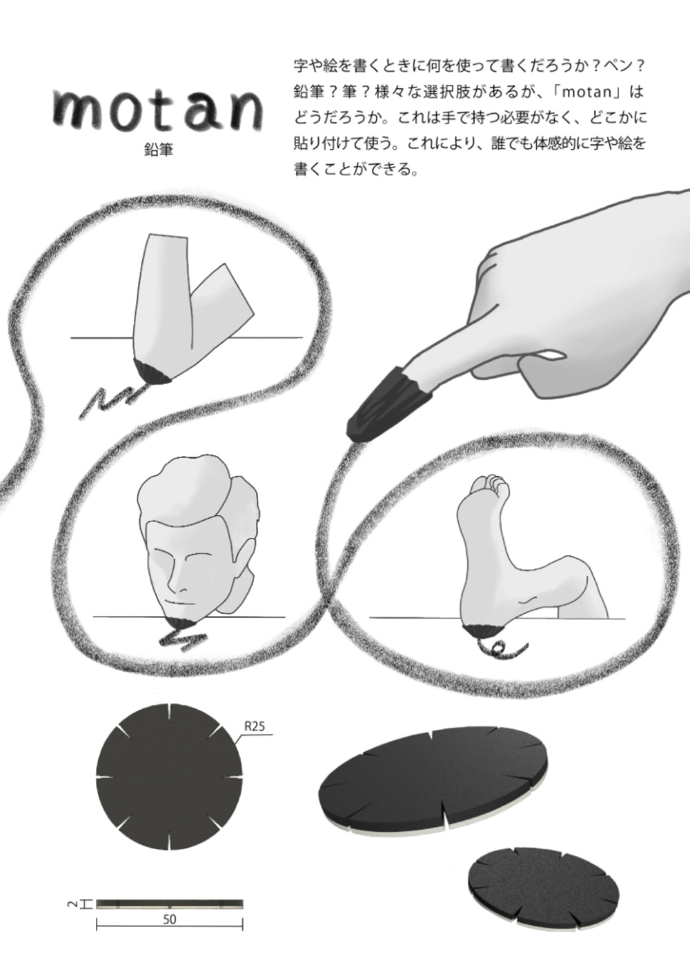
- title
- motan
- creator
- c,pan (Sota Yamaguchi, Fumi Takeshige, Kazuki Tateishi)
Description
What do you use when you write or draw? Pen? Pencil? Brush? There are many options, but “motan” is the newest addition. “Motan” does not necessarily need to be held in your hand, and can be stuck to another surface. This flexibility allows anyone the opportunity to feel and write letters and pictures.
Evaluation Comments
A product that simply makes you think “I want to play!” It can be used in a variety of situations, such as a child who cannot hold a pencil yet, or being caught in a sticky situation with your hands tied. There’s a debate about how exactly to carry it, but also an appeal for the chance to experience it.
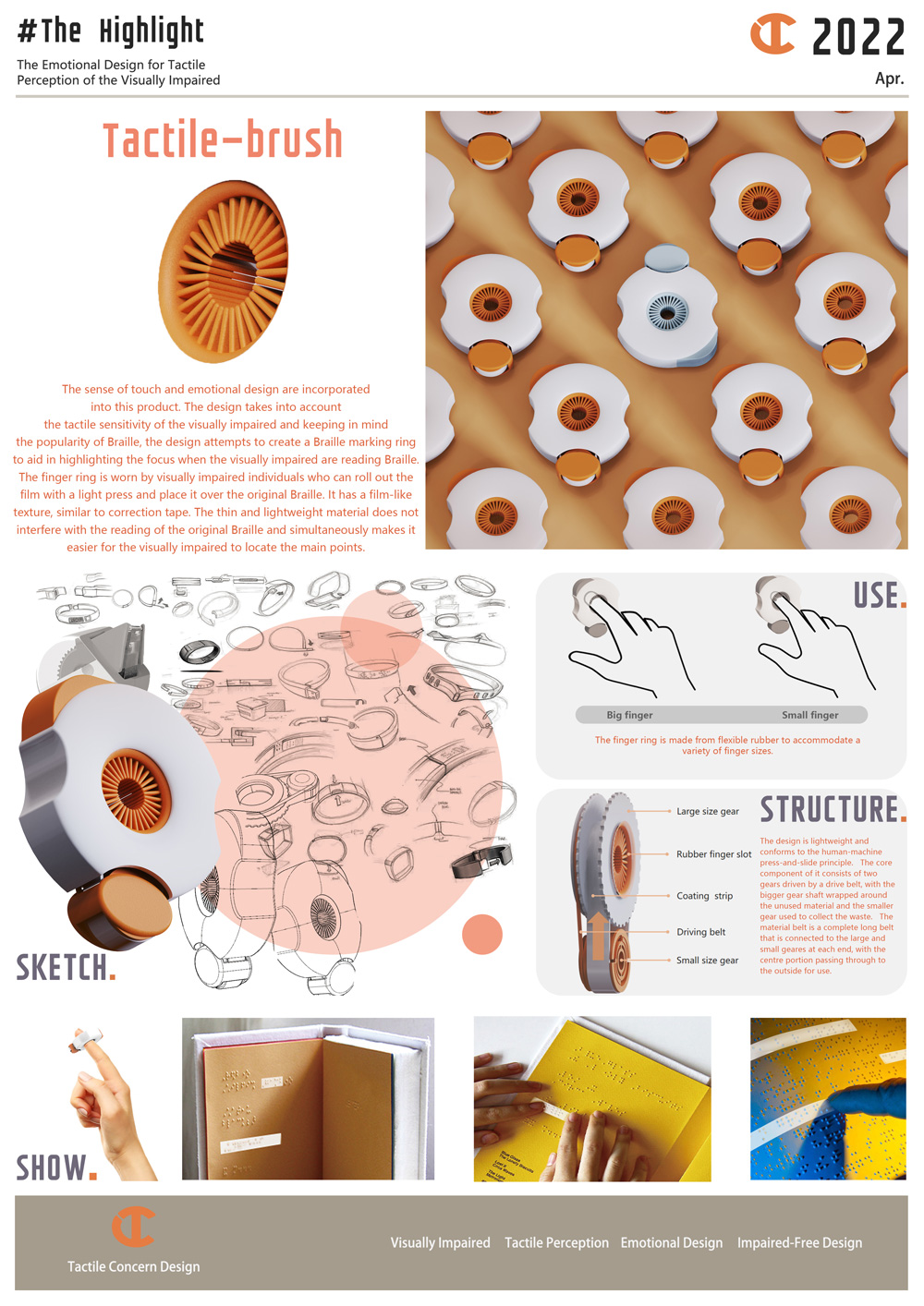
- title
- Tactile—brush
- creator
- Liu Yutong
Description
The sense of touch and emotional design are incorporated into this product.The design takes into account the tactile sensitivity of the visually impaired and keeping in mindthe popularity of Braille, the design attempts to create a Braille marking ring to aid in highlighting the focus when the visually impaired are reading Braille. The finger ring is worn by visually impaired individuals who can roll out the film with a light press and place it over the original Braille. It has a film-like texture, similar to correction tape. The thin and lightweight material does not interfere with the reading of the original Braille and simultaneously makes it easier for the visually impaired to locate the main points.
Evaluation Comments
The idea of putting a thin and light film on Braille was surprising, and feels as though you were drawing a marker over top. It’s exciting to be able to share the same senses between two different perspectives. A product with the ability to broaden horizons, not only to vision, but also to other physical characteristics.
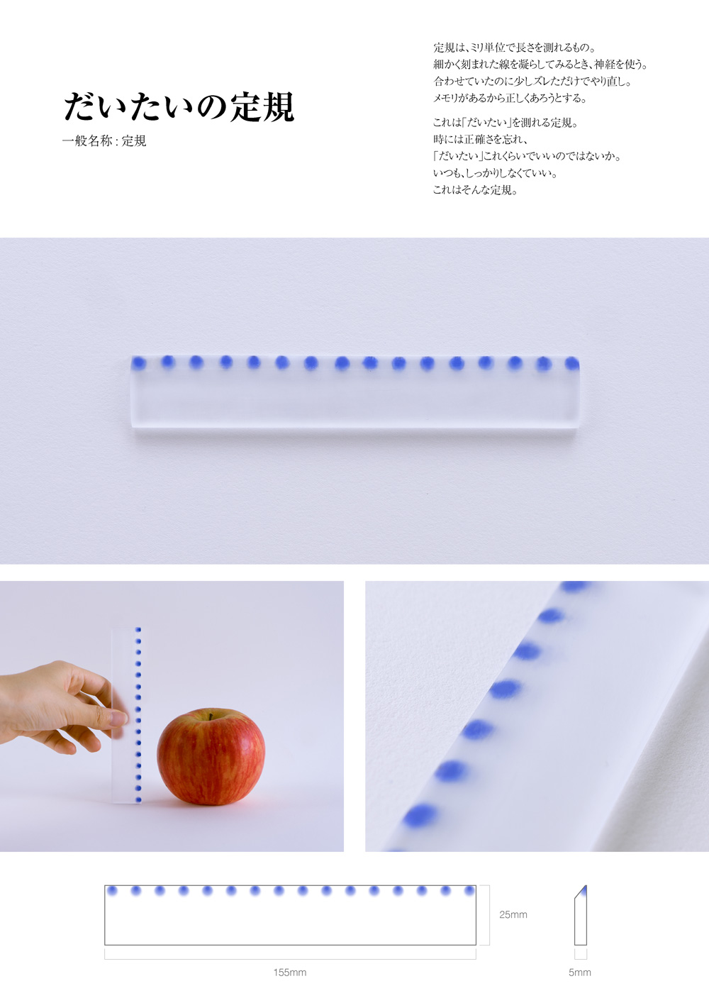
- title
- fuzzy ruler
- creator
- TAsta (Shiori Shigawa, Mao Onishi)
Description
A ruler for approximate measurements. Rulers are stationery that always require accuracy down to the exact millimeter, but also reinforces the notion that fine details of memory must be treated similarly. Accuracy is always required in our daily lives, but by broadening our horizons and occasionally disregarding this level of accuracy, we can have a little peace of mind.
Evaluation Comments
There’s irony in the fact that a product called a ruler is suspicious of its own nature. The lightness as an object is also fitting for the concept. In today’s world where everything is required to be quantified accurately, it seems to present a unique opportunity to reevaluate the purpose of measuring things.
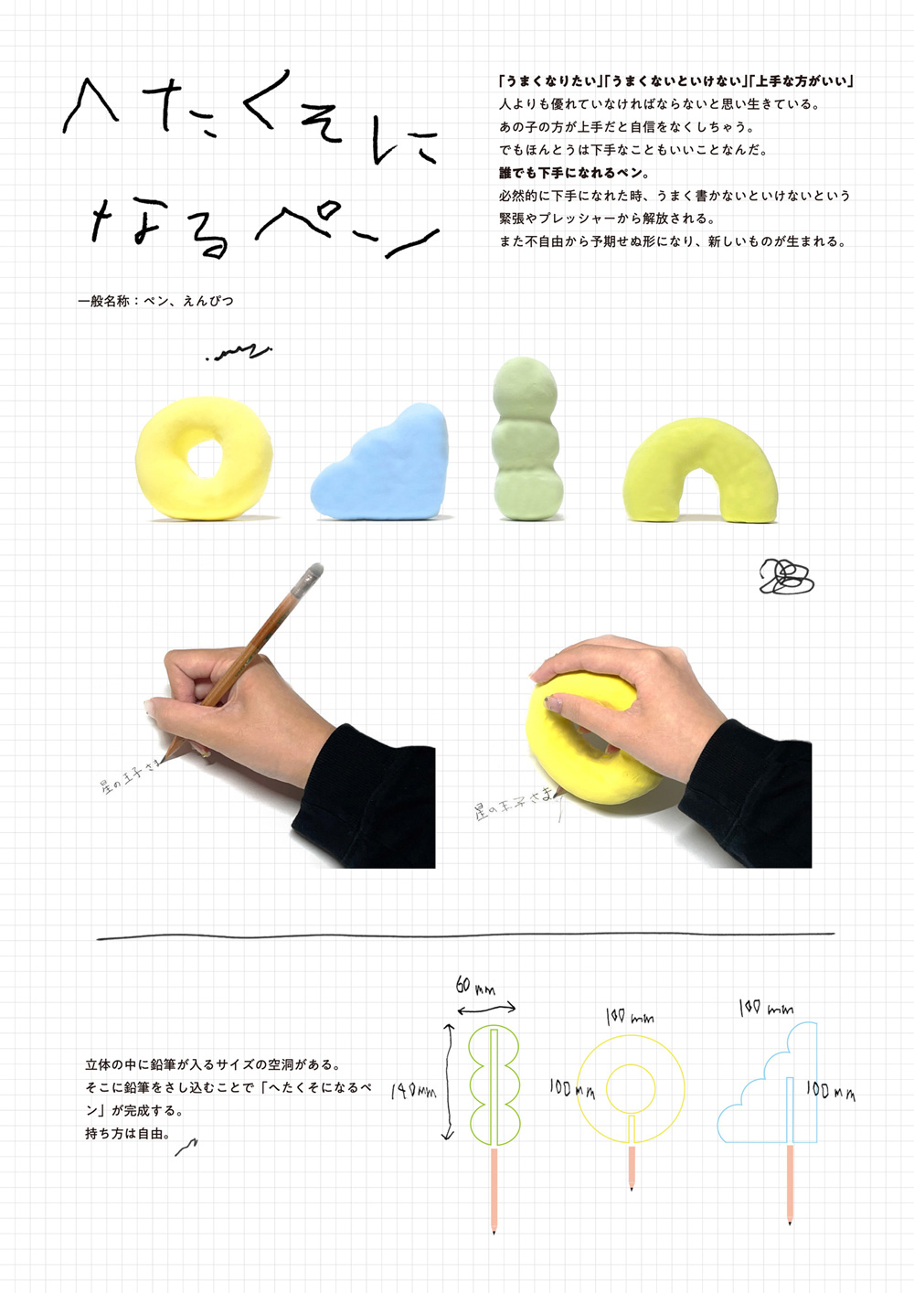
- title
- Can do bad handwriting
- creator
- Saya Hikiune
Description
Children often lose a bit of confidence when they are constantly filled with thoughts like “I want to be better,” and “I need to improve.” This is because of the negative view on writing poorly. But in reality, even something that is a little bit flawed can be charming too. Anyone can be an amateur with this pen. Whether writing or drawing, it'll look like you’re a novice. You can feel relieved of the tension and pressure to write well when you do it a little less perfectly. In addition, the inconvenience can lead to unexpected shapes and new things.
Evaluation Comments
It’s exciting to throw away the preconceived notion of writing and drawing well. It creates an opportunity to reconsider the act of “writing” itself with the option of being able to write a little less skillfully.
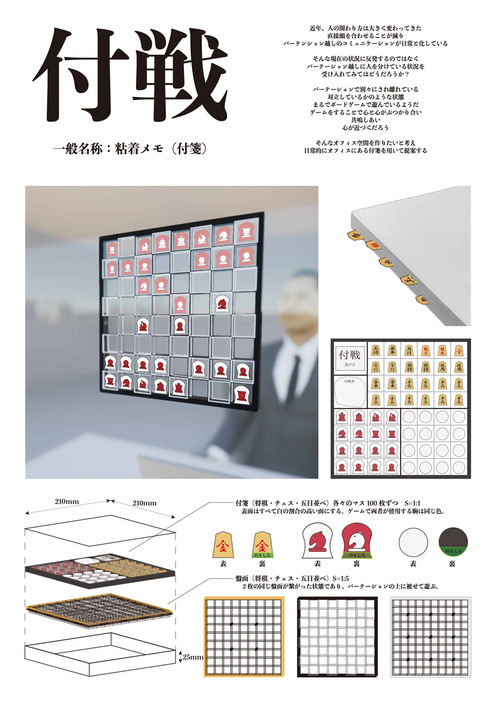
- title
- Tag Fight
- creator
- SPT (Saya Matsumoto, Cesar Ikumoto)
Description
In recent years, the way people interact has changed drastically. Face-to-face meetings are decreasing, and communication through partitions is becoming a daily routine. Why not embrace the situation and make the most of it? We’re at odds with the separation caused by partitions. But it’s also like playing a board game. Hearts and minds can collide, resonate, and come closer together in such a situation. These sticky notes can make this atmosphere manifest in the office space on a daily basis.
Evaluation Comments
A pleasant spin on the concept of adding positive elements to the partitions that separate people. In addition, the hygienic benefits of something that can be easily replaced is suitable for the modern day. Above all else, the innocent title is simply captivating.
- title
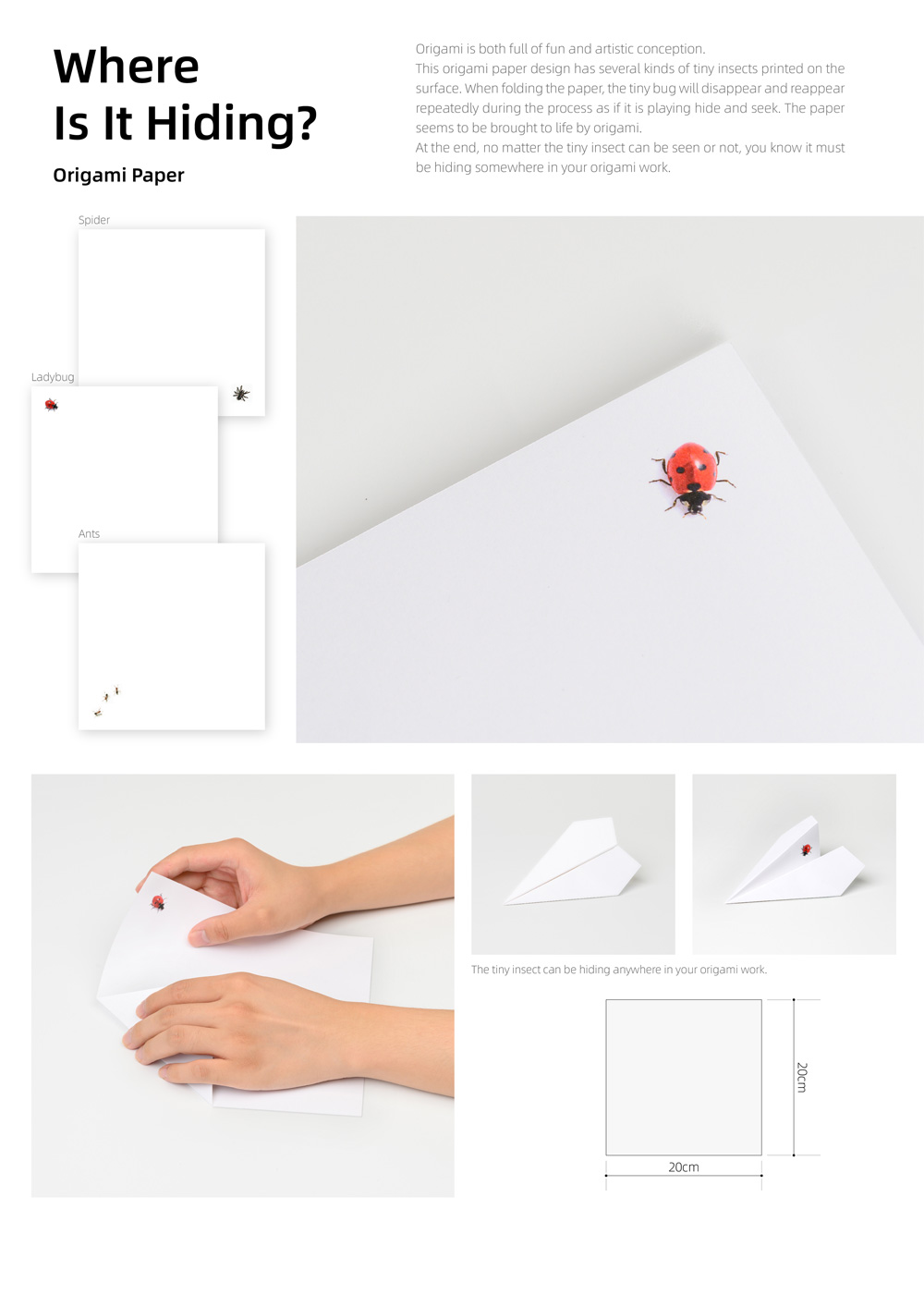
- Where Is It Hiding?
- creator
- MZ Design (Zou Hu, Miao Jingyi)
Description
Origami is both full of fun and artistic conception. This origami paper design has several kinds of tiny insects printed on the surface. When folding the paper, the tiny bug will disappear and reappear repeatedly during the process as if it is playing hide and seek. The paper seems to be brought to life by origami. At the end, no matter the tiny insect can be seen or not, you know it must be hiding somewhere in your origami work.
Evaluation Comments
It’s fun that you can enjoy finding insects hidden throughout the paper while making origami. On the other hand, folding the origami so that insects don’t show up on the paper seems to symbolize the act of hiding important things in a modern society where all kinds of information is open. There’s a lot of depth to a product with such a simple concept.
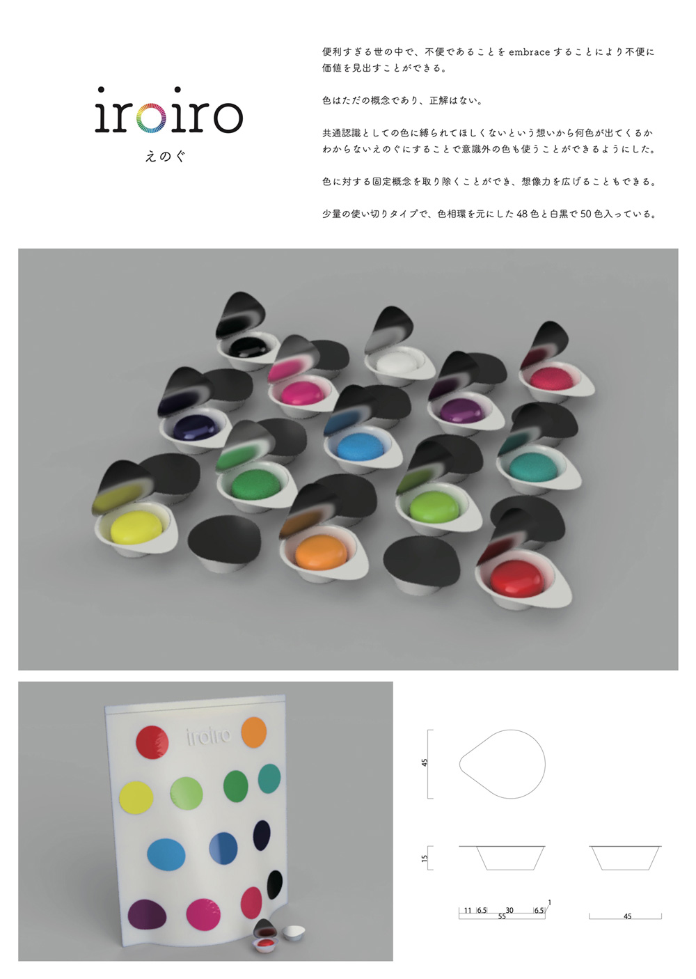
- title
- iroiro
- creator
- osu (Kazuma Michiwaki, Souta Suzuki, Akari Tsukamoto)
Description
With “iroiro” paint, you won’t know what color you’ll get until the lid is opened. There’s a general consensus with how colors are supposed to be used, such as apples being red. However, there are no rules that dictate what color something needs to be. These paints, not bound by definitive concepts, came from the perspective that there are no correct colors when creating art. New discoveries can be made when painting with the unexpected colors you fatefully encounter.
Evaluation Comments
The premise of not proactively choosing colors is unique. We all have fixed concepts about color, but with the added restriction of unchosen colors, it feels as though rediscovery and expansion of creativity can come from these accidental encounters.
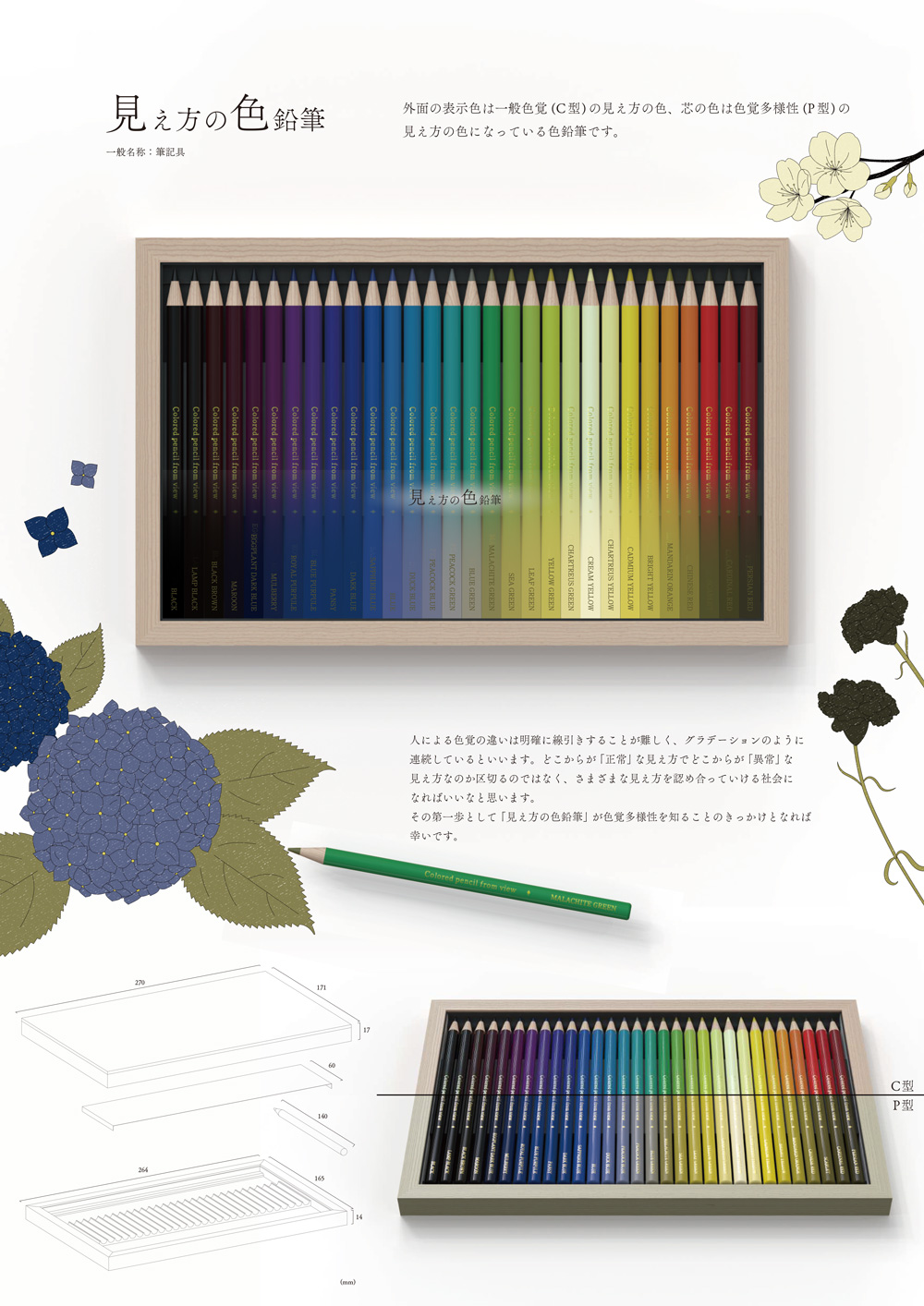
- title
- Colored pencil from view
- creator
- Ibuki Ohara
Description
It is said that about 5% of men and 0.2% of women in Japan have color blindness. Furthermore, difference in color vision among people is continuous like a gradation, and it cannot be said that the way you see is exactly the same as someone else. It would be great to create a society that is accepting of all kinds of perception, rather than separating them between what is “normal” and “abnormal.” It’s our hope that “Colored pencil from view” will be a first step towards an opportunity to learn about color vision diversity.
Evaluation Comments
A gentle product that allows you to draw while thinking about others who see colors differently. By daring to obscure the differences in perception, hearts and minds can gradually come together. An attractive and subtle expression of the importance of diversity in modern times.
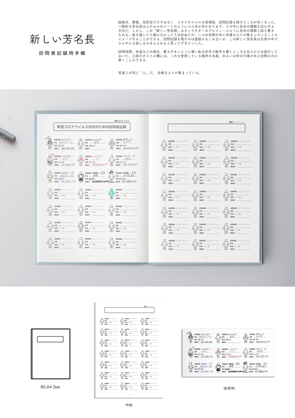
- title
- NEW GUEST BOOK
- creator
- Kim Minju
Description
“NEW GUEST BOOK” offers a new kind of guest book to people in the post-COVID era. Have you ever felt the desire to express yourself as the person you truly are? Typical guest books simply take a name and contact information, but why not the situation of “today” as well? Wouldn’t it be interesting to better visualize the people gathered on the pages of the guest book? “NEW GUEST BOOK” was created to spice up daily life with a little extra fun.
Evaluation Comments
While preserving the function of collecting guest information, this product has been redesigned with a new style. It’s now possible to look back on what is written not only as information, but also with the impressions left behind. A product that dares to bring out the appeal of analogue in the face of digitalization.
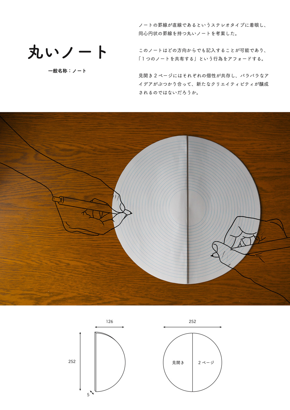
- title
- Ripples
- creator
- Taketoshi Kitajima
Description
A round notebook that can be written in from any direction. With this notebook placed in the middle of your desk, anyone can comfortably write in it, whether they are sitting across from it, in front of it, or diagonally. The “round” shape conveys the meaning of “resonance.” The individuality of the unique backgrounds and handwriting of people can give way to new creativity when their ideas come together on the pages like ripples in water.
Evaluation Comments
The simple idea of turning a rectangular notebook into a circle completely changes the notion of how notebooks have been used, and opens up a wide range of possibilities depending on the direction and way you write in it. It’s as though you can experience a new way of thinking by writing in this notebook.
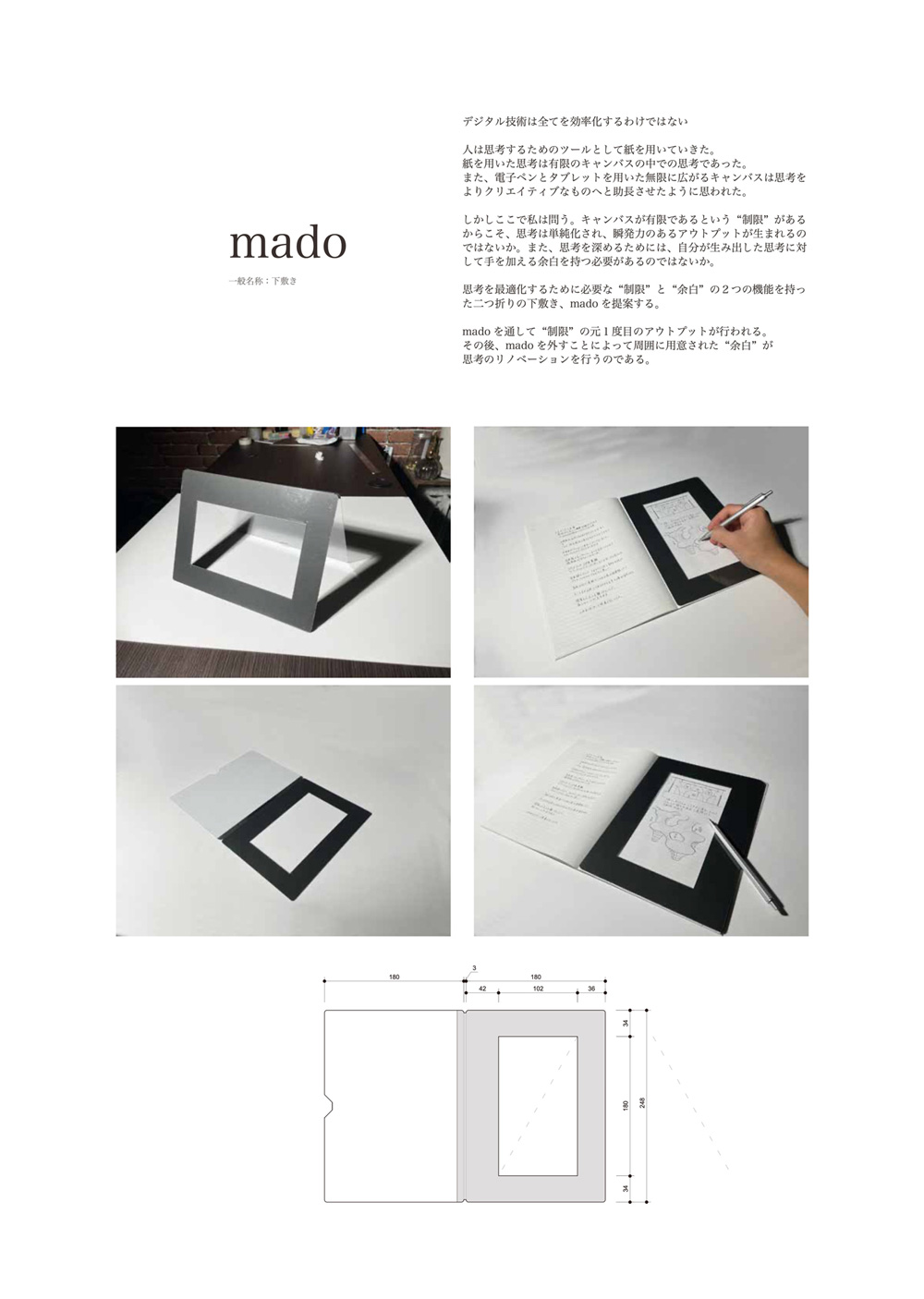
- title
- mado
- creator
- Hideto Hoshino
Description
“Mado” is an underlay that supports “human” thinking. When we think about something, or when we make something, our thinking stops when confronted with a large blank canvas for the goal we have in mind. So we start by running the brush toward a narrow canvas with “limits.” At the same time, there is still “white space” that expands thought. In order create an answer to these conflicting conditions, “mado” was designed. In the modern era where uniqueness and efficiency are necessary, why not embrace a kind of stationery suitable for its time?
Evaluation Comments
It’s a product that can bring together two contradictory functions, “limit” and “white space,” to a point. It’s interesting to feel your thoughts “renovated” after writing on a restricted piece of paper and seeing the blank spaces that appear.